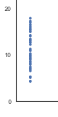
If you need to plot data that has one variable where values can be the same or very similar, for example the age of a group of people, you'll likely end up with data points that are plotted over the top of each other.
To make this type of plot easier to read and allow the reader to gain better understanding of the data, we can use jitter.
Overplotted Data
Jittered Data
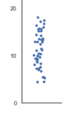
Jitter means adding a small movement to the plotted point to make all the points easier to see. In this case we can move the points a little to the left and right.
The underlying data isn't changed, just the plotted point's position.
Using Jitter in Power BI
There are a few options here. You could use Excel to create another column in your data with the jittered values before loading your dataset.
Or you could use Power Query/DAX to calculate the jittered values once data is in Power BI.
Both approaches require you to know beforehand that you need to jitter the data, and to do extra work to calculate this jitter. But if you use some native Python visualizations, this work is done for you and it's easy to turn jittering on and off.
Download PBIX File and Dataset
Enter your email address below to download the sample file and data.
Python Visualizations in Power BI
Power BI supports the use of Python to create visualizations so this is very useful if Power BI doesn't already support the type of visualization you want to use or if you can't find a good custom visual to meet your needs.
Actually using a Python chart isn't as complicated as you may think. You follow the usual steps to get your data into Power BI then drag the fields into the Values area. A few simple modifications to the Python code and that's all you need.
But before we get into Power BI, you need to make sure you have Python installed on your computer so that you can write the code in Power BI Desktop.
You can download and install Python from the main Python.org page.
Python Visualizations in Power BI
Running Python Scripts in Power BI Desktop.
Creating the Plot
With Python installed the first thing you want to do after starting Power BI Desktop is load the dataset from a CSV file.
I'm using a dataset that shows, amongst other things, the total bill for meals at a restaurant over a four day period, Thu - Sun.
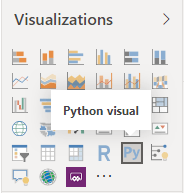
With the dataset loaded, click on the Python visual icon
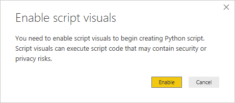
Power BI will ask you to enable script visuals so click on the Enable button.
Now drag across the day and total_bill values and set them both to Don't summarize.
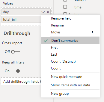
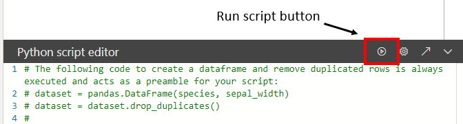
When you drag fields into the values area, you'll see the Python script editor appear at the bottom of the window, this is where the visualization code goes.
When your Python code is ready, you click on the Run script button to draw the visualization.
Python in Power BI works with a data structure called a DataFrame and this is automatically created for you. Think of the DataFrame as a table. PBI names this DataFrame dataset and it contains the data in the Values area.
If you have a field called day, the Python script accesses the data in the day column by using the term dataset['day'].
For this visual I'm using a Strip Plot from the Seaborn visualization library. A Strip Plot is essentially a scatter chart for categorized data. Along the x axis are the days (the category) and on the y axis is the bill amount. The code to draw this is just

We end up with a chart like this
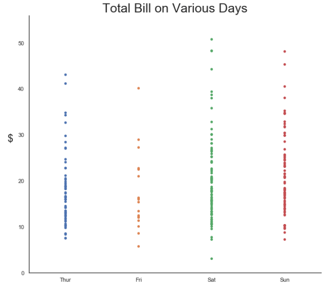
You can see that because we have so many data points of similar value we get overplotting. This doesn't give a good feel for the frequency or distribution of the data.
Adding Jitter
To add some jitter just make the jitter parameter True

and you end up with this plot
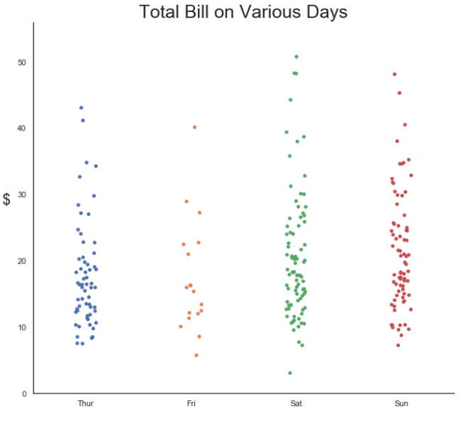
It's now easier to see how many data points we have, but we can improve things further by making the points a bit bigger and by making each marker's outer edge white. This will let us see more clearly where points are still plotted over each other.
NOTE : Each time you replot the chart the jitter is recalculated, so the points will end up in different positions each time you run the script.
Our plotting code is now

resulting in
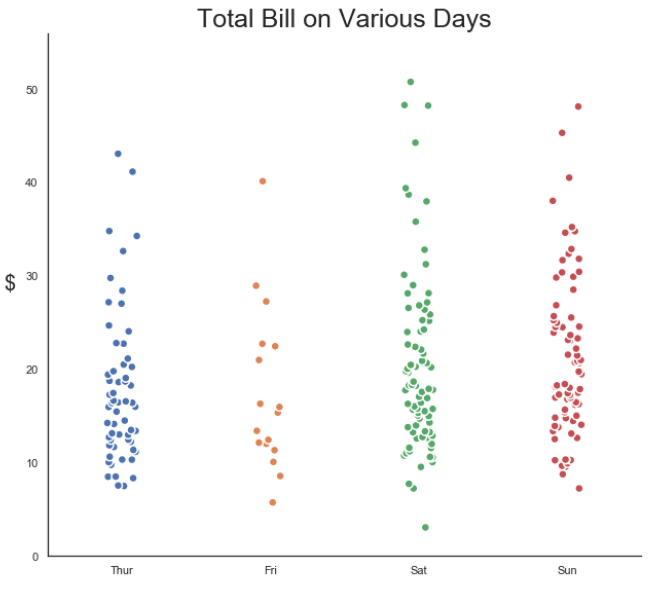
The default for a strip plot is for jitter to be on, but you may not always want to use it, and for the sake of this example I'm explicitly turning it off and on to demonstrate its effect.
Summary
When you have data points plotted over the top of each other, jitter is useful to spread those points out and let's you understand the data better.
Download the sample PBIX file and dataset (above) and give it a go yourself.
Further Reading