For many people when they think of a chart that shows parts to a whole, a pie chart is the first choice. And if you’ve known me for any length of time you’ll know I pretty much despise data in a pie.
Don’t get me wrong, I love pies. It would be un-Australian not to like pie (Australians eat between 270M and 300M pies per year. That’s 12 each). I just think pies are for eating, not data (most of the time).
Parts to a Whole Excel Charts
So if Pie Charts are evil then what’s the alternative?
I’m glad you asked. And before you jump in with ‘Stacked Column Charts’, the answer is no, definitely not. They’re second on my bad chart list, but that’s a rant for another day.
The alternative is almost always a bar chart, but let’s start with our example data:
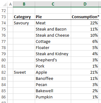
Yes, your eyes don’t deceive you. It’s the consumption of pies broken down by pie category, and within that the type of pie 🙂 Oh, and if you’re wondering what a ‘floater’ is, it’s this.
Download the Workbook
Enter your email address below to download the sample workbook.
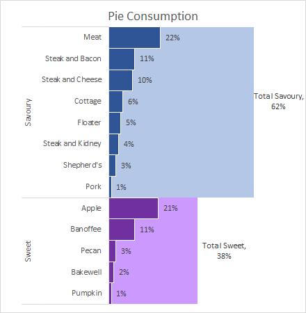
Parts to a Whole Bar Chart
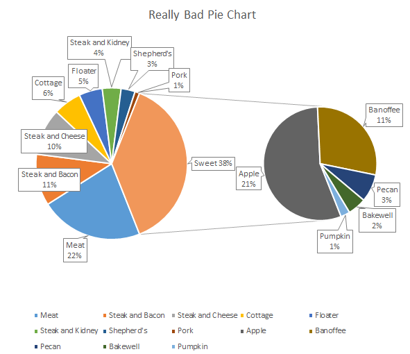
Let’s say I want to see what the overall split is by Category, and then the breakdown within those Categories. I could use 3 separate pie charts, or even a really bad pie chart like this:
But why would I when I can use a bar chart that’s quick and easy to interpret like this:
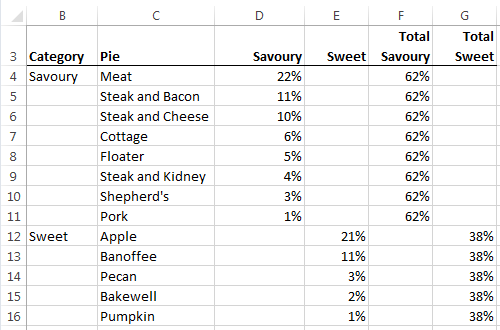
The key to this chart is all in the layout of your data. There are 4 series in the bar chart above and you can see them in columns D:G of my data table below:
Recreating the Parts to a Whole Bar Chart
To recreate my Parts to a Whole Excel chart:
- Insert chart: Select the data > Insert tab > Bar Chart
- Categories in Reverse Order: Double click/right-click the vertical axis > Format Axis > Axis Options > check the box for Categories in reverse order. This will sort the data in the same order as the source data, which is in descending order by pie type within each category.
- Set Overlap and Gap Width: Edit the series; right-click/double click one of the bars to open the Format Data Series dialog box > Series Options > set series overlap to 100% and the Gap Width to 0%
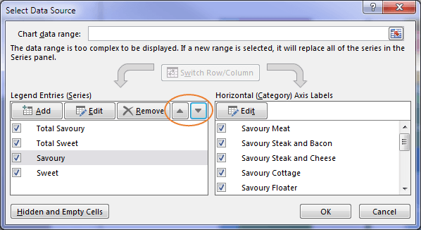
- Rearrange series order: Right-click the chart > Select Data > rearrange the series using the up/down arrows so that your ‘Total..’ series are at the top of the list:

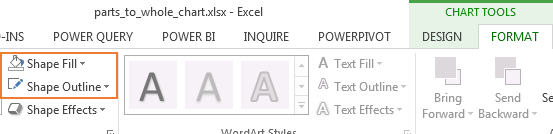
- Format colours: With the bars in the chart selected add definition to them with a white outline (Format tab > Shape Outline), and set your colours for the bars (Format tab > Shape Fill):
- Labels: Add labels to the bars if you wish, but make sure you remove the horizontal axis (click once to select it > Delete), otherwise you’re just duplicating information. You will also have to delete the extra labels for the ‘Total…’ series so you just have one label for each. You’ll see what I mean if you try it yourself.
- Title: Give your chart a title. Don't forget you can make your title more than just a heading.
Job done. Time for a Pie Floater, anyone? 😉
Want More?
The bar chart above wasn't particularly complicated, but because I know a few tricks for formatting charts I was able to create something very effective from the basic charts available on the Insert Chart menu.
And it's skills like this that can make the difference between being able to quickly and clearly communicate your message, or burying it in a pie poor chart.
If you'd like to learn more charting tips and techniques like these, check out my Excel Dashboard course.

This is informative but I wish there were more instructions 🙁 I’m someone who needs this kind of information to be very explicit and detailed step by step.
Would you consider doing this with a simple example? Would you consider something like years 2008 to 2013, total SUVs purchased, and then just 2 brands eg. Suzuki and Honda.
So column A would have the years, column B-the percentage of Suzukis bought each year, column C-the percentage of Hondas bought each year and column D, the total percentage [but have the total percentage NOT sum to 100]. Eg. in 2008, 15% Suzuki, and 20% Honda, so total for 2008 is 35% etc.
I searched on YouTube and checked out some other websites as well but they don’t seem to explain what you have here, which is a layered bar chart. Your tutorial is exactly what I want but I can’t seem to follow it. Don’t get me wrong; many people understood by looking at the comments but for me, I’m not totally getting it 🙁
Hi Yve,
There are explicit steps listed under the heading “Recreating the Parts to a Whole Bar Chart” and you can download the file and replace my data with yours. At which point are you getting different results? Perhaps you can post your question and Excel file in our forum where we can see what you’ve attempted based on the instructions in this tutorial and we can help you further.
Mynda
>There are explicit steps listed under the heading “Recreating the Parts to a Whole Bar Chart”
Except you skipped MANY steps to get to this point. How did you format the data in the PivotChart Fields in the first place in order to have a populated Axis to click on in Step 2? This information would actually be super helpful to new users.
Hi Katie,
It’s not a Pivot Chart. If you download the file you can see how the data is laid out.
Mynda
Good Day, Mynda! Thank for this great post!))
“6. Labels: Add labels to the bars if you wish, but make sure you remove the horizontal axis (click once to select it > Delete), otherwise you’re just duplicating information. You will also have to delete the extra labels for the ‘Total…’ series so you just have one label for each. You’ll see what I mean if you try it yourself.”
I selected only one Total Savoury/Total Sweet bar (the middle one, I guess, that’s better) by double clicking on it,Right Mouse, Add Labels, just entered the text needed.
Spared myself several clicks)))))
Good tip, Sergey! Thanks for sharing.
3 words – Fantastic , Mind blowing & Superb.
You are simply Genius
I have used this technique of yours. My colleagues are just amazed
Thanks a ton 🙂
That’s great, Jagan, thanks! Glad you were able to use it.
Mynda
No doubt Pie Charts have their uses in Excel, especially in the earlier days of Excel Charting and data metrics, but with the advances in Excel charting it seems that pie charts haven’t really moved that much ( there is only so much you can do with a circle ). The more advanced Excel has become and the users of Excel have increased their knowledge and understanding what else can be done, the less we tend to use pie charts … I actually use one pie chart in all the dashboards I create for others … even then I did not want to use it, but the client wanted it, so I made it dynamic in that it changes with the click of a dropdown list ( makes me feel better about using one ). In today’s analytics driven business world there is a need to utilise the best tools we can, most of the time, that doesn’t include pie charts.
Well said, John.
The data in the example is static. Can it be used for dynamic data?
How to use this type of a chart be used for data that keeps changing every month.
Hi Mandeep,
Sure, you can link any chart to dynamic data with dynamic named ranges.
Mynda
Hi Mynda
Without suggesting pie charts are better overall, the only “criticism” (??) I offer is that a pie chart (being a circle) gives a definite view of what the whole is and displays the correct proportionality, whereas a bar chart does not – unless the scale of the horizontal axis is fixed from 0 to 1 and there’s a border around the plot area to visually define the extent of the whole.
Other than that, your reasoning for bar over pie makes a lot of sense.
Hi Col,
Interesting points you make. For me the purpose of representing items as a proportion of a whole is to make comparisons from one item to the next and understand which items are significant/insignificant etc.
Unlike a Pie chart, the bar chart isn’t an area chart so the overall size of the chart area isn’t required to make comparisons between the data (this means they can take up a small space and still convey the message). This also means that fixing the axis at 1 doesn’t change how the lengths of the bars compare to one another (see below), however the scale should always begin at zero.
An interesting point Ziggy made is that the representation of the categories (Savoury and Sweet) with columns that take up the whole width of the items may lead people to interpret the size of the area, as opposed to just the length of the bars. A solution to this may be to include a horizontal axis to make it clearer that this is a bar chart, not an area chart.
Cheers,
Mynda
Nice approach to showing two levels of data in an easy-to-read chart! If I wanted my headline/message to be: “Aussies love their savory pies, but apple is a strong contender,” how would you format the chart differently?
🙂 in that case, Michael, I’d sort the chart by pie type and omit the category bars since it would appear from the headline that the pie type comparison is more important than the category.
Mynda
I am looking for a chart of other visual where the parts are actually greater than the whole. Example my budget is $100 but my 6 variables equal $125.
Hi John,
I’d use a different chart to plot variances against budget. Here is an example: https://www.myonlinetraininghub.com/charting-variances-in-excel
Mynda