Highlighting the minimum and maximum in an Excel chart can help focus your readers’ attention.
We can manually select points or columns and change the color, and that’s fine for static charts, but if your chart gets updated then you’ll want to automate the process.
The approach is slightly different for line charts and column charts, so I’ll cover both here.
Download the workbook
Enter your email address below to download the sample workbook.
Watch the Video

Label Excel Chart Min and Max - Line Charts

It all begins with the chart source data (see image below). Column C contains the data that plots the line, column D contains the maximum marker and column E contains the minimum marker:
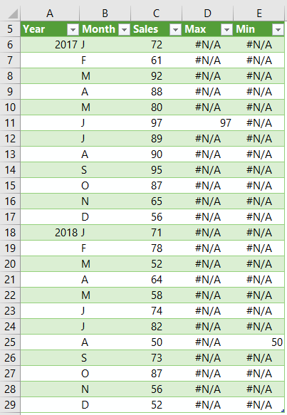
We use formulas in columns D and E to automatically find the maximum and minimum values, plus using formulas for this allows us to update the data and not have to manually alter the chart.
Max formula: =IF([@Sales]=MAX([Sales]),[@Sales],NA())
In English the Max formula reads; if the sales amount = the maximum sales amount in the Sales column then return the sales amount, otherwise return the #N/A error.
Min formula: =IF([@Sales]=MIN([Sales]),[@Sales],NA())
In English the Min formula reads; if the sales amount = the minimum sales amount in the Sales column then return the sales amount, otherwise return the #N/A error.
Note: The chart source data is formatted in an Excel table and as a result the formulas above use Structured References instead of regular cell references that you might be familiar with.
Tip: In line charts we use #N/A to hide values we don’t require labels for, but in the column chart we use a different technique. More on that in a moment.
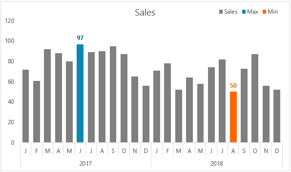
Excel Line Chart with Min & Max Markers
Step 1: Insert the chart; select the data in cells B5:E29 > insert a line chart with markers
Step 2: Fix the horizontal axis; right-click the chart > Select Data > Edit the Horizontal (Category) Axis Labels and change the range to reference cells A6:B29.
Step 3: Format the markers; click on the max marker in the chart > right-click > format data point > Marker Options > apply settings as per image below:
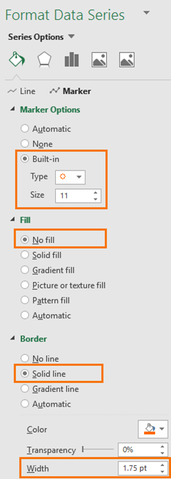
Tip: It’s a good idea to set the line for the marker series to ‘no line’ just in case you have ties in your max/min values.
Rinse and repeat for the Min marker choosing a different color.
Step 4: Add data labels to markers; right-click the marker > add data label > format the label above the line for the max marker and below the line for the min marker.
Bonus points; match the label font color to the marker color.
Bonus tip: If you have multiple min or max values you’ll also want to set those series’ lines to ‘no fill’, otherwise you’ll have a line joining the markers.
Thanks to fellow MVP Jon Peltier for the hollow circle marker trick. Normally I just use a solid dot marker, but the circle is nice for a change.
Label Excel Chart Min and Max - Column Charts
Highlighting minimum and maximum values in a column chart is slightly different, but it also begins with columns for max and min the source data, as shown below:
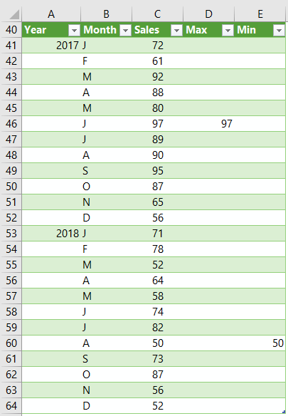
Again, we use formulas to find the minimum and maximum values in columns D and E:
Max formula: =IF([@Sales]=MAX([Sales]),[@Sales],0)
In English the Max formula reads; if the sales amount = the maximum sales amount in the Sales column then return the sales amount, otherwise return zero.
Min formula: =IF([@Sales]=MIN([Sales]),[@Sales],0)
In English the Min formula reads; if the sales amount = the minimum sales amount in the Sales column then return the sales amount, otherwise return zero.
For column charts we use zero to hide values we don’t want plotted in the chart. A column with a zero height simply doesn’t display.
However, to avoid a load of zeros displaying in our labels we need a custom number format that hides the zero values.
I like to apply the format to my source data as this will be automatically picked up by my chart.
The format is 0;-0; and you can see it below in the Format Cells dialog box (tip, don’t forget the last semi-colon in the format, as that’s what hides the zero):
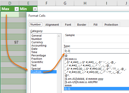
Note: My numbers are small so my custom number format doesn’t have a comma separator for thousands, However if your values are large, or you want $ or ₤ symbols included in your format then refer here for more on Custom Number Formats.
Ok, now that my source data is ready I can insert my chart. BTW, this also applies to bar charts.
Excel Column Chart with Min & Max Markers
Step 1: Insert the chart; select the data in cells B40:E64 > insert a 2-D column chart
Step 2: Fix the horizontal axis; right-click the chart > Select Data > Edit the Horizontal (Category) Axis Labels and change the range to reference cells A41:B64.
Step 3: Overlap columns; right-click any column > format data series > Series overlap 100%, Gap width 60% (or whatever you prefer).
Step 4: Colour code min/max; left click the max column > format the fill colour. Repeat for the min column.
Step 5: Add labels; right-click the max column > add data label. Repeat for min column.
Bonus points; match the label font color to the column colors.
Bonus tip: Make the label font color one shade darker than the column color to help it stand out.
Label Excel Chart Min and Max - Summary
I want to recap the key differences in hiding points in line charts vs column/bar charts because this is something I regularly get asked about.
Line charts require the #N/A error to hide points. This prevents the line dipping down to zero and #N/A errors are simply not displayed in line chart labels.
Column or Bar charts require zero or blanks to hide the column/bar. This results in no bar being drawn in the chart, but if you add labels you’ll see zero values along the horizontal axis. To hide the zeros in labels we use a custom number format that tells Excel not to display the zero; 0;-0;
If you try to use #N/A in column/bar charts you won’t be able to hide them in the labels.
Hello Mynda.
Is it possible to do it also for pivot chart ?
Not a regular Pivot chart, but you could with a Power Pivot Pivot Chart and a custom DAX measure.
Your formula for max / min is not working??!
Do you mean your version of the formula isn’t working? If so, please post your question and sample Excel file with the problem on our Excel forum where we can help troubleshoot for you.
Hello Mynda. Took me a while to have the line chart’s legend look like yours. Mine had the dot but also a line through it. Got it in the end. Is it where the ‘Tip’ section is?
My question is if another value becomes a new minimum or maximum the chart updates of course but the data label disappears. So in real life do we need to go through the last few steps?
Thanks alot for the tuts.
Daniel
Hi Daniel,
If you set the labels for the series then you don’t need to re-set them when the min/max changes, it will update automatically (you can download the file for this post and you’ll see it adjusts).
I suspect you managed to set the label to the single min/max point, instead of selecting the whole series. To be sure you selected the whole series you can go via the Ribbon; select the chart, then on the Chart Tools Format tab > select the series from the drop down on the far left, then set the labels.
Mynda
Mynda
I have a similar line chart which keeps track of the time of a key weekday event; with each week’s min/max times, the average for each week and ytd average (not as junky as it sounds, really)
But I’ve now added a subtle ring around each min/max point – thanks Mynda/Jon (actually filled white creates a better look, on my chart)
Updating it used to be a minor chore but, using the power of a table and helper columns, all I have to do is open, enter each day’s time and save (even the date updates itself)
@Sunny: the only “junk” is what you’ve hidden (I nearly always do too, the default should be “off”), what you’ve added almost certainly enhances – and, like you say, it’s fun to do!
jim
Thanks, Jim! Glad you enjoyed this post and found some uses for the techniques.
Mynda
@jim : I am a real “junkie” when it comes to dashboards. In the real world, many cannot accept “bare-looking” charts. The general expectation is the charts must be “beautiful” and have all the bells and whistles such as filters, hyperlinks, drill-down etc (and this must be done in Excel !!). Oh well, the boss is always right 🙂
Luckily for us, there are experts such as Mynda and Jon around to guide us.
Sunny
Hi Mynda
Line Chart – I use this method to large draw circles on all the points to look line board magnets, hiding almost everything on the chart other than the horizontal axis.
Column Chart – This method is also useful to show the top 3 (or whatever) with different colors. Just add more helper columns if necessary.
What I did may look like “chart junk” to many but it is fun to create and it really impresses people.
Sunny
Cheers, Sunny. Great reminder about the top 3. I teach that technique in my Excel Dashboard course too.
Mynda