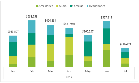
If you work with PivotTables, then you’ve probably found that you can’t include grand totals in Pivot Charts, or subtotals for that matter. And if you’ve ever created a stacked column chart then you’ll have likely wanted to include grand totals as column labels, like this:
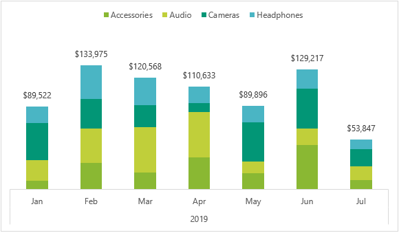
And then remembered you can’t.
One workaround is to create a regular chart from a PivotTable, then you can include the Grand Totals in the source data range.
Another option is to use CUBE functions to connect to the PivotTable source data. The nice thing about CUBE functions is you can get the PivotTable to create them for you and they can retain connectivity to Slicers. That’s right, you don’t even need to learn how to write CUBE formulas!
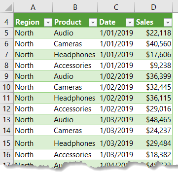
My data, shown below, is formatted in an Excel table called, Table1. It’s product sales by date and region:
Download Workbook
Download the workbook and follow along:
Enter your email address below to download the sample workbook.
Automatically Create CUBE Formulas
The key to CUBE formulas is that your data needs to be referenced from Power Pivot*, aka the Data Model.
*Power Pivot is available in for Excel 2010, Excel 2013/2016 Office Professional Plus, Office 2016 Professional, any version of Excel 2019 or Office 365, or the standalone edition of Excel 2013/2016. Click here for the full list.
Step 1: Load data to the Data Model
Insert a new PivotTable and at the dialog box check the ‘add this data to the Data Model’ box:
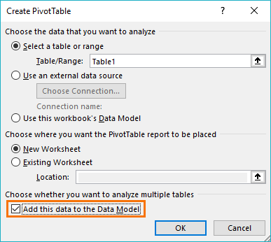
Note: Excel 2010 users will need to load the data to Power Pivot via the Power Pivot tab > Add Linked Table. Then from the Power Pivot window Home tab > Insert PivotTable.
Step 2: Build the PivotTable
Create the PivotTable that will support your Pivot Chart. I like to insert a chart at the same time to make sure the PivotTable layout is going to result in a chart that looks the way I want.
I’m using a stacked column chart, therefore I need the series names in the column labels and the dates in the rows, so they form my horizontal axis labels:
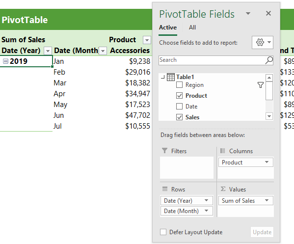
Tip: My dates are grouped into years and months: to do this, right-click the date in the PivotTable > Group.
Optional: If you’d like to filter your chart with a Slicer, insert it now. I’ve inserted a Slicer for the Region field. More on this in step 6.
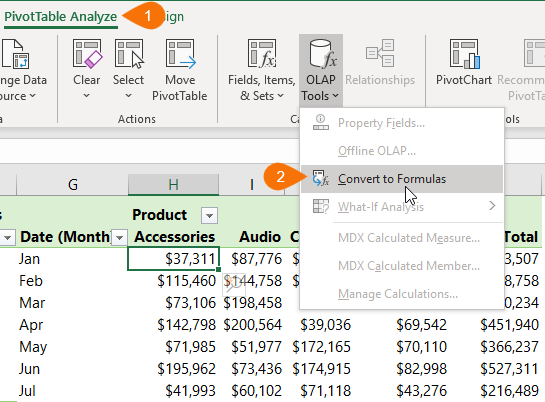
Step 3: Convert the PivotTable to CUBE Formulas
Select any cell in the PivotTable > PivotTable Analyze tab > OLAP Tools > Convert to Formulas:
If you inspect the cells in what was your PivotTable, you’ll see they’re now CUBE formulas, as shown below:
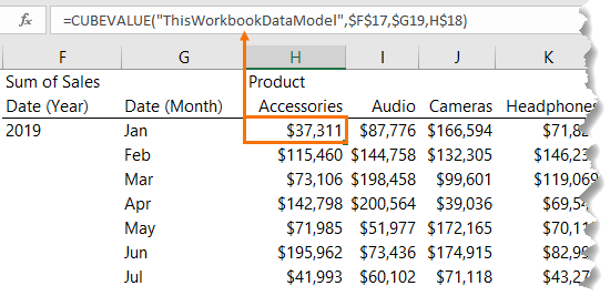
The CUBE formulas are directly referencing the Data Model. Any changes to the Power Pivot Data Model will be reflected in the CUBE formulas.
Step 4: Insert a Regular Chart
Now that you’ve converted the PivotTable to CUBE formulas you can insert a regular chart i.e. not a PivotChart. I’m using a stacked column chart.
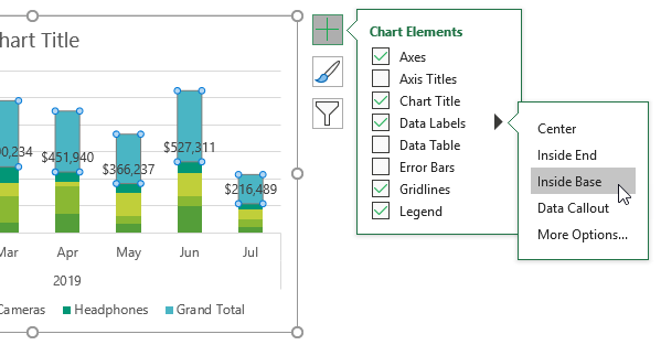
Step 5: Format the Chart
The Grand Total value is the top segment of the stacked column chart. We need to hide this, but first let’s select the grand total series and add Data Labels > Inside Base:
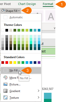
Next, with the grand total series still selected go to the Format tab > Shape Fill > No Fill
Hide the gridlines and vertical axis, and place the legend at the top (be sure to delete the legend entry for ‘Grand Total’; select it in the legend and press the Delete key):
Step 6: Connect CUBE Formulas to Slicers (Optional)
My data set allows me to filter the data by region and I’m going to do this with the Slicer I inserted in step 2.
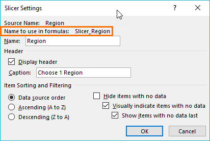
First, right-click the Slicer > Slicer Settings and find its ‘name to use in formulas’:
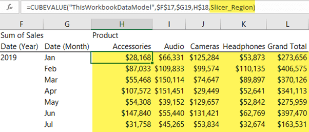
Now, edit the CUBE formulas in the values area to include the Slicer ‘name to use in formulas’ in the next ‘member_expression’ argument, like so:
=CUBEVALUE("ThisWorkbookDataModel",$F$17,$G19,H$18,Slicer_Region)
Be sure to copy the formula to all the values area cells:
Step 7: Format and Arrange Slicer and Chart
Now all that’s left is to align the Slicer to the chart and make it look nice:
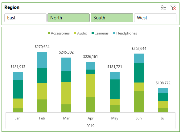
Notice the Slicer acts as a header for the chart and informs the user what regions it relates to without the need for an extra heading.
Tip: This CUBE formula technique also works with PivotTables based on an OLAP data source like SSAS Cubes.
Learn Power Pivot
Power Pivot is hugely versatile and enables you to work with a lot of data and or, data spread across multiple tables. If you’d like to learn Power Pivot please consider my Power Pivot course. There is more information on what Power Pivot can do on the course page linked to above.

Dear Mynda,
Recently I’m faced with the same issue.
I want to share the way I solved it, keeping within the orbit of PIVOT Tbl & Chart.
Use a Calculated Item as Grand Total on a stacked Column PivotChart.
Change the Chart Type of the Calculated Item to a Line Chart, add Labels and Format the Line to NONE.
Nice! Thanks for sharing 🙂
Hi
That works great for the Grand Total at the top right position of the pivot table.
How can I include a stacked column bar in the pivot chart for the Grand Total of all shown months just next to the “Jul” bar (let’s name that “All Months”)?
Thanks a lot
Nico
Hi Nico,
It can’t be done with a Pivot Chart. You’d have to create a regular chart that references PivotTable data.
Mynda
Actually, you can make this work with two charts; one being a transparent overlaying the pivot chart.
I created a regular stacked pivot chart; then overlayed a normal line chart using name formulas to provide the values.
Total named formula =OFFSET(A5,1,MATCH(“Grand Total”,$A$5:$F$5,0)-1,COUNTA($A:$A)-5,1)
(My table was in A5, and my grand total would move between columns B & F depending on the slicer selection). This gives me an array of the values.
I used an index name formula = OFFSET(A6,0,0,COUNTA($A:$A)-5,1) to get the primary row name
Plotted these two items on a regular linen chart, changed background transparency and voila…. no cubes (and works on Mac and Windows)…..
Yep, that’s another great way to achieve this result. My concern with using two charts is that the vertical axis might get out of sync between the two charts and sometimes the charts can be rendered differently on users’ PCs that have different screen resolution etc. I’m always wary of these potential issues and make sure I put measures in place by using a ghost series to fix chart axis heights, and test the chart appearance on multiple machines before distributing my reports.
For my example, the range of values are within a known range – so I set my axis height manually.
I’ll have to watch for the screen resolution one though.
Btw, love your videos – gives me lots of new ideas!!
Great to hear, Richard 🙂
This chart method saves a lot of time. However, i am facing challenges when data is added for subsequent months. Since the table with Cube formula is in range, it doesn’t capture any new data added for new month automatically. Is there any solution that can solve this please?
Hi Justin,
You can use a dynamic named range for your chart series so that any new rows/columns added to your cube formula table are automatically included in the chart. If you get stuck please post your question on our Excel forum where you can also upload a sample file.
Mynda
This works in one year, but if I have 2 years of data grouped by year first, then per month, the bars are messed up. Any alternatives?
Hi Eric,
Is your chart data laid out as shown in step 6, with the year in one column, then the month and so on? If so, it shouldn’t matter how many years you have in your chart. Perhaps you can post your question in our Excel forum where you can upload a sample Excel file and help you further.
Mynda
After connecting to Slicer : putting slicer name in “Cubevalue” formula I will get #value error,
Please help to solve this.
Hi Arti,
Try to create a pivot table and use the same fields and slicers as in your formula, this way you will see if any measure fails.
This answer doesn’t seem to fit with the question. When I follow the instructions above I too received the $value error. There is a step that I’m missing.
Hi Kevin,
You have to make sure your measures work, if they return error values, the CUBEVALUE formula will obviously not work.
Can you please upload a sample file with your attempts so we can see what’s wrong? Use our forum, you can create a new topic after sign-in.
Unfortunately my data has an extra complication / filter. My Column headers are based on a measure. I think that is then creating the #value error.
Might be, can’t say without seeing a sample file.
I found out that for the slicers to work, they can not be added to the “Columns” field of your pivot table. Like in the example, “Product” is under the column field, but not a slicer. “Region” is a slicer so that it cannot be added to the column field. That’s how i fixed the $value error.
It’s nice to see CUBE formulas getting a bit of usage – great work.
Thanks, Mark!
I sent questions about above chart but have since found the answers but thank you and very nice.
You’re welcome, Marc.