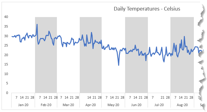
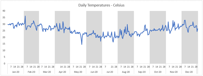
Shading or highlighting periods in Excel charts can help users more quickly interpret them and identify patterns. In the chart below I’ve highlighted every second month to give a quick visual indication of each period, which allows the user to focus on the line instead of having to refer back and forth to the horizontal axis.
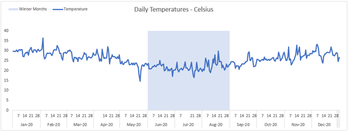
Or even highlight date ranges, like the (Southern Hemisphere) winter months shown below:
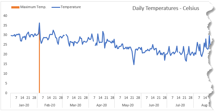
You can also use this easy technique to highlight specific dates, like that of the maximum temperature, with a line:
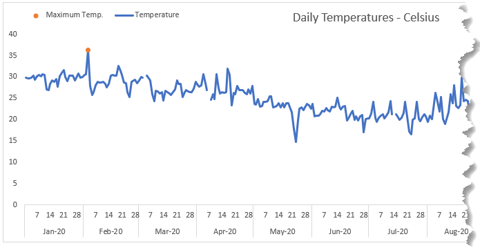
Or a dot marker:
Watch the Video

Download Workbook
Enter your email address below to download the sample workbook.
Step by Step Highlighting Periods in Excel Charts
The secret to this technique is to plot another series on the secondary axis for the highlighting/shading. I’ll step through the first chart example and you can download the Excel file and or watch the video to learn how to create the others.
Step 1: Set up the chart source data.
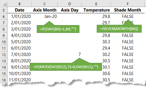
Notice the horizontal axis uses helper columns C and D for the month and day which will form a nested axis. I’ve used formulas to list only the first day of the month in column C and every 7th date in column D to avoid the axis getting cluttered.
Column F contains a formula that specifies which months are shaded; in my example the even months are shaded. The formula returns TRUE for even months and when plotted in a chart the TRUE is equivalent to 1.
Step 2: Insert the Chart.
Select the data in columns C:F and insert a line chart.
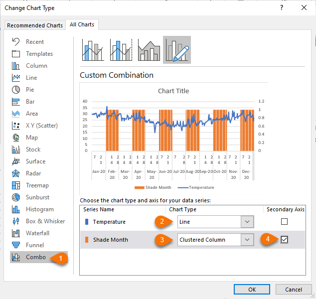
Step 3: Change Chart Type.
Right-click the chart > Change Chart Type… Select Combo. Set the series you want to plot as a line, in my example it’s the temperatures. The series for shading should be a clustered column on the secondary axis:
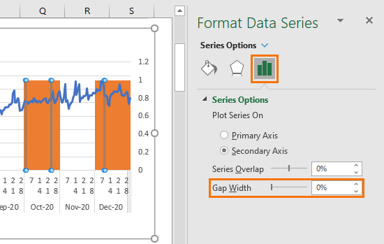
Step 4: Remove Gap Width.
Select the column series “Shade Month” > CTRL+1 to open the format pane. Here set the gap width to 0%
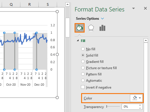
Step 5: Format Colour.
Change the column series fill colour to something subtle:
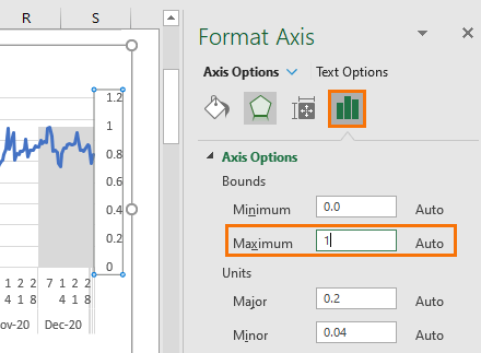
Step 6: Secondary Axis Scale.
Set the secondary axis maximum to 1 so that the columns to go to the top of the chart:
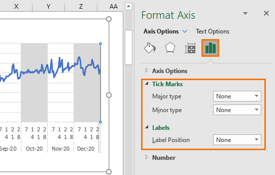
Step 7: Hide the secondary axis.
Go to the Tick Marks and Labels settings and set to ‘None’:
Step 8: Apply further formatting as desired.
For example, a chart title, legend, remove gridlines etc.:
More Ideas for Highlighting Periods in Excel Charts
 Labelling Events in Excel Charts - Plotting data over time can reveal patterns and trends, but often blips in the data require further explanation. We can help our user by labelling events to explain those blips or patterns revealed in the data.
 Label Chart Minimum and Maximum Points - Automate highlighting the minimum and maximum in an Excel chart to help focus your readers’ attention.

Hi Mynda,
good idea, I’ve used something similar to highlight value-ranges (like quality-region A, region B, region C, too short, too long) for a x-y-chart.
My problem with combined charts (x-y-chart and clustered column) is, that with the chart-type ‘clustered column’ the formatting of the abszissa can’t be defined. That makes precise positioning in a x-y-chart a bit troublesome – or do you know how to manage that?
Best regards,
Rainer
Hi Rainer, I don’t know what you mean by abszissa, sorry.
I had a question on how to make highlight %age increase/decrease on top of two bars? If required, I can share a sample I saw online if your email is provieded.
Hi Maher,
You can create a new topic on our forum, you will be able to attach files to that conversation.
Here is the forum.
Another method is to leave the Shade Month on the primary axis.
In cell F6 enter =ISEVEN(MONTH(B6))*(MAX($E$6:$E$368)+5) and copy down.
The 5 is just a random number higher than the maximum value of the temperature.
You can use any number you like. It will make the column chart higher than the line.
Nice alternative, Sunny! Thanks for sharing 🙂
This is awesome. I had a set of data that had 4/5 readings each day. I wanted to present in such a way that the movement of data within a day is also discernible.
This one grate way! Thanks
Sri
So pleased it will be useful to you, Sri!