Excel Waterfall charts are now available to Office 365 users via the Insert > Charts menu. It makes light work of building what was a laborious chart to create in earlier versions of Excel. However, it has some limitations, so you may prefer the manual approach required by users of earlier Excel versions anyway. I’ll cover both methods in this tutorial.
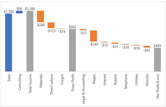
Waterfall charts help us visually understand the cumulative effect of positive and negative values over time or categories. A common use is in financial analysis to track how profit or cash flows are arrived at.
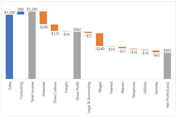
The Office 365 Excel Waterfall Chart above uses a new charting engine and as such it’s not as customizable as regular Excel charts you might be used to. For the most part it isn’t a problem, but I really dislike the category labels rotated vertically and the only way to make them horizontal is to make the chart ridiculously wide.
Another annoyance is you can’t adjust the plot area size, only the overall chart area can be adjusted. There are some other issues, but I don’t want to nit pick 😉
Download Workbook
Enter your email address below to download the sample workbook.
Insert Excel Waterfall Charts
For Office 365 users creating a waterfall chart is easy, you just need some data.
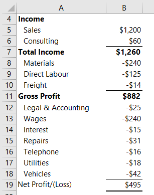
Tip: Avoid empty rows as these will appear as gaps in the chart. Also, negative values like expenses must be entered as negatives for Excel to plot them correctly.
Select the data in cells A5:B19 > Insert tab > Waterfall chart:
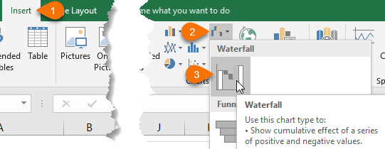
Set the subtotals and totals; one by one right-click on the columns in the chart > ‘Set as total’:
You should see that the positive, negative and total columns are automatically formatted with different colours.
Formatting Tips
Remove the gridlines and vertical axis as we don’t need them if we have data labels. Just left-click to select them and press the Delete key. I’d even go as far as to remove the legend and title in income charts as the horizontal axis and labels are self-explanatory.
Excel Waterfall Charts in Earlier Versions
Now, if you don’t have Office 365 don’t despair as you can build Excel Waterfall Charts with a few clever tricks.
You can even build a waterfall bar chart and align it to your P&L like so:
We’ll look at a waterfall column chart first.
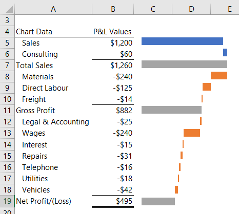
Manual Waterfall Column Chart Data
You’ll need 3 extra columns (C:E as shown below) to support the chart:
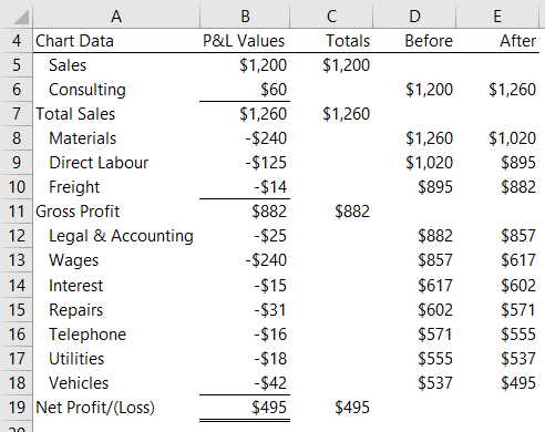
Column C contains the totals. This series will be a column chart.
Columns D and E support Up/Down bars series. Column D contains a running total of the balance before the current row, and column E contains a running total of the balance as at the current row. These values are the bottom and top ends of the up/down bars.
Creating Manual Excel Waterfall Charts
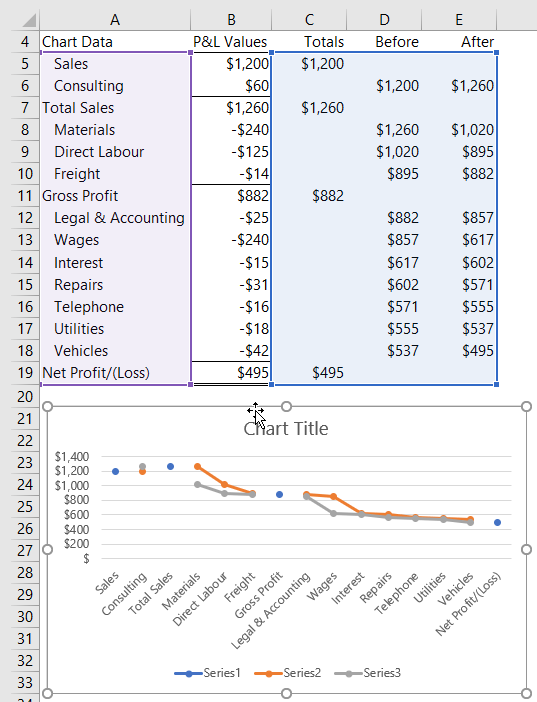
Step 1: Select data in cells A5:A19 then hold CTRL and select cells C5:E19
Step 2: Insert the chart; Insert tab > Line chart. It should look like this:
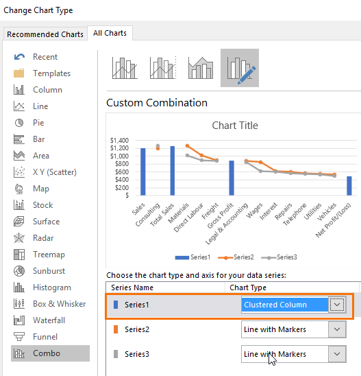
Step 3: Change Chart type for subtotal and totals; select ‘Series 1’ markers in the chart > right-click > change series chart type > select ‘Clustered Column’ from the list (Excel 2013 onward dialog box shown below):
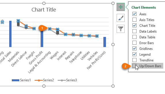
Step 4: Add up/down bars; select either of the Series2 or Series3 lines in the chart > click the + widget > check the box for ‘Up/Down Bars’:
Note: Excel 2007 and 2010 users go to Chart Tools: Layout tab, click the Up-Down Bars button, and select Up-Down Bars from the menu.
Step 5: Hide both lines and markers; select the line > CTRL+1 to open the format pane > Set the Line to ‘No line’ and the Marker to ‘None’.
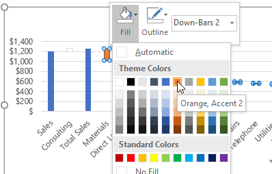
Step 6: Set the colour fill for the up/down bars; left click once to select them, then right-click to open the mini toolbar and select a new Fill and Outline colours, or use the Fill Colour palette on the Chart Tools tab:
Repeat colour formatting for the totals and positive values as required.
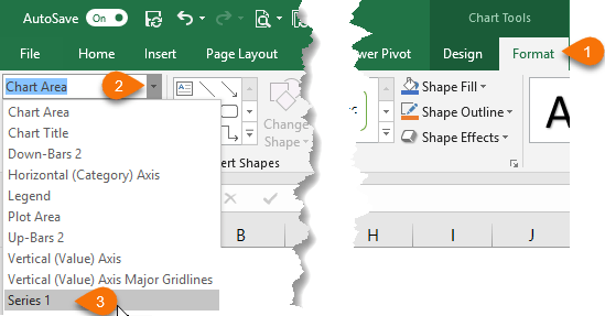
Step 7: Add data labels; from the Chart Tools: Format tab select ‘Series1’ from the ‘Current Selection’ drop down as shown below:
Excel 2013 onward; click the + widget button to the right of the chart > Data Labels.
Excel 2007 and 2010; Chart Tools: Layout tab > Data Labels.
This will add labels to the subtotal and total columns.
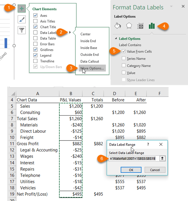
Step 8: For the Up/Down bar labels you need to take a slightly different approach which is only available in Excel 2013 onward; select Series2 from the Chart Tools: Format tab drop down. Then click the + widget to the right of the chart > Data labels > More Options… > Label Options: Value from Cells > select the values in column B:
Note:
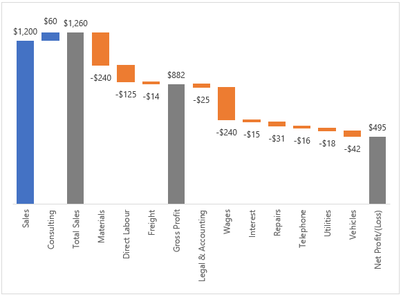
For Excel 2007 or 2010 users there is no easy way to add labels. Adding labels to the chart will result in a mess which you have to tidy up. To tidy them up select each label box with 2 single left-clicks, then click in the formula bar and type = then click on the cell containing the label value in the chart source data table and press ENTER. Repeat for remaining labels.Step 9: Tidy up; remove gridlines, vertical axis, title and legend. You should end up with something like this:
Thanks to fellow Excel MVP, Jon Peltier, for sharing this technique. If you want an easy way to build waterfall charts then check out Jon’s Chart Utility that builds waterfall charts and more with the click of a button. It’s available for PC and Mac.
Waterfall Bar Charts
As I mentioned earlier, I don’t like vertical labels on the horizontal axis. They’re difficult to read and that defeats the purpose of a chart in the first place.
One option is to use the Excel Camera Tool to take an image of the chart and rotate it on its side. However, the Camera image isn’t always crisp, plus you can’t rotate the value labels. Swings and roundabouts. ☹
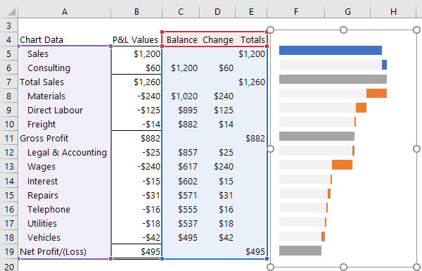
The waterfall bar chart (shown below) solves these problems. It requires a slightly different calculation for the 3 series because the ‘Balance’ series is the stepping stone for the visible portion of the bars and is actually hidden in the chart.
In the image below, I’ve shown the ‘Balance’ series portion of the bars in pale grey, but later we’ll set the fill colour to ‘None’ so the ‘Change’ portion of the bars appear to float.
Creating Manual Waterfall Bar Charts
Step 1: Select data cells A5:A19 > hold CTRL and select cells C5:E19
Step 2: Insert the chart; Insert tab > Stacked Bar Chart
Step 3: Fix category order; double click the axis labels > in the Format Axis Options > check ‘Categories in reverse order’
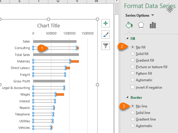
Step 4: Hide the balance series; select series 1 in the chart i.e. the ‘Balance’ series > set the file and border to none:
Step 5: Set bar fill colour; one at a time select the positive value columns, in my case ‘Sales’ and ‘Consulting’, and set the fill colour to something different. I’ve chosen blue.
Step 6: Formatting [Optional]; remove the title, legend, gridlines and vertical axis and delete them.
Step 7: Position the chart; align the chart to your P&L and cover columns D:E with the chart like so:
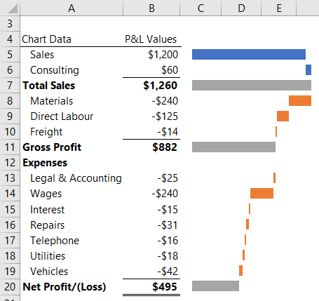
Notice I added an empty row for the 'Expenses' header on row 12. Another benefit of this chart is that you can get away with empty rows in your source data because you're using the labels in column A for the chart axis labels.
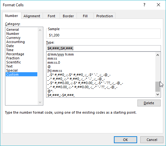
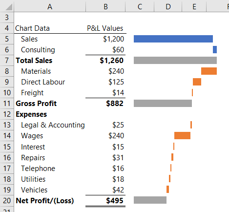
Tip: If you don’t want the expenses in column B to display the negative sign then format them with a custom number format (note, I’ve rounded my values to the nearest thousand) as shown below:
The chart will treat them correctly because the underlying values are still negative, but they’ll appear like a normal P&L that doesn’t display negative values with a minus sign:
Please Share
If you liked this please click the buttons below to share.


I have 365 – do I still have to manually create the vertical waterfall or will excel do it automatically?
You can use the built in Waterfall chart type in 365.
My totals are a loss, so my vertical axis is negative. Is there a way to flip the axis so the totals are going up even though they are losses?
Surely if your total is a loss then you should be showing it as a loss position on the vertical axis, no?
Creating Manual Excel Waterfall Charts question….
I have set series 2 data labels display ‘below’. However, the down data bars with significant values are displaying the data label within the data bar. Why has this happened and how do I fix the issue?
Many thanks in advance.
Deborah
Hi Deborah,
It’s tricky to say without seeing your file but I suspect each series data labels have different display settings. You can try selecting the labels for the down bars and setting their location separately.
If that doesn’t work, please post your question on our Excel forum where you can upload your Excel file and we can see what the problem is.
Mynda
Hi Mynda,
I have 365 but it is great to see both ways of creating a waterfall chart… enjoyed the bar version too.
I want to use them for a causal – to plot the ups and downs to bridge from (for example) the sales for last year, to the sales for this year.
The frustration is the limitations on colour schemes.
Your sample has the standard office blue/ orange/ grey but for my sales chart I want increases in green, declines in red, but then for environmental metrics increases are red and then decreases are green.
So I go to Page Layout on the ribbon and create a colour theme but the issue is that this then applies to all the charts.
Alternatively, if I change the colour of each column it is no longer dynamic and so does not change if the data changes (e.g. if this time prices are up it would be green but next time prices are down so red).
Grrrr…
Any suggestions?
Steve
Hi Steve,
For every colour you need a separate series. So, split the decreasing values into one column in your source data and the increasing values into another. You can set each series with its own colour. Then set the series overlap to 100%.
Mynda
Hi Mynda
Love your idea of creating a Waterfall bar chart.
Sunny
Thanks, Sunny!