Progress charts are a powerful way to track milestones and showcase achievements.
However, there’s no built-in way to create Excel progress circle charts, but with some clever uses of doughnut charts we can whip them up in no time.
In this tutorial we’ll look at how to quickly create them and link them to Slicers to make them dynamic and interactive:
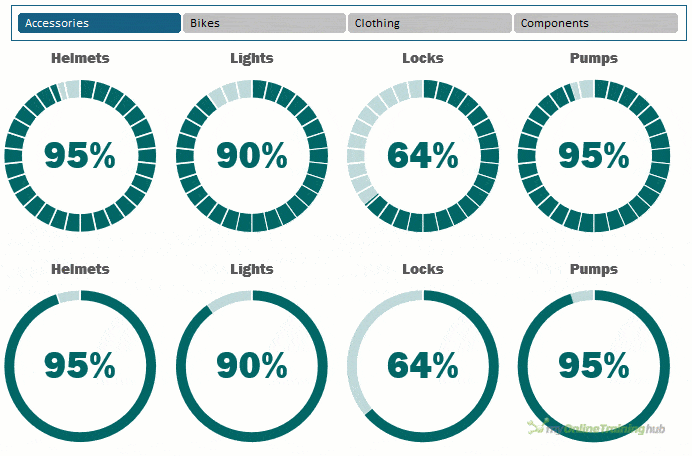
Table of Contents
Excel Progress Circle Charts Video

Download Example Workbook
Enter your email address below to download the files.

Excel Progress Circle Charts with Segments Step by Step
Example Data
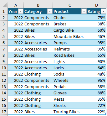
For this example, I’ll be using some ratings data for a bike company. The data is stored in an Excel table called Table1:
Creating the PivotTable
You can create these charts without using a PivotTable, but I want them to be interactive, and PivotTables enable me to connect a Slicer to it and select different views of the data.
I’ll build a simple PivotTable containing the Product and Rating fields:
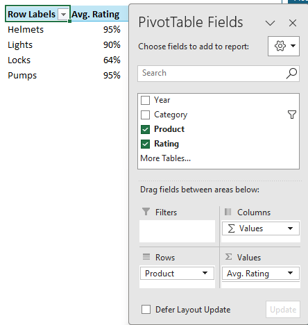
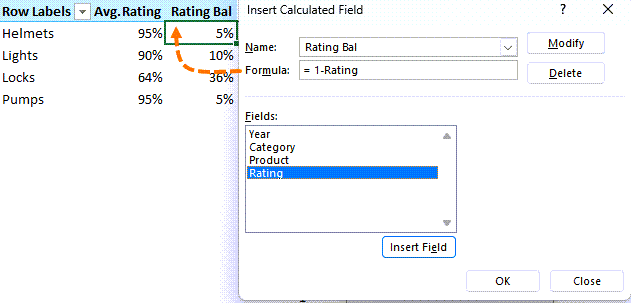
Notice the rating is summarized by the average. I also need to add a calculated field (PivotTable Analyze tab > Fields, Items & Sets > Calculated Field) to the PivotTable for the balance to 100% because the circle progress charts are out of 100%.
Segment Data
The segments in the chart can represent milestones, aid interpretation or simply draw attention.
For this example, I’ll use 30 equal sized segments, and this requires another series. I used the SEQUENCE function to generate a list of 30, 1s:
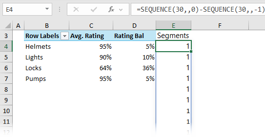
If you want more or less segments, simply change 30 in the formula to suit.
If you don’t have the SEQUENCE function, you can select 30 cells and then type 1 and press CTRL+ENTER to enter it in each cell.
Tip: instead of the same size segments, change the values for each segment to vary their sizes to reflect milestones with the total value adding up to 100. e.g. the first segment could be 20% of the project, the next segment 30% and so on.
Note: You would need to add labels to each segment to aid interpretation.
Creating the Chart
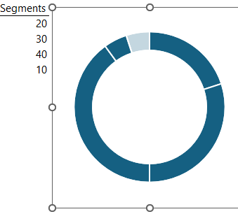
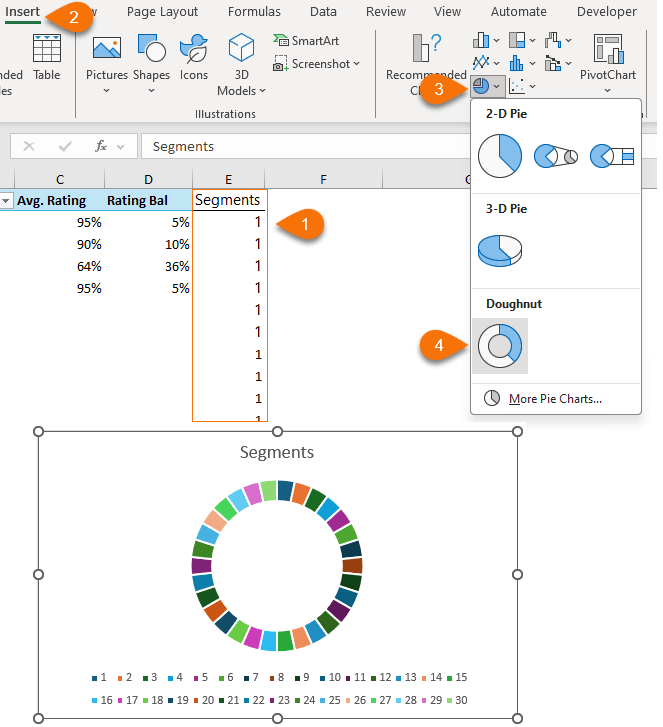
To create the circle progress chart, select the segment data in cells E3:E33 > Insert tab > Doughnut chart:
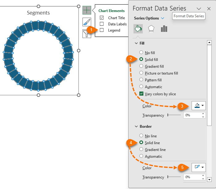
Remove the legend and colour the segments with a single colour fill and white border:
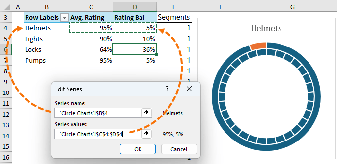
Link the chart title to the first item in the PivotTable:
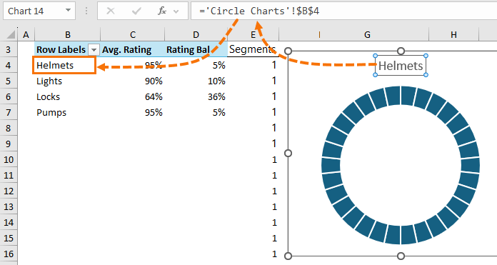
Right-click the chart > Select Data > click ‘Add’ in the Legend Entries pane:
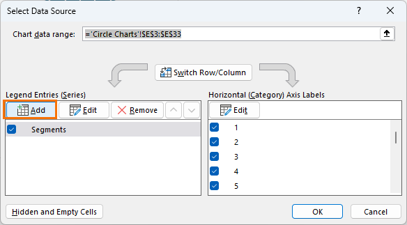
Select the label and values for the first item in the PivotTable:
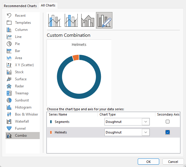
To overlap the series, select the chart > Chart Design tab > Change Chart Type > put the second series on the secondary axis so it sits on top of the segment series:
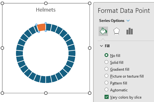
Select the first segment of the second series and format it with ‘no fill’:
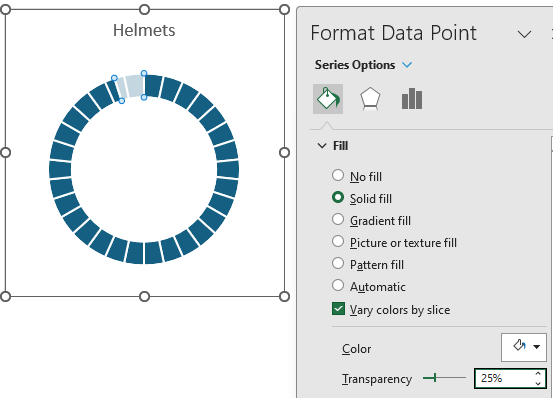
For the second segment of the second series, format it in white with 25% transparency:
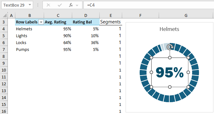
Add a text box for the value in the centre of the chart. Link the text box to the Avg. Rating cell for the series and format the font:
Set the text box and chart to have no border and no fill.
Copy the chart 3 times and update the references to point to the cells for the remaining products in the PivotTable.
Note: the charts will lose the formatting of the second series. To reapply it, select the formatted chart’s border > Copy > select border of the chart you want to format > Paste Special > Formats.
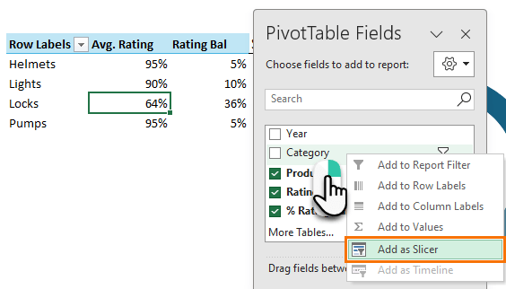
Add a Slicer for the Category field:
Note: this works because each Category only has 4 Products. If you have an uneven number of products in each category, then some charts will be empty when you select categories with less products than others.
Excel Circle Charts without Segments
Circle charts without segments use the same data layout, so you can follow the steps above for the PivotTable, and then skip the steps for creating the segments.
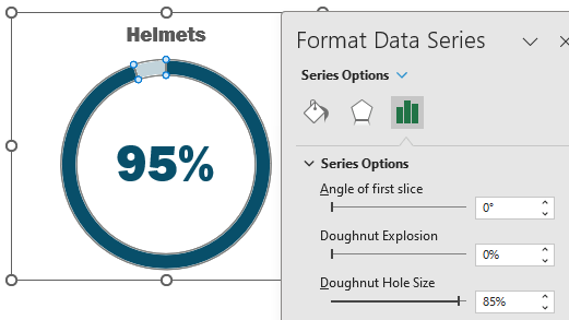
You might also like to make the doughnut hole bigger:
Alternate Progress Charts
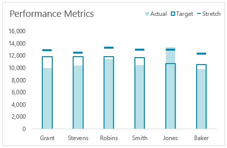
Circle progress charts take up a lot of space. If you don’t have the luxury of space in your report, an alternate is this actual vs target chart.
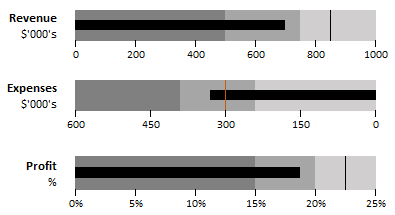
For progress charts with quantitative bands, bullet charts are a great alternative that also don’t take up much space:
Hi Mynda, great chart. I’m working on a slight variation to suit my needs. In your example, assume you have four items under Accessories and only two under Bikes. Each time l click on Bikes l have an extra 2 circles with no information. Can these 2 circles with no information be hidden or removed?
Hi Craig,
You can with the circle charts without segments. These will disappear. But the segmented charts won’t because there is a constant fill colour in the chart for the segments.
Mynda
Absolutely brilliant, just what I needed, thank you!
Wonderful to hear, Stuart!
It’s free
The file is free to download, if that’s what you mean
Great video!
Glad you liked it, Kenneth!