New in Excel 2016 (for Office 365 subscription users only*) are Map Charts.
*If you have Office 365 and can’t see the Map Charts then it’s likely you’re on the Deferred Channel, which hasn’t received them yet. You can check information about all channel releases for Office 365 client applications here.
Download the workbook
Enter your email address below to download the sample workbook.
Note: if you don’t have the correct version of Excel 2016 then you won’t see the charts.
Types of Excel Map Charts
Excel map charts can display your data encoded by:
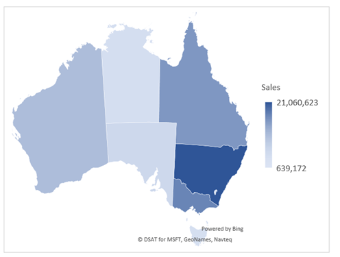
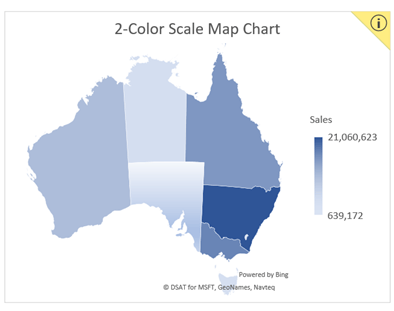
- Values with a 2-color scale:
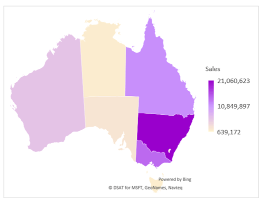
- Values with a 3-colour diverging scale:
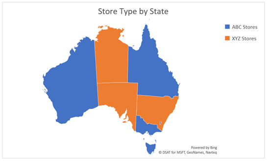
- By category:
Excel uses the Bing map engine to plot the data.
Inserting Excel Map Charts
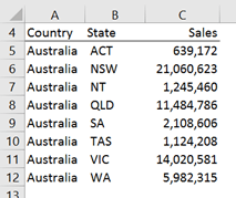
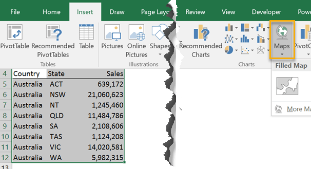
First of all make sure your data includes some location information like country, state, region or county.
It’s important to make sure the locations aren’t ambiguous. For example, in Australia we have a state with the abbreviation WA, but there’s also state in the United States with the abbreviation WA, so we need to make it clear which WA we mean.
We do this by including columns in our map data for the country as well as the state like so:
Select the table of data > Insert tab > Maps > Filled Map Chart:
Tips for naming your columns, with thanks to fellow MVP, Ingeborg Hawighorst:
- United States – Country and State – State can be abbreviated
- Australia – Country and State – State can be abbreviated
- UK – for Counties within the UK use Province
- New Zealand – Regions should be written with an ‘s’ as opposed to Region singluar
With Category Map Charts each state/region/country can only have one category. In the example below you can see that each state is assigned to one type of store. Makes sense right?
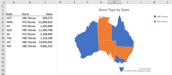
Tip: notice how the states are not disambiguated by a country column. I guess Bing is being clever and using the context of the other states to assume the WA state I’m referring to here is the one in Australia. However, if I had data for states or regions in other countries in this table as well then I’d definitely need to add a country column to my data.
Formatting Map Charts
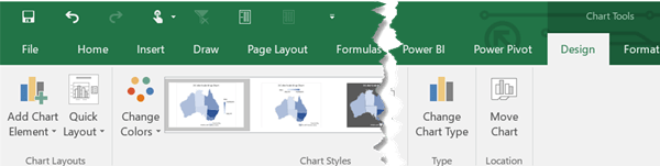
With the map selected you can use the contextual Chart Tools - Design tab:
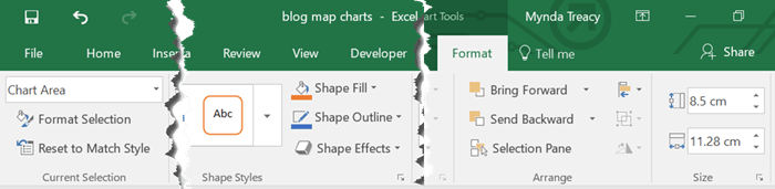
And Format tab:
Double clicking on the chart opens the format pane on the right-hand side:
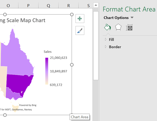
Tip: You can left-click on elements in the chart to select a different element to format.
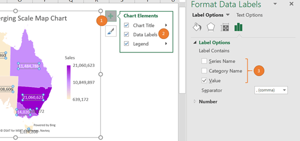
Add labels (1 and 2); double click the label to open the format pane where you can choose from series name, category name and value (3):
Select the map itself to view the Format Data Series pane where you can choose the chart icon (2) to expose the Series options and Series colour settings:
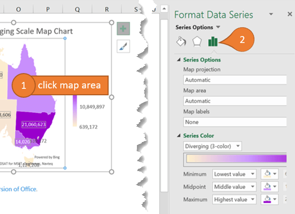
Tip: the Map Area drop down list under Series Options allows you to choose whether you see the whole world, the region, only regions with data or multiple regions. By default it’s set to ‘Automatic’ which means it will adjust to suit the data.
Confidence Warning
If you see a yellow ‘i' icon in the top left of your map, like this:
Clicking on it will reveal a message similar to this:
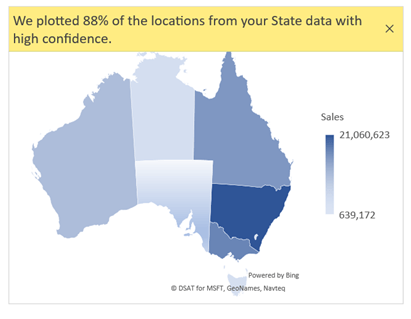
You see this message when 10% of more of your data could not be plotted in the chart. Go back to your chart source data and reduce ambiguity by adding columns with more location information e.g. country, region, state, county etc.
Of course it may also be a result of spelling errors 😉
Map Chart Limitations
- Map charts can only plot high-level geographic details in a one-dimensional display. Cities, latitude and longitudes, and street address mapping isn’t supported.
However, you can plot data at a postcode level, but this is generally ineffective because some postcodes have a small geographic area, for example cities, compared to areas outside of cities, and so it can be difficult to see the city data on the chart.
- Map Charts are not available for PivotTables. Instead use this technique.
- Map Charts do not allow you to insert a custom chart title by referencing a cell in the worksheet. A workaround to this is to use a shape/text box for your chart title instead. A tip from MrExcel: leave the chart title field under the text box so the map doesn’t take up the space where you want to display your text box. Enter a few spaces in the title box so you don’t see the default ‘Chart Title’ text.
Where are my Maps
If you have Excel 2016 on an Office 365 subscription and you can’t see the Map Chart icon then it’s likely you’re on the Deferred Channel, which hasn’t received them yet. You can check information about all channel releases for Office 365 client applications here.
If you have Excel 2016 but aren’t on an Office 365 subscription then you won’t have access to the new Map Charts.


Hi
I am creating a map Example in excel now it is showing a map of Australia 🙂
Issue One is Tasmania sales are not showing on the map ?
Issue Two is New Zealand and Papua new Guinea do not show up on the map 🙁
Issue three can you have a target and sales show up on the map or do you require two separate maps ?
How do i get this to Work is it possible ?
Country State Sales
Australia ACT $100
Australia NSW $200
Australia NT $300
Australia QLD $400
Australia SA $500
Australia TAS $600
Australia VIC $700
Australia WA $800
New Zealand NZ $900
papua new guinea PG $1,000
Your assistance is greatly appreciated
BR Aaron 🙂
Hi Aaron,
You have mixed states and countries in the state column. Excel doesn’t know what to do here because you’ve called it ‘State’. You need to have consistent data in each column, either all states, or all countries. In other words, you can’t break the Australian data down by state, but have the NZ and Papua New Guinea data at country level.
Mynda
Hello.While inserting a map chart in excel, I got the following message:
“Map charts work best with geographical data such as state/province and country/region in separate columns. Check your data and try again”.
Please help me fix that error.
Thanks a lot,
Reverien
Please post your question on our Excel forum where you can also upload a sample file and we can help you further.
Hi,
For Australia, South Australia, can I drill down to Local Government Areas, also known as Councils, (which are the same as Counties in the USA)? I can drill down to postcode (zipcode) but cannot seem to work out how to take it back a step further to show Council areas/catchments.
For example:
Country State Council Number of consumers
Australia SA City of Charles Sturt 4
Australia SA City of Marion 2
Australia SA City of Playford 10
Australia SA City of Onkaparinga 6
Hi Jodie,
No, Excel map charts aren’t aware of our council areas, sorry.
Mynda
It’s completely useless. Only recognizes the first 12 items.
No it doesn’t. Map charts will plot as many items as you give it. Sounds like the range you’re referencing is only 12 rows high and doesn’t include all of your data.
First of all, let me just say your excel course is awesome. Anyway, I’ve got data at 3 levels of detail, county, state, and US total, all of which populate the sheet dynamically as the user selects from drop down menus. I have no problem map charting any of the data… BUT I can’t seem to figure out a good way to dynamically change the level of detail the map shows. I’m not talking about zoom level, I mean actually changing the underlying data that is being mapped from a county to a state (or national) level of detail. For example, if I’m viewing data at the county level, I have no problem switching counties, even switching to counties in a different state. But if I switch the level of detail to “State” I can’t get the map chart to adjust (reliably). I made some progress using dynamic names as the data source, but it often broke. I’ve resorted to stacking 3 identical charts, one for each level of detail. Then I use a macro to push the appropriate chart to the top of the stack, blocking the other two from view, when the user makes a selection. It’s not elegant but it works. Any better approaches?
Hi Erik,
Great to hear you’re enjoying the course. Can you please post your question in the forum and upload your Excel file (anonymise the data if required), that way I can see what you’re working with. If we can’t find a consistent solution then you could use this technique to select a pictured based on a cell value rather than the VBA.
Mynda
Will do (but going on vacation for a week… so it will be awhile). Meantime, thanks.
Hi! For some reason, I can’t get Norway to appear. I’ve ensured proper spelling and even tried Norway’s two official names (Norge and Noreg). What am I missing? All the other countries in my dataset work fine but Norway, no.
Hi Spencer, I’m not sure what’s wrong with the map chart. I’ve escalated this as a bug to Microsoft. I’ll let you know what they say. Mynda
Thanks Mynda! I’ll look forward to that. I really appreciate the help!
Hi Spencer, it’s a bug. Microsoft have logged it and will release a fix, but I don’t have any ETA for it, sorry.
Hello! Firstly thanks for this tutorial; super helpful! I’m creating a map to show geographic coverage of my team state by state in the United States. Two of my team members cover FL, so I wanted to fill the FL data point with a lined pattern instead of a solid fill. When I go to format the data point, none of the patterns work but I can change colors, edit the shadowing, etc. Have you come across this issue before or do you have any ideas on how to fix? Thanks!
Hi Hanna,
Map charts only allow for a gradient fill based on values. You can’t choose different fill for different states, which will explain why the patterns don’t get applied.
Mynda
Hi Mynda, my inquire is that a from Uganda, so, how can I Map my data putting into consideration that in Africa like my country, we don’t clear state points that can easily be identified by whether Bing or Google, and yet at times I would like to represent my data state (districts). Any advise.
Thank you.
Not easily. Please refer to this post for some ideas on building your own maps.
Mynda
My mapping looks fine – I can get the ‘dots’ to populate but then they disappear when I click off the map to go to save, or print, or do something else. Tips?
Sounds like a bug. The file might be corrupt or just the map chart. You could try recreating it, or recreating it in a new workbook.
Mynda
Many thanks Mynda, Can’t tell you how much this is helping our project. We are aiming to provide services to difficult to define families. Essentially there are “indicators of need” but in table form this is a nightmare for decision makers. Being able to present this in map form has been like having people who are lost in a deep, dark cave and then turning the lights and signs on. thank you.
🙂 great to know you’ll be able to make use of the map charts, Maurice.
is it possible to utalizr this feature with different countries around the world. let’s say Yemen for example. does Excel have a list of provinces of Yemen.
Hi Tarek,
Excel map charts use Bing maps to plot the data. In theory it should be able to plot data for any country, but I have seen issues with countries outside of the U.S. e.g. New Zealand isn’t always plotted correctly. I can’t say for Yemen, but you can try.
Mynda
So I created a map chart with three countries and 5 cities in each. Each city had a certain concentration of employees. When I click on the slicer for all Australian employees, the world map changes to Australia but does not give me a gradient mapping of Australia.
I am trying to achieve this, Is it even possible?
Hi Vivek,
Map charts are not available for PivotTables, so I’m not sure how you’ve implemented it to respond to a Slicer, but you will have needed to reference a dynamic named range. Perhaps you can post your question and Excel file on our forum where we can help you further.
Mynda
Good day,
May I ask for an assistance regarding classification of region/zip code/state? Neither of the said categories works with my country, Philippines. What should I use and where can I get a guidelines on which classification should I use on which country the next time should I use this map method.
Thank you very much for your help.
Hi John,
I’m not sure what data you’ve provided to the map, but try including the following columns country, region or state or county. You may need to play around with the last 3 to see which name Bing uses for the areas in your country.
Mynda
Dear Linda,
thanks for your prompt response on unavailability of Fill Maps on my systems. i am currently an MS 365 user and still dont have it. what can i do to have access to it
thank you
ngozi
That’s unusual because Office 365 automatically updates. You can try manually updating it by going to the File tab > Account and clicking on Office Updates.
Dear Linda,
I observed that you have 2 types of maps on Map Insert tab- Fill Map and 3D Map. I only have 3D map on Excel 2016. I find Fill maps easier since i was introduced to it on your page.
How can install the Fill maps chart on my excel.
Thank you
Ngozi
Hi Ngozi,
Only Office 365 users have access to filled maps. It’ snot something you can install. You either have it or you don’t, sorry.
Mynda
hi there,
im from indonesia, you mentioned above that postcode was ineffective. i use zip code for usa country and work well, but if i use post code for indonesia country not working..
could you give me suggestion?
thanks
Hi Edy,
You could try changing the column header cell to ‘zip code’ instead of ‘post code’.
Mynda
THE LEGEND FOR MAP CHART WILL ONLY DISPLAY 20 CATEGORIES. THE MAP IMAGE DISPLAYS ALL 21 CATEGORIES. ANY IDEA HOW TO FIX THIS
Hi Colleen,
I’d say you have to make your chart bigger to allow enough room for all of the category legend items. Try different positions for the legend; top, bottom etc.
Mynda
Hi Mynda,
I have the same problem. The chart would only display 20 categories no matter how big the chart is. Do you have any solution to this? Thank you!
Sounds like a limiation with the map chart. If you’re able to share a sample Excel file on our forum we can take a look and see if there is a workaround.
Hello,
If you own three businesses, and are trying to plot on a map across two states where the postal codes of each are and where they overlap, how do you go about this. When I highlighted all the data for one store, it only showed the data within one county. I then tried to Add Data Series, and that didn’t seem to work unless I am not doing it correctly or there is a better way to continue adding data to the same map. Can you please help? Thank you, Jaime
hi Jaime,
Map charts can only handle one set of data i.e. one series. If you want to segment that series by categories, as in the example no. 3 above, then you add a column to your source data that defines the category, but you can’t have multiple categories for the same state, region, post code etc. because Excel won’t know which one to show in the chart. In other words, overlapping can’t be displayed.
Mynda
what other countries can you add states/provinces etc?
Hi Mar,
As far as I know it works with all countries, but I’ve not tested it.
Mynda
Interesting Mynda but I want to have a moan!
I moan to Microsoft but no one listens there so you are an Excel MVP and the nearest I have got to them!
I have been an Office 365 Pro Plus subscriber for a long time now and that has got me Office 2016 or something really similar so I suppose I should be grateful for that. I have known for a long time that I am in the deferred channel and that explains why it took MS NINE MONTHS to deign to give me Office 2016.
I do a lot of Excel training and many of my delegates are completely baffled by the market segmentation that sees many of them locked out of key features if they are on the wrong Excel path … and by the way, they had no idea, for example, that they had been locked out of, eg Power Pivot because of the Office 365 subscription they have.
It come home to me today and yesterday how cheap we are made to feel when I downloaded a file from Chandoo and was told that his version of Excel is newer than mine. Today I wanted to work through this map tutorial but to no avail.
Off my chest now and I am not blaming you or Chandoo in any way at all: however, you are both MVPs and possibly likely to have some sympathy!!
Hi Duncan,
We MVP’s have been voicing this concern for quite some time. Recently they added Power Pivot back into the Excel Professional bundle, so that was a small win.
As for the deferred channel, the good news is this is something you can choose and has nothing to do with how much you pay. By default Office 365 ProPlus is on the deferred channel, but you can fix that. Here are the instructions:
https://support.microsoft.com/en-us/help/3185078/how-to-switch-from-deferred-channel-to-current-channel-for-the-office-365-suite
Mynda