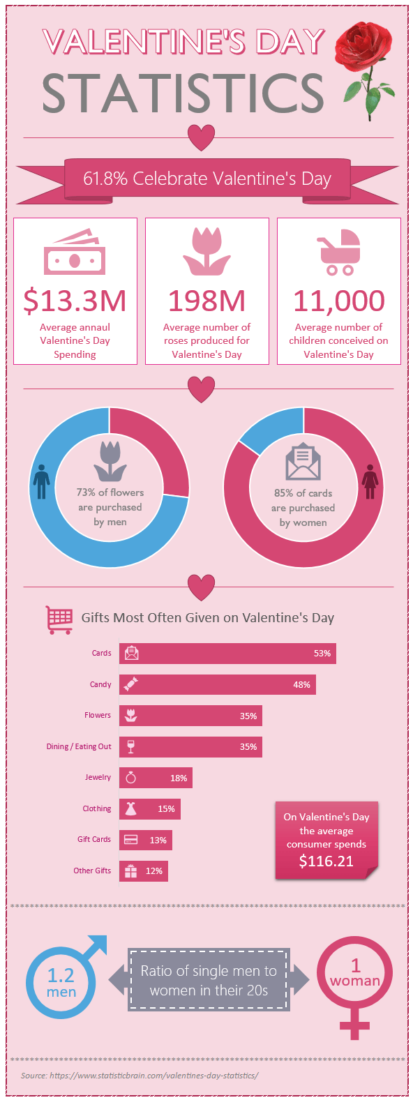
Excel infographics, like the one below, are easy to build and there are loads of tools you can use to add some sparkle.
Infographics are suited to one off brochure style reporting designed to catch your eye and be easily digestible and memorable. They’re often found in newspapers or other print publications because they draw you in with the colourful display and fun graphics.
Don’t confuse them with Excel Dashboard reports, which are interactive and aim to quickly convey key business metrics without unnecessary noise and gimmicks that might distract your audience.
Download the file
Enter your email address below to download the sample workbook.
Building Excel Infographics
The black and white image below numbers the various elements I used to build my Excel infographic. Continue scrolling past the image for further instructions.
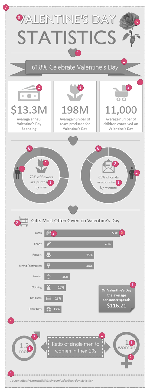
Excel has lots of tools you can bring together to build infographics, including:
- Shapes and text boxes – layer Shapes and Text Boxes to align and arrange different elements without being limited to the size of one object.
- Icons (available in Excel 2016 Office 365 onward) – Icons convey a visual message about the data that is instantly recognized. They’re fun and add interest to the numbers.
- ALT Codes & Unicode Symbols – Enter the ASCII or Unicode codes for 1000's of symbols like ✈ ❤ ⛱ .
- Word Art – add graphic design font elements to give your infographic a professional touch. Use different fonts and font sizes, but try to limit it to two or three at the most.
- Custom Cell Formats – I used a repeating asterisk to create separation between some of the metrics. Download the file and inspect the cell number format in the Excel file to see how I did it.
- 3D Models (available in Excel 2016 Office 365 onward) – there are lots of 3D models already available. I used one for the rose in the top right, but it was just for fun. Don’t feel they’re necessary.

Note: 3D models result in large file sizes. The small rose in my Excel infographic added 18MB to my file size, which is why it’s not in the downloadable file.
- Doughnut and Bar Charts – Generally, I avoid pie and doughnut charts because they’re big and bulky and are more difficult to read than bar or column charts. However, in infographics your goal is to grab attention first and convey information second. And for this, pie and doughnut charts work well.
That doesn’t mean you should pile your pies full of segments. No more than two or three segments is enough.
When using bar or column charts it’s helpful if you can sort the data in descending or ascending order.
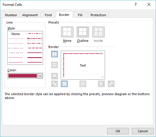
- Cell Fill and Borders – I used a fancy line style for the infographic border and applied a contrasting color:
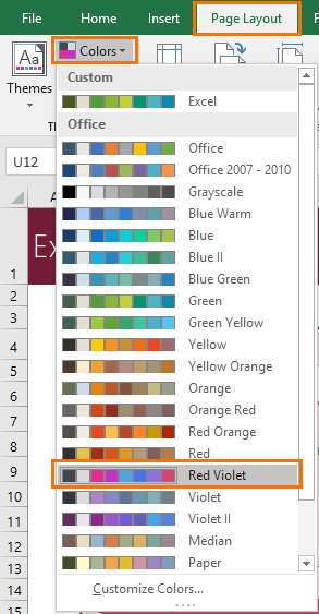
Bonus tip: Set your Excel Theme to a color palette that suits your topic. This will save you time choosing colors because the color palettes will be prepopulated to suit your infographic.
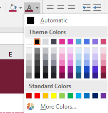
I used the Red Violet color theme, as you can see in the screenshot below.
A word of advice on color; less is more. Try to stick to one color palette column for the majority of your infographic, and maybe use one or two colors from the other side of the spectrum to differentiate elements. The screenshot below highlights the colors I used in green boxes:
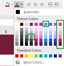
Use color consistently; I’ve used blue when encoding male data, stereotypical I know!
Excel Infographics Summary
- Remember, infographics are for one off brochure style reports. Don’t be tempted to turn your dashboard reports into infographics.
- Layer and combine different Excel tools like Shapes, Icons and text boxes. But don’t use every shape available, again, less is more.
- Be consistent with color – data that represents the same location/product/gender etc. should be encoded in the same color.
- Don’t go crazy with fonts. Two or three different fonts is enough.
Use placement - put your most important information towards the top to draw the reader in. Create a story with the data that flows from one point to the next to keep the reader engaged.
Please Share
If you liked this please click the buttons below to share.


Are there alternatives to using icons for Excel 2013?
No, sorry. Online pictures might provide some images you could use, then you could use the image formatting tools to change the colors etc., but it probably won’t give the same consistent look and feel as the icons do.
I actually found Insert>Symbol>Segoe UI Symbol will provide a couple lower-quality text symbols. But it doesn’t quite capture the same icons used in this example. Not as clean, but can be used 🙂
♂♀
Thanks for that.
Actually I recently did a post on ALT Codes and Symbols which you could read and see how you can insert Unicode symbols into Excel.
Phil
Thanks Mynda, I love your blog posts including this, very helpful.
Thanks, Manny! Glad you liked it 🙂
Thanks for the interesting tutorial, Mynda.
Re the 3D graphics, couldn’t you just set up the graphic the way you want, then capture a screenshot of it and use that instead to lower the size of the file?
Hi Glenn,
Yes, absolutely, you could do that, but I didn’t want to include it in my file and confuse people who download it.
Mynda
as usual, really useful.
Thanks !
Glad you liked it!