Sometimes a secondary axis is a necessary evil. After all, most of the time you can’t plot big numbers and little numbers in the same chart without the little numbers getting lost in the scale.
For example, let’s say we want to plot our annual sales and profit margins in one chart. Here’s the data:
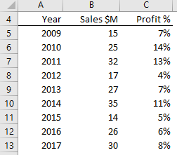
Default Chart
And here’s the default Excel chart. You can barely see the columns for the Profit %, let alone get any insight into their shape or trend:
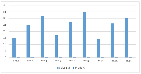
Secondary Axis
In steps the Secondary Axis to the rescue (right-click the Profit % columns > Format Data Series > select 'Plot series on Secondary Axis'):
Meh, it’s better of course, but it’s still not that quick to interpret because now we have to figure out which axis plots which data. I’ve labelled the axes, but it’s still not ideal, especially since I have to turn my head to the side to read them.
I could move the axis labels to the top and rotate the text, but that’s a lot of fiddling around and it still won’t be that quick to read.
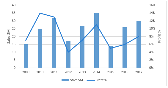
Data Labels
Better to do away with the axis labels altogether and instead, label the data like so:
Notice that I also got rid of the gridlines. We don’t need them since we’ve labelled the data points. Plus, I lightened the line with a thinner, dashed line.
Separate Charts
Another option is to create two separate charts; one for the sales values and one for the profit percentages:
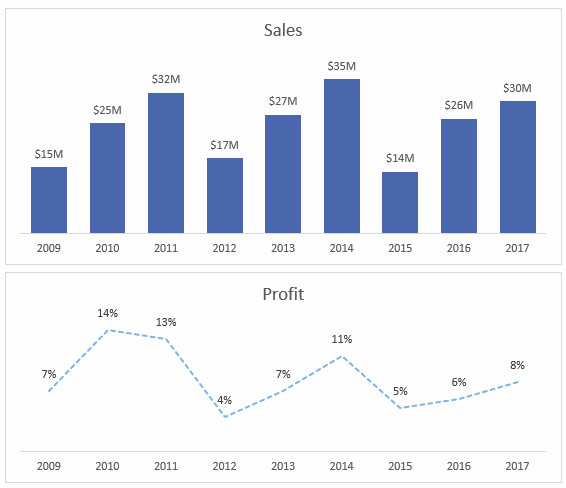
Random tip: Did you know CTRL+D will duplicate a chart? Just select the outer edge of the chart and press CTRL+D to make a copy!
Share Axes
Since our horizontal axes line up we can declutter even further and remove one of them so the charts share a single axis:
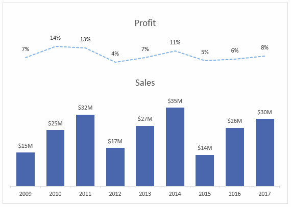
Tip: Remove the chart borders and insert a text box around both charts. Set the fill to ‘none’, or send the text box to the back so the charts sit on top. Or leave the chart border off and use white space between your charts to create a grouping of sorts.
Summary
Well we’ve come a long way since the default chart served up by Excel.
With a few simple changes, we’re able to present our readers with a chart that’s quick and easy to read. Let’s be honest, anything less would be a waste of their time and yours.
Download the Workbook
The workbook includes the examples used in this post and some notes so you can refer to it later.
Enter your email address below to download the sample workbook.
Want more?
In my Excel Dashboard course, I cover many more ideas for visualising your data including which charts suit what type of data. Take a moment to check it out and see where your new skills take you.

How do you keep a custom chart from changing when refreshing source data or changing pivot table filtering? I have a case where I’m using a combo chart with secondary axis, but it changes to the default single axis after refreshing source data or changing pivot table filtering.
Hi Mark,
This is a known issue with Pivot Charts. I usually build a regular chart from a PivotTable.
Mynda
Hi
I live in Iran and have been members of your site for a long time. I will use your training and I will be grateful and grateful to you. You will always be healthy and healthy.
Thanks
Thanks, Shapou 🙂 glad we can help.
Nice one! Does anyone know an easy way (that doesn’t include VBA!) to make the Y axes line up if they don’t both cross the X axis at zero? It’s driving me nuts…
Hi Danielle,
I use a ghost series in my charts to force the axes to be the same. Here is a post on how to insert ghost series: https://www.myonlinetraininghub.com/fix-excel-chart-axis-with-a-ghost-series
Note: If your axes don’t start at zero then you’ll need 2 ghost series; one for the MIN and one for the MAX. That will ensure both of your axes start and finish at the same place.
Mynda
Thank you!
Mynda, I shared this on Google+ here https://plus.google.com/+PeterBuyze/posts/FG9RGJr7A2d
Aw, thanks Peter 🙂
I am getting compliments all the time for this subject, so you chose it well. Keep up the good work Mynda !!
Wonderful! Thanks, Peter 🙂