Following on from my Introduction to PowerApps and Excel, this post looks at some customizations we can do to our app.
PowerApp Themes
PowerApps provides some pre-built themes that you can apply by selecting them from the menu whilst editing the app.
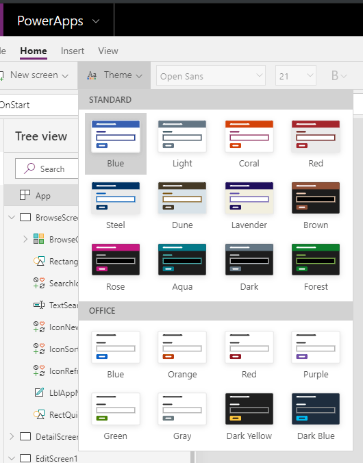
Choose the theme you want and the styling is applied, but that is as much as you can do without modifying the individual elements of your app.
Components are currently an experimental feature that allow you to create some reusable elements, like a header.
There's still more work to be done before we have customizable themes like we do in Excel.
Modifying App Elements
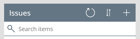
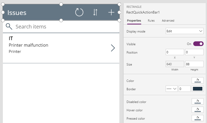
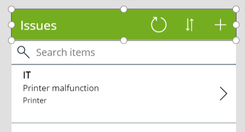
I've changed the theme to 'Light' so I now have a gray header.
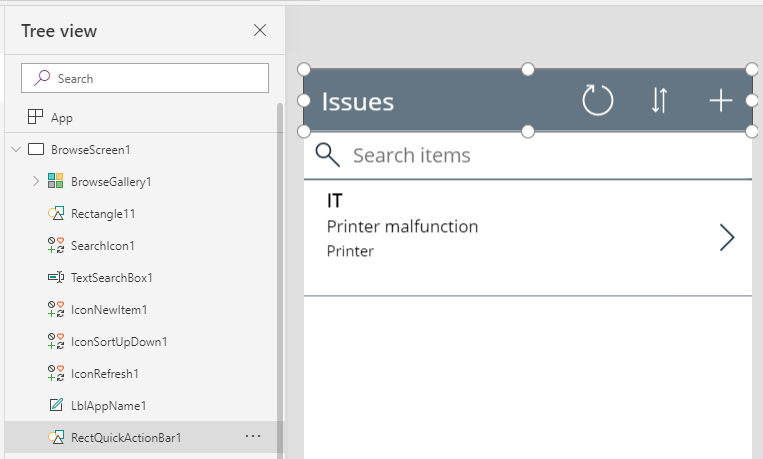
To change this color I select the element called 'RectQuickActionBar1' in BrowseScreen1 in the left side Tree View.
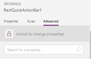
In the right hand side Properties pane, click on the padlock to unlock the element for editing. By default, elements are locked so you'll need to unlock anything that you haven't already changed.
On the Properties tab you can see the Color Chooser.
Click on this to show the Standard palette of colors to choose from.
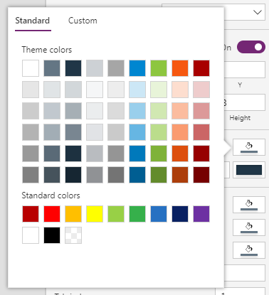
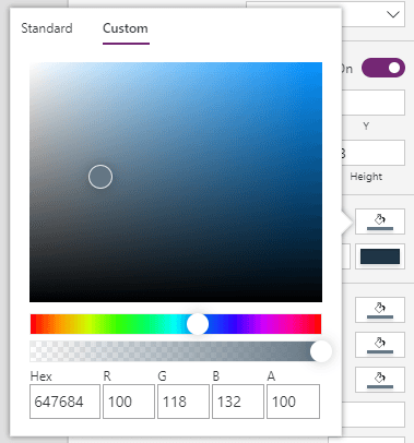
You can also choose a Custom color, or enter the Hex or RGB values for a color.
I'm using our company green which has a Hex value of 75AD21.
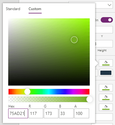
The header is now green. This change will need to be made for every screen in the app.
Changing the Browse Screen
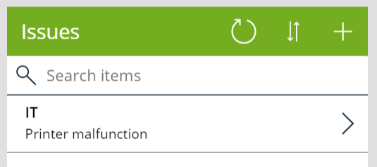
In the last image above you can see that an Issue is displayed with three pieces of summary data.
- Department
- Description
- Issue Type
This video shows the process of changing the Browse Screen
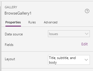
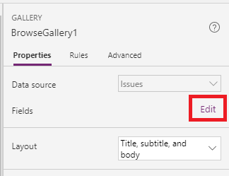
If I want to quickly change this I can select BrowseGallery1
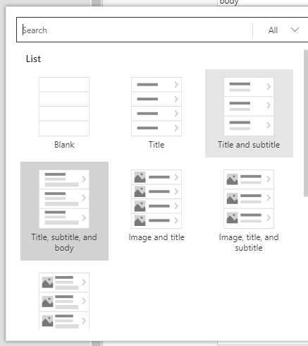
and in the Properties pane, change the Layout which is currently set at 'Title, subtitle and body'
A number of options are available and I'll choose 'Title and subtitle'
Which will make the summary display look like this
Changing the Displayed Fields
You can also change the fields displayed. First I'm going to change the layout back to 'Title, subtitle and body' then in the Properties pane click on Edit Fields
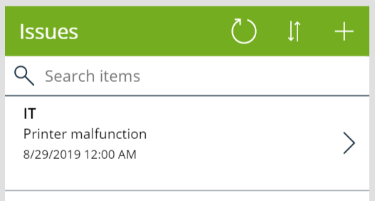
The displayed Title is the Department. The Subtitle is the Issue Description and the Body is the IssueType.
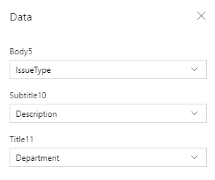
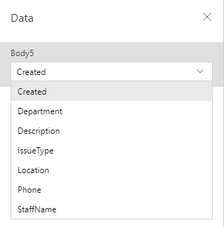
I think it would be useful to know when the issue was logged so I'll change the Body to display the Created date/time.
Our summary page now looks like this.
Changing Icons
On the Details screen the icon to indicate 'Go back' is a left pointing chevron.
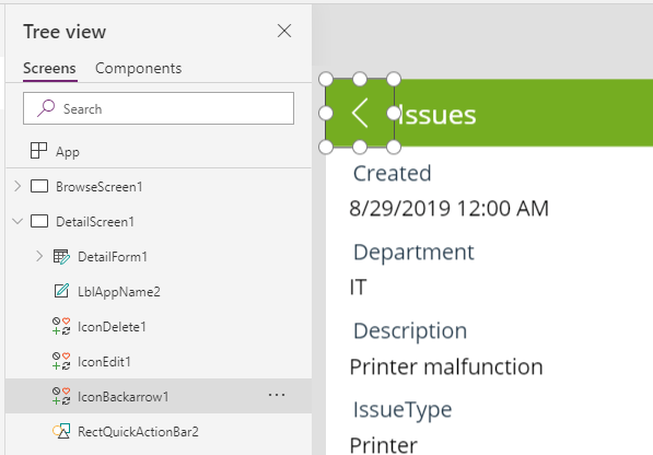
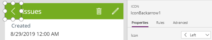
To change this, click on it and in the Properties pane, click on the drop down list for Icon.
There's plenty to choose from and I'm going to change it to a small chevron in a circle.
Summary
A lot of easy customizations can be made by selecting an element in the Tree view and then looking at what Properties you can change.
Don't go nuts though, best to keep it simple and not make too many modifications.
