If you’re going to build dark themed Excel dashboards, then you need to have some tricks up your sleeve in order to give them that wow factor. In this tutorial I’m going to show you some techniques that work well with dark colours that will have your data popping.
In the video below I build this dashboard from scratch so you can learn all the techniques necessary.
Watch the Video

Download Workbook
Enter your email address below to download the sample workbook.
Download the Excel Workbook and sample data. Note: This is a .zip file. Extract the contents to get the Excel workbook and CSV data files.
Steps for Building Dark Theme Excel Dashboards
The video illustrates building the dashboard step by step from scratch. Below are written instructions. If anything isn’t clear, please refer to the video above so you can see how it’s done.
Setup Excel File & Get Data
I start with a regular Excel file. There’s no dashboard add-in or anything special required.
Step 1: Set the colour theme for the workbook to Blue II and add a sheet for the Dashboard. Apply a cell fill colour to the dashboard area, in this example it’s A1:AB37. Add shapes for charts (sizes shown in the image below are in centimetres):
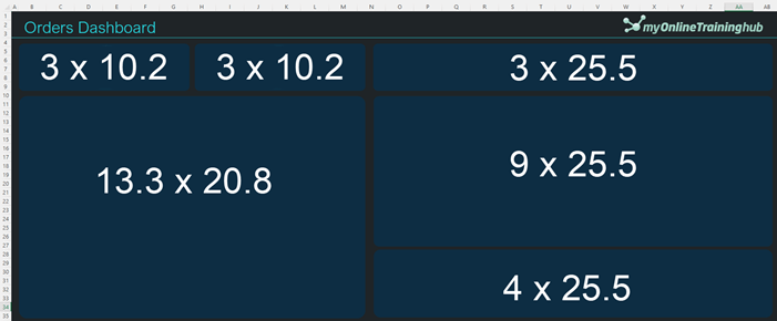
Tip: you could use a dashboard background image instead of shapes so they’re fixed in place.
Step 2: Hide empty rows and columns to define the dashboard area.
Step 3: Get the data for the dashboard. I used Power Query via the Data tab > From File > From Folder. See this introduction to Power Query for more on Power Query, or take my Power Query course.
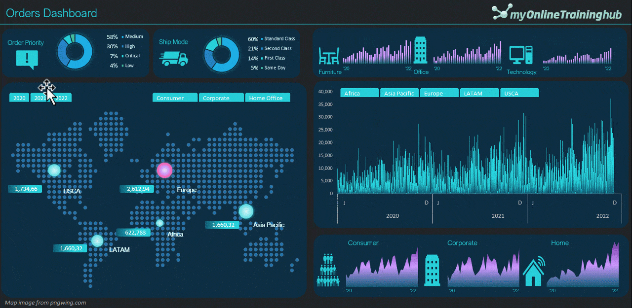
Doughnut Charts
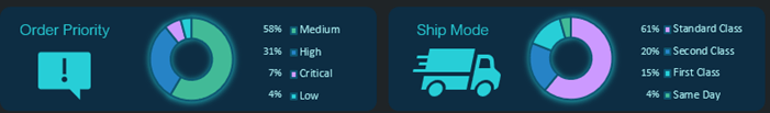
Step 1: insert PivotTables for Ship Mode and Order Priority:
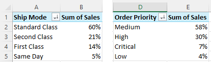
Format the PivotTable values font in light blue/green and Arial Nova Light (not shown in images above) so that it feeds through to text box data labels.
Step 2: Insert Pivot Charts and format:
- Hole size 50%
- Chart size: 2.7 x 8cm
- Doughnut border same colour as background
- Fonts light blue/green
- Apply a shadow in light blue/green
Step 3: Copy formats to the other doughnut chart.
Step 4: Excel icons (Insert > Icon) search for: ‘Important’ and ‘Ship’. Size 2 x 2cm.
Step 5: Add text boxes beside chart legends to display percentages. Link text boxes to PivotTable value fields.
Top Column Charts
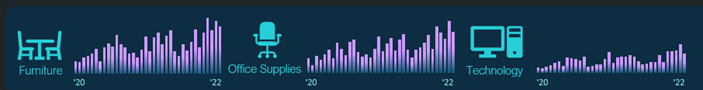
Step 1: Build a PivotTable containing Sales by Order Date grouped by years, months and days, but only use years and months in these charts. Add the Category field to the filters area and select ‘Furniture’.
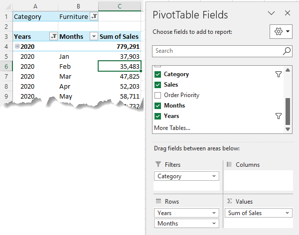
Step 2: Copy the PivotTable two times and change filter categories so that you have one PivotTable for each of the three categories.
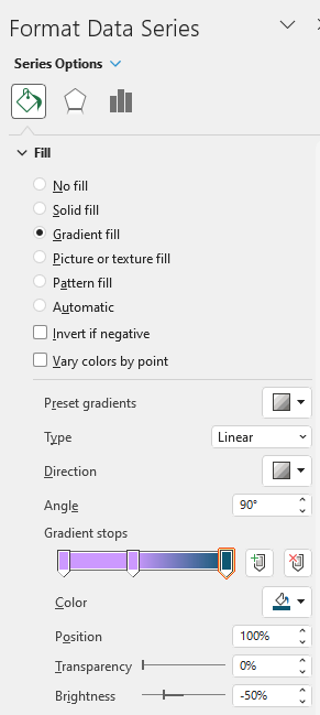
Step 3: insert column chart for the first PivotTable and set the formatting to:
- Remove chart title, gridlines, legend and axis labels.
- Gap width 50%
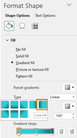
- Gradient fill:
Step 4: insert other Pivot Charts and copy format from first chart. Resize all charts to 3.1 x 6.8 cm.
Step 5: Insert icons: Furniture, Office & Computer. Fill light blue/green. Size 2 x 2cm.
Step 6: Insert text boxes for horizontal axis labels.
Map Chart
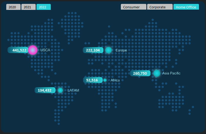
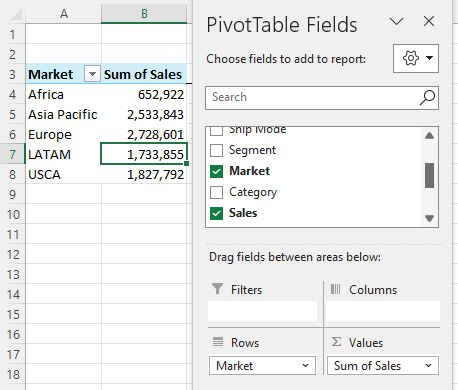
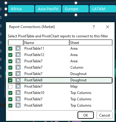
Step 1: Build PivotTable for map chart (Market & Sales):
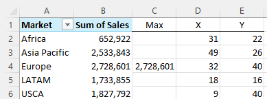
Step 2: Find the Max sales and insert dummy X, Y coordinates.
Step 3: Insert bubble chart (based on X & Y columns only).
- Edit the series and add Sales as the bubble size.
- Size chart 11.5 x 19cm
- Set axis min = 0, max = 60, major = 2
- Set bubble size to 30
- Add another series for the Max series (same X &Y labels, but bubble size is the Max column)
Step 4: Insert Map image as chart background
Step 5: Find X, Y coordinates for market regions
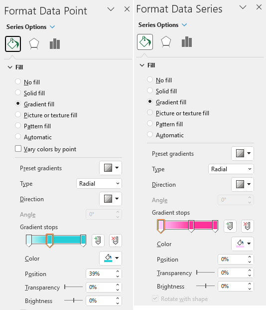
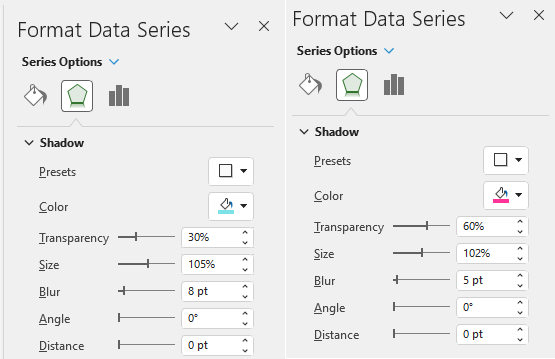
Step 6: Set scatter chart bubbles for first series to blue and add a shadow. Repeat for Max series in pink:
Step 7: Turn off chart gridlines and hide axis labels and chart border. Chart size 11.5 x 19cm.
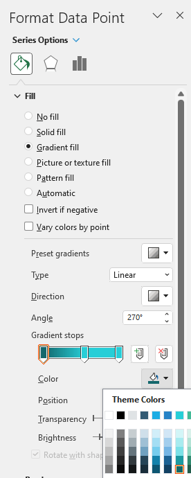
Step 8: add chart labels 0.6 x 2.2cm. Add a gradient fill:
Link shapes to PivotTable Sales value cells.
Step 10: Add text boxes for Market name labels.
Step 11: Add Slicer for Year and Segment. Format the Slicer with colour scheme to match dashboard.
Column Chart
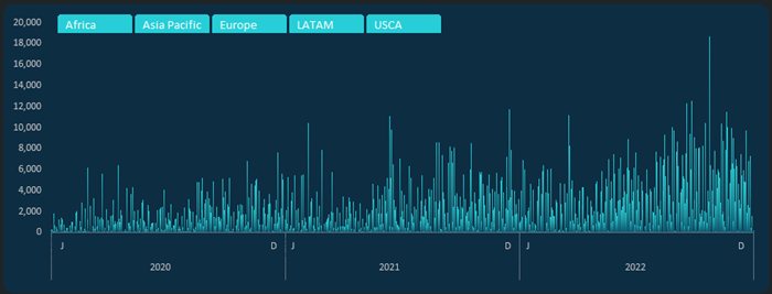
Step 1: Build PivotTable with Sales by Years and days. Set the Days field to Show items with no data.
Step 2: Insert column chart. 8.6 x 25cm.
Step 3: Format column chart – hide background and axis labels and format columns:
Format vertical axis labels font to a pale shade of grey.
Step 4: Add horizontal axis labels using text boxes.
Step 5: Add a Slicer for Market
Area Charts
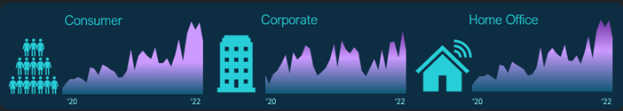
Step 1: Insert PivotTable containing Sales by Years, months, with Segment in the Filters area:
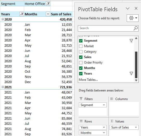
Step 2: Copy PT, one for each segment.
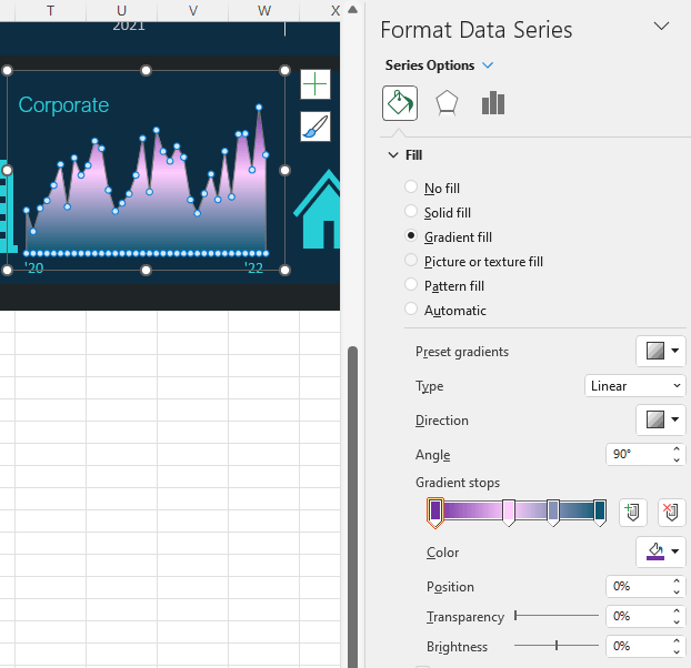
Step 3: Insert area charts. 3.9 x 7
Step 4: format gradient fill:
Step 5: insert icons: People, Building and Home. Size 2cm.
Step 6: Add year label text boxes to horizontal axis.
Slicers
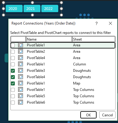
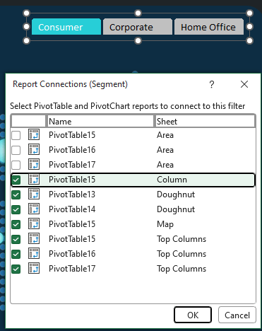
Connect Slicers to PivotTables as follows:
Year Slicers (size 1.06 x 4.5cm):
Segment Slicer (size 1.06 x 8.4cm):
Market Slicer (size 1.06 x 12.4cm):
Updating Reports
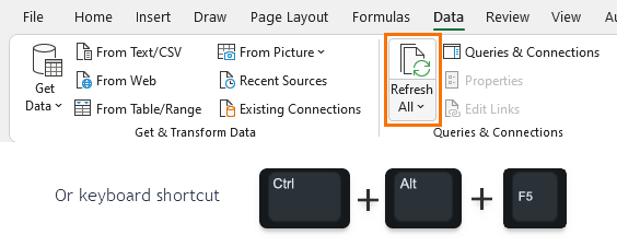
Now that the dashboard is built, you’ll want to be able to update it with new data as it becomes available. Simply add the file containing the new data to the same folder as the other data and click the Refresh All button on the Data tab.
More Excel Dashboards
 |
If you’d like to learn more about Excel Dashboards and get your skills up to speed quickly, please consider my Excel Dashboards course. |
You might also like my other dashboard tutorials:
 |
Custom Excel Dashboard Backgrounds |
 |
Embedding Excel Dashboards in a Web Page |
 |
Excel Student Performance Dashboard |
 |
5 Pro Excel Dashboard Design Tips |
 |
Interactive Personal Finance Dashboard |
 |
Non-financial Excel Dashboards |
 |
Secrets to Building Excel Dashboards in Under 15 Minutes |
 |
Personal Stock Portfolio Dashboard |
 |
Excel Dashboards vs Power BI Dashboards |
 |
Plan v Actual Excel Dashboard |

I just found the tutorial about the HR dashboard. When I downloaded all the csv file for each month, they were all the same…January 2016. How can I get the csv files for all the months?
Thanks
Hi Alex,
You have all the data, it’s just that the dates are being interpreted incorrectly by your system as you’re in a different locale to me. See this tutorial on changing type using locale to fix it.