PivotTables are a great way to summarise your data, but PivotCharts can be a pain in the, um, neck.
PivotChart Restrictions
- They’re not as customisable as a regular Excel chart
- They only play nice with data from one PivotTable
- PivotCharts aren't available for all chart types e.g. Sunburst, Scatter, Histograms, Waterfall and more.
In this post I'm going to show you 3 methods you can use to trick Excel into creating a regular chart based on a PivotTable, allowing you to have all the benefits of PivotTables with the flexibility of regular charts.
Download the Workbook
Enter your email address below to download the sample workbook.
Watch the Video

How to Create Regular Excel Charts from PivotTables
Method 1: Manual Chart Table
A while ago I showed you how to create Excel charts from Multiple PivotTables. And this is great if your data needs arranging into contiguous cells so it can be plotted as one series, or if the source data is inconsistent in the two PivotTables and needs organising first.
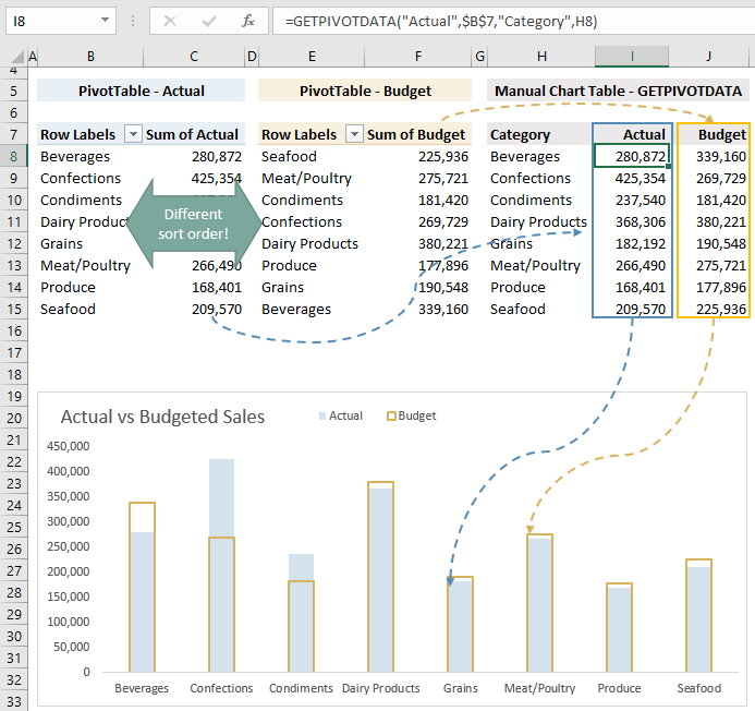
For example, the chart below consists of values from both the Actual and Budget PivotTables. Notice the sort order of the categories isn't the same in each PivotTable. By using GETPIVOTDATA to return the values from the respective PivotTables I don't need to worry about the order of the categories, even if the sort order in the PivotTables changes later.
Method 2: Dynamic Named Range
However, if the order of the data is identical in each PivotTable (and you can be certain it always will be), or if you only have one PivotTable, then you can skip the Manual Chart Table and simply reference the PivotTables using Dynamic Named Ranges. This is also useful if you're expecting the data to grow and you need the range to automatically expand to include the new data.
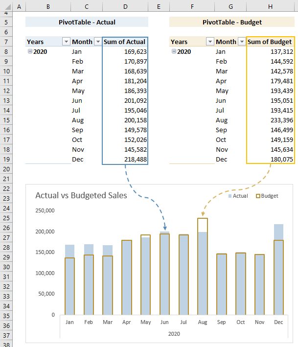
Note: I don’t recommend using the chart colours above. I used yellow and blue so you could more easily follow the data trail.
Tip: remove the Grand Total columns and rows from your PivotTable as you don’t need them in your chart and they will only interfere with your dynamic named ranges.
Dynamic Named Ranges in Charts
Once you’ve set up your Dynamic Named Ranges you need to insert them in your chart. I’ve set up the following dynamic named ranges:
- chart_actual
- chart_budget
- chart_axis
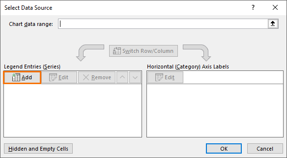
Insert the Chart:
- Insert an empty chart by selecting any empty cell > Insert tab > Column Chart (or whatever chart type you want)
- Right-click the chart > Select Data
- In the legend entries side of the dialog box click ‘Add’:
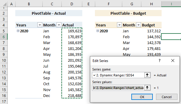
- I’ll add the Actual series first. In the Edit series dialog box, cell D4 contains my series name and my series values are the dynamic named range chart_actual. Note: you must prefix the dynamic named range with the sheet name enclosed in apostrophes and an exclamation mark on the end e.g. ‘2. Dynamic Ranges’!
- Repeat for the Budget series
- Now add the dynamic named range for the axis labels by clicking ‘Edit’ under Horizontal Axis Labels:
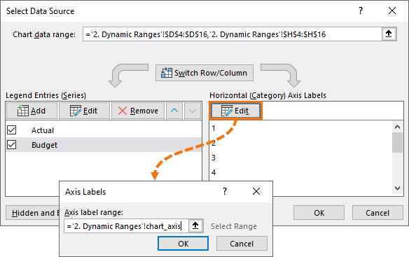
Now you’re ready to format your chart as you wish.
And the best part is when you refresh your PivotTable and it expands/contracts your chart will automatically adjust, just like a Pivot Chart only better.
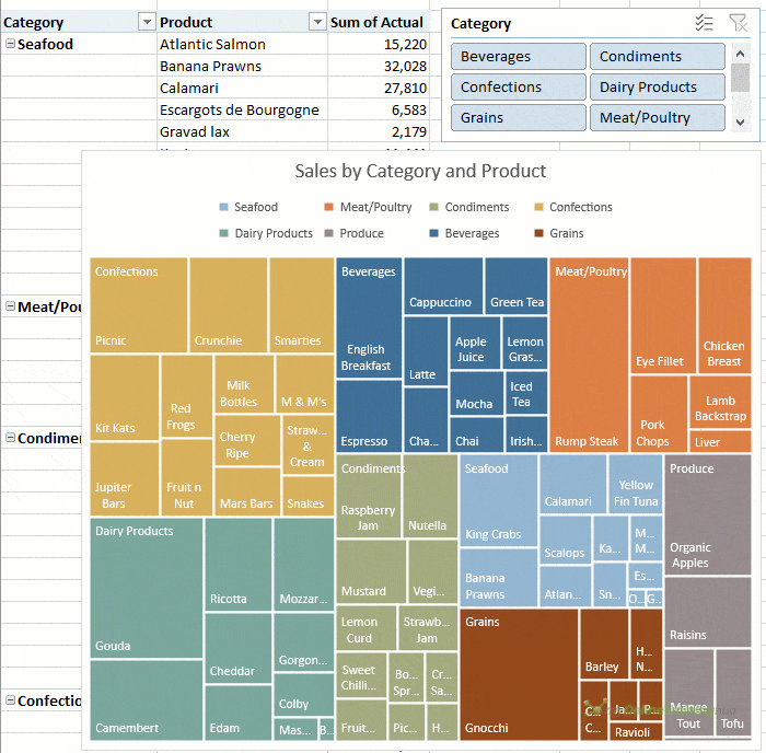
Method 3: Bait and Switch
This method works well with charts that can ignore empty cells, like the Treemap and Sunburst etc. It's a bit less work than the previous methods:
- Create a PivotTable containing the data for the chart and insert a Slicer if required.
- Copy and paste the PivotTable as 'values' in some empty cells adjacent to the PivotTable.
- Insert the chart based on the pasted cells from step 2.
- Edit the chart range to point back to the PivotTable cells.
- Delete the data you pasted in step 2.

Thank you for this excellent turorials. I follow your series religiously and appreciate all that I’ve learned from you. However, I have a problem with this set of instructions for creating the manual table as described in the first option.
When I change the reference in the Manual Table for “Revenue”, I get a #REF. What am I doing wrong?
GETPIVOTDATA(“[Measures].[Revenue]”,$A$2,”[Calendar].[Year]”,”[Calendar].[Year].&[2018]”)
GETPIVOTDATA(“[Measures].[Revenue]”,$A$2,”[Calendar].[Year]”,F3)
A B C D E F G H I
1 Pivot Manual Table
2 Row Labels Revenue Profit GM% Year Revenue Profit GM%
3 2018 $19,807,854 $10,212,533 59% 2018 #REF!
4 2019 $19,376,476 $9,818,026 60% 2019
5 2020 $16,822,609 $9,016,694 62% 2020
6 2021 $21,163,994 $12,134,045 65% 2021
7 2022 $18,812,588 $11,978,403 70% 2022
8 Grand Total $95,983,521 $53,159,702 62%
Thank you, but I solved the problem. I needed to Concatenate the Year value into the GETPIVOTDATA formula like this:
GETPIVOTDATA(“[Measures].[Revenue]”,$A$2,”[Calendar].[Year]”,”[Calendar].[Year].&[“&$F3&”]”)
Nice tutorial on a technique many people don’t know is possible. I’ve written a few related articles, years ago.
A quick note on Names for a dynamic chart.
In general you can edit the SERIES formula, and change cell references to Names right in the Formula Bar. But you will have trouble with names like “chart_axis” and “chart_actual”. If a name begins with C or R (or the corresponding first letters of a language’s words for column and row), Excel will refuse to accept these names in the Formula Bar. You can still add them in the Select Data Source dialog, as you demonstrate, but I much prefer to edit the formulas directly. I usually prefix the names of my Names with X_ or Y_, which not only reminds me they are defined for a chart, but also for which set of values they will be used.
Ooh, great tip, Jon! Thanks for sharing.
thanks for making this post as it deals with an issue I have been having trouble with today…having a chart run off a picot table that has sum calculations and formulas based on the count values that I needed to plot but was unable to.
You’re welcome, glad it was helpful.
Great post. Thanks a lot.
Yves
Glad it was helpful, Yves 🙂
Hi Mynda,
Really, wonderful blog, I have learned a lot from your videos and I have found a lot of solutions that helped me a lot, really thanks.
my question concerning this topic above is, How can I add a dynamic % labels like :
– actual sales vs. budget
– actual sales vs. actual last year per product per customer or sales man
in Regular Excel Charts from PivotTables
thanks in advance
Hi Andrew,
Great to hear you’re finding out tutorials helpful 🙂
Here are some tutorials on creating dynamic text labels:
https://www.myonlinetraininghub.com/excel-dynamic-text-labels
https://www.myonlinetraininghub.com/excel-dynamic-text-formulas-trick-free-video
Mynda
Thank you for this article. I followed the steps and was able to create a regular chart off my pivot table using Dynamic Named Ranges. The chart plotted nicely; however, when I added a slicer to make the chart dynamic, the chart did not plot correctly anymore when I used the slicer. Is there a way to have the dynamic ranges work when a slicer is applied, and some ranges are filtered out?
Hi Gene,
Yes, you should ensure the ‘COUNTA’ range takes into account the field that is being filtered by the Slicer so that it automatically adjusts the range. If you’re still stuck, please post your question and sample Excel file on our forum where we can help you further.
Mynda
Thanks Mynda for your great Lessons and Video tutorials, because they have really helped me alot.
Great to know, Ivan 🙂
Thanks Mynda for your time in teaching. Wishing you a nice day. Best regards
Glad you found it helpful, Ali 🙂
Sensational as always
Thanks, Maggie!
Hello Mynda, love these blog articles, especially your inspirational XL dashboards.
1 Question:
Dynamic Chart Defined Name/Formula to display “2 ROW” HEADER from Dynamic Table, instead of the conventional 1 row hdr, in Excel 2003? Hence just in formula not Pivot Table/List, the purpose is to exclude dynamic combo box selection with ‘field blanks’
Oddly thought this would be easy, but Range/Axis edits don’t work for desired results and can’t find any 2 ROW HEADER Dynamic Chart examples.
Hi Stephan,
The best solution is to merge the headers into a single row, multiple headers are simply not right, no excel tool will work with multiple headers: Power Query, Power Pivot, Pivot Tables, defined tables.
Catalin
Hi Mynda,
Thank you for the great hint.
Could you please give me some directions?
I frequently prepare charts for different customers, each Excel file may contain 12 to 30 charts. Currently I manually type the customer’s name in the header of each chart, how can I build a macro or to automate this process so and have all headers done automatically once I do the first?
Thank you in advance
Carlos Sanchez
Hi Carlos,
I’d use a dynamic text label and link all labels to one cell in your workbook.
Mynda
Love the idea of doing a chart off a “regular” table based on a pivot table. Gives a lot more options of what you can do.
I also love the way you did the budget part of the chart – the solid border and no fill. I tried it on one of my charts. I get the side borders, but I cannot get the top border to show over top the actual numbers. What is the secret to getting the top border to show for the budget?
Thanks!
Hi Paul,
Glad you found this post useful.
To get the budget border to show on top of the actual columns you need to make sure the Actual series is at the top of the list and budget is below. In step 6 above you can see in the image that Actual is first, then budget.
To change the order of your series simply right-click the chart > Select Data. That will open the dialog box you see in step 6. Then use the up/down arrows to rearrange the series order.
Let me know if you get stuck.
Mynda