Conditional formatting in Power BI visuals allows you to draw attention to, or highlight, data in text or numeric fields using color, icons or data bars.
You can also assign URL's to fields to make them clickable and load web pages.
Let's look at how to apply all of these different types of conditional formatting.
Watch the Video

Download Example Power BI File
Enter your email address below to download the sample PBIX file.
Background Color
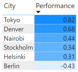
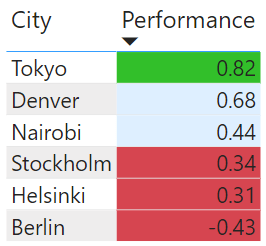
This example data shows some random values for cities.
To apply conditional formatting, in the values well, click the down arrow on the value you wish to format
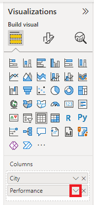
and then click on conditional formatting, which reveals this sub-menu.
You can set background colors, font colors, add data bars, icons and insert clickable web links (URLs).
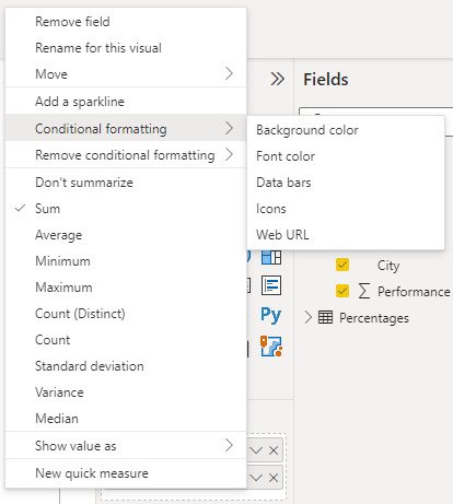
To remove conditional formatting click on Remove conditional formatting, and you will see this sub-menu.
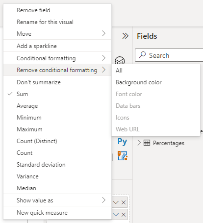
From here you have to choice to remove individual types of formatting or remove all.
Gradient
Having chosen background color you then see this window which has the default Gradient chosen. You can also format by rules or by a field value (a measure or calculated column), I'll look at those options later but for now let's stick with gradient.
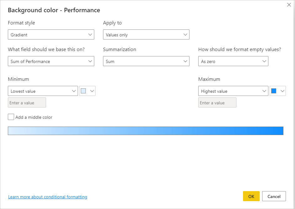
Formatting using a color gradient means that the lowest value is set to one color, and the highest value is set to another color. All values in between are set to some shade/mix of these two colors depending on how close they are to the minimum and maximum values.
You can apply the formatting to either:
- Values only
- Values and Totals
- Totals Only
Where it asks what field to base the formatting on, most of the time it will be the same field that you are actually formatting. But you can have cases where you might format one field (like a text column/measure) based on the value of some other numeric field (column/measure).
The summarization to use is probably better described as what aggregation to use, for the value that the formatting is being based on, e.g. sum, min, max etc.
For empty values you can format these
- As zero
- With a specific color
- With no formatting
The Minimum and Maximum values to use can be either the minimum and maximum found in the field, or you can set specific values for one of both of these.
Colors can be chosen for the minimum and maximum values and these determine the color gradient that will appear across all values.
You can also set a middle color for your values. If you activate this then you can choose a specific middle value or use the default option and let Power BI work out what the middle value is in your range of values.
With the settings as shown above, when I click OK to apply these my table is formatted like this
Rules : Numbers
If you want to use rules then re-open the background Color formatting settings and change the format style to Rules
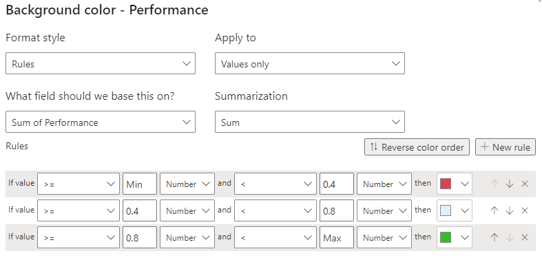
You can now create rules that determine what colors to assign to values based on bands of values.
As you can see in the image above, anything between the the Minimum value and 0.4 is red, anything between 0.4 and 0.8 is light blue and everything else up to the maximum value is green.
Saving these rules results in this formatting
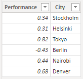
Rules : Percentages
You can also format using rules and percentages. It's important to understand how formatting using percentages across a range of values works.
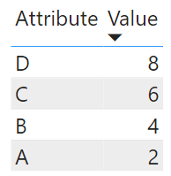
I'll use this simplified table of data for this example
Opening the formatting again I modify the rules to this
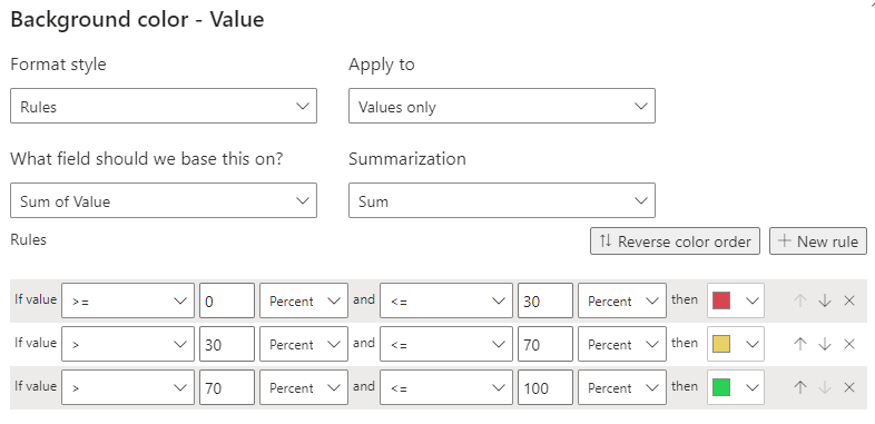
- 0% to 30% = Red
- >30% to 70% = Yellow
- >70% to 100% = Green
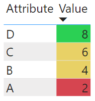
Applying this gives this formatting
If it's not clear why the colors are applied this way let me explain.
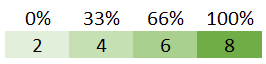
Across my range of values, 2 is treated as 0%, 8 is 100%.
That means that 4 is 1/3 of the way to the maximum value of 8, therefore 4 is 33%.
Similarly 6 is 2/3 of the way to 8, therefore 6 is 66%.
Looking at the rules I created
- 0% to 30% = Red. 2 is the only value less than 30%
- >30% to 70% = Yellow. 4 and 6 are greater than 30% and less than 70%
- >70% to 100% = Green. 8 is 100%
Field Value
Formatting using field values means using a measure or calculated column to assign the formatting. I prefer using measures. If you use a calculated column you're adding data to your data model that probably doesn't need to be there.
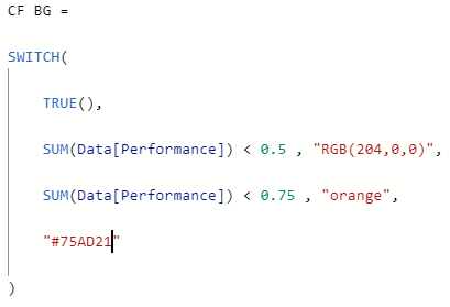
A measure to create formatting for a background color could look like this
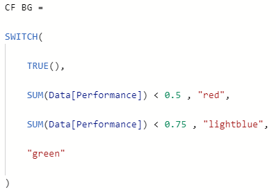
The color names can be
- Known CSS colors, more info here
- Hex color codes e.g. #75AD21
- RGB color codes e.g. RBG(200,50,25)
NOTE: Microsoft state that you can use HSL/HSLA color codes too but I can't find examples and can't get them to work.
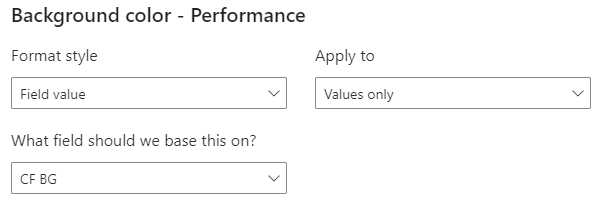
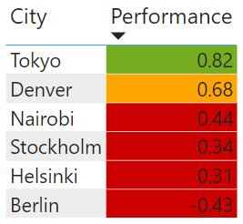
To apply this measure, open the background color formatting settings, set the Format style to Field value and choose the measure from the What field .... ? drop down.
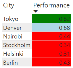
If you want to change these colors it's easy too. Edit the measure and change the colors as shown
After saving the measure the formatting is changed. No need to go back into the conditional formatting settings and change anything.
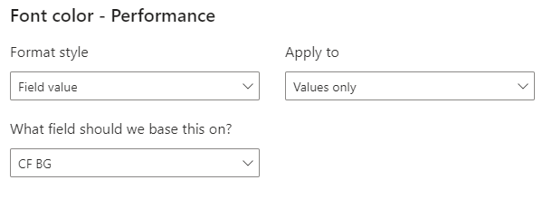
Font Colors
With fonts, you have exactly the same options as you do with background colors.
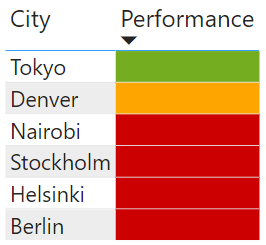
One trick to achieve a cell of a single color is to set the font and background to the same color, like this
With the background formatting removed the colored fonts look like this
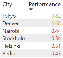
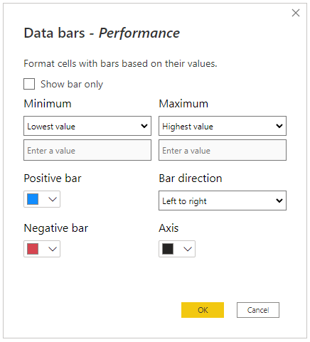
Data Bars
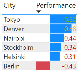
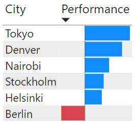
Data bars give you a colored bars, like a bar chart. You can set colors for the positive values and the negative values, based on the maximum and minimum values in your data range. You can set custom min and max values if you wish.
By default the bars are 'Left to right' which means you get positive values on the right of the 'axis' and negative values to the left.
The axis is a thin bar that separates the positive and negative data bars.
Using the settings above I get this
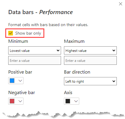
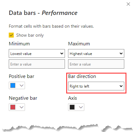
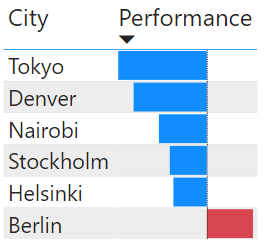
You can turn off the data values if you wish by checking 'Show bar only', it might make things look a little neater
If you want the bars running Right to left, choose that option in the settings
Icons
Icons can be displayed either by creating rules or using a field value. The configuration options are either the same, or very similar to what I've already covered.
Using these settings
![]()
gives this in my table
![]()
If you want to just display an icon and not the data values, set the Icon layout to Icon only
![]()
![]()
Custom Icons
By default, Power BI provides you with lots of icons
![]()
But if you want to use your own, you can create a measure or calculated column that points to a web accessible icon - store the icons on a web server somewhere.
I created a measure that assigns a bad, neutral or good icon depending on the values in the Performance column.
You can use .ico, .png, .jpg and .gif files for the icons
![]()
![]()
![]()
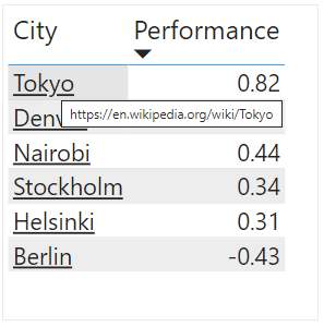
URL's
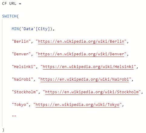
Adding conditional formatting with URL's creates a link to a web location. That could be more information on something, a report related to the data or whatever you want.
Let's say I want to link to a web page about each city. I need to create a measure or calculate column that gives the URL to the web page/location I want to link to.
Here's my measure
Open the URL formatting options for the City column and configure the settings like this
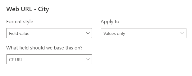
Now each city name links to a page of information about that city. Clicking the link opens that page in your default browser.