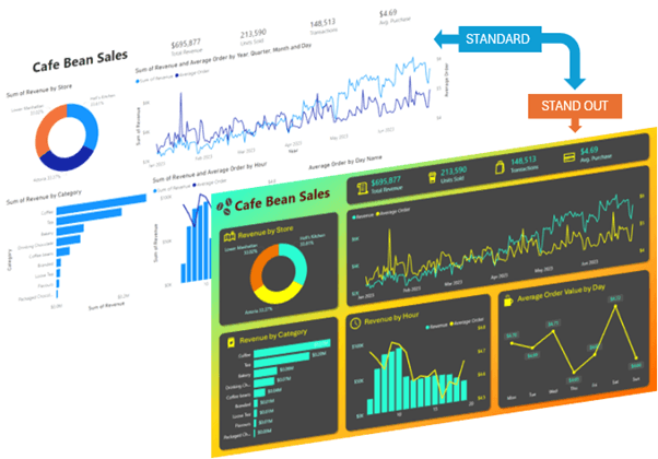
Are you ready to elevate your Power BI reports from standard to standout?
Power BI's extensive array of settings can be overwhelming, but don't panic!
In this guide, we'll show you four easy Power BI design tricks to transform your reports into visually engaging narratives that grab attention and clearly deliver your message.
Plus, if you want to try it yourself, you'll find the download link for the example file below.
Table of Contents
Download Example Power BI File

Download Power BI File and Background Image
Enter your email address below to download the sample workbook.

Transform Your Power BI Reports: A Step-by-Step Guide
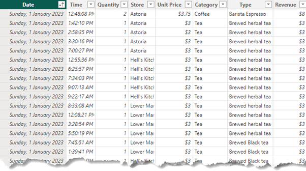
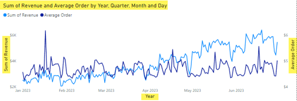
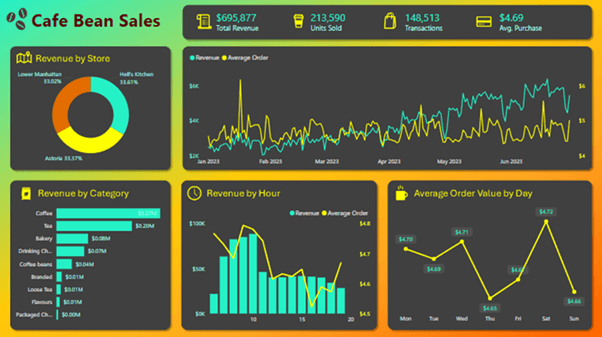
For this example, I'll be using sales data for a coffee chain:
1. Choosing a Colour Theme
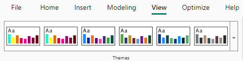
One of the first considerations when designing your dashboard is the colour theme. On the View tab, you can choose from built-in themes or create a custom theme based on your company's branding.
For example, a dashboard for a coffee chain might use shades of brown, but that can be drab. Instead, you could choose striking colours to entice people to read your report, or ensure the theme is accessible if needed.
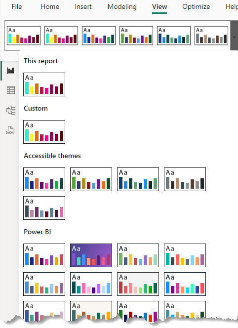
For this dashboard, I've created a custom theme that complements a dark background.
This initial step can dramatically change the look and feel of your dashboard. You'll still need to format axis labels and other elements, which we'll cover next.
2. Simplifying Titles and Labels
Power BI's default visuals often come with an overload of labels and titles, many of which state the obvious:
Let's streamline these elements for a cleaner look -; see the video for step-by-step.
Remove Titles & Backgrounds
Select a visual and press CTRL+A to select all visuals.
Hold CTRL and deselect the Title and cards without titles.
In the Format Pane, turn off the titles.
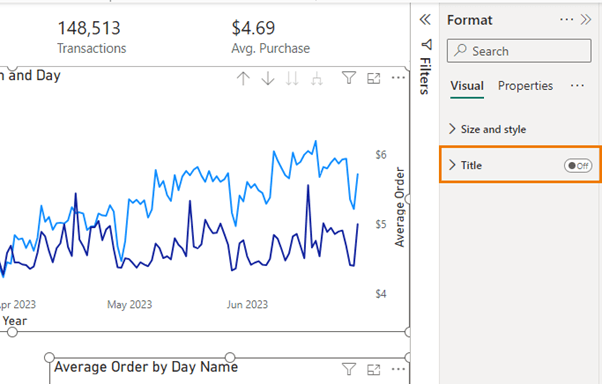
You can add custom titles in the background later for more flexibility.
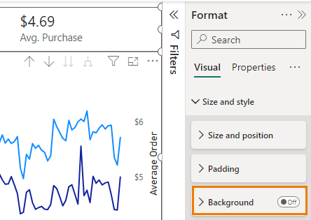
I'm going to create a dark background for my report, so I need to turn off the visual backgrounds: CTRL + A to select all visuals again, then go to the size and style settings and turn off the background for all visuals in the Size and Style settings.
Axis Labels and Colour Coding
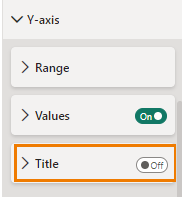
Double-click the line chart's Y axis and turn off the axis titles.
Colour code the axis labels to match the lines and format horizontal axis labels in pale grey for dark backgrounds.
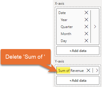
Rename data fields in the Build pane for clarity:
Align and colour the legend text as needed.
Repeat these steps for all other visuals, adjusting data labels and axis settings for consistency.
3. Aligning Visuals for a Clean Layout
Ensuring that visuals are aligned and there's adequate white space enhances readability and aesthetic appeal. Here's how to achieve that:
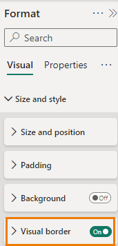
Format Visual Borders
Temporarily turn on borders for all visuals to check alignment: select one visual > CTRL+A to select all > Size and style > Visual Border:
Align and Resize Visuals
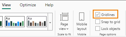
Turn on gridlines from the View tab to help with alignment.
Adjust the size and position of visuals using the gridlines as a guide.
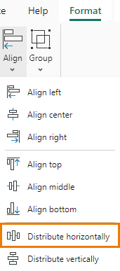
Distribute visuals horizontally using the Format tab for consistent spacing:
Once aligned, turn off borders for a cleaner look.
4. Creating a Custom Background in PowerPoint
For a polished look, create a custom background in PowerPoint:
Set Up in Power BI
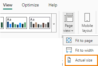
Go to View tab > Page view and set it to Actual Size:
Take a screenshot of your report's layout.
Design in PowerPoint
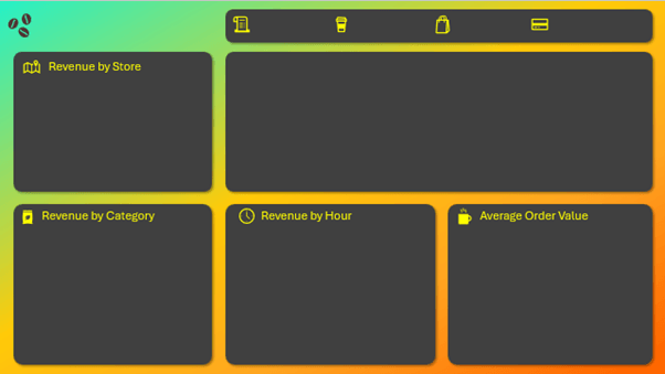
Paste the screenshot into PowerPoint and use it as a guide as to where you need individual visual backgrounds inserted.
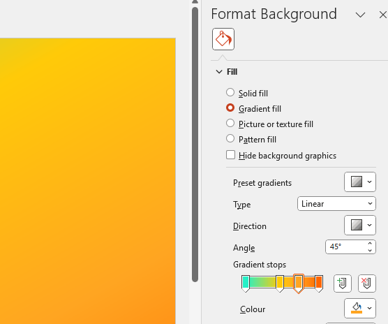
Design tab > Format background. Use gradient fills, images or preset designs:
Insert shapes with rounded corners for each visual area, adjusting size and shadows for a cohesive look.
Add icons and text boxes for titles and labels.
Export and Apply in Power BI
Save the PowerPoint slide as a .png or .jpg file.
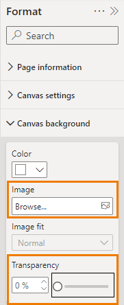
Back in Power BI, go to Format > Canvas Background, upload the image, and set transparency to 0%:
Adjust the visuals to fit the placeholders in your custom background.
Finishing Touches
Finally, make any necessary tweaks to the font colours and align the visuals within the custom background. The result is a clean, professional Power BI report with a custom background that enhances the overall presentation.
Transform your Power BI reports with these easy techniques and make your data stand out!
Next Steps
Ready to skyrocket your skills? Take advantage of our comprehensive Power BI course, which covers everything you need to become proficient in Power BI.
