Dear Forum,
When I import data from Excel multiple tables to BI, some of the columnar items are recognized as 'measures' (the 'sigma' symbol appears next to the item), and others of the same data type in a second table are not.
In the screen shots, I have two tables located on the same Excel worksheet: 1. Performance scores by 'Team' and 'Month' with 'YTD Average'; and 2. Team performance by 'Team', 'Region Team' and 'Month' with 'YTD Average'.
All numeric values have been converted to %, and the rest remain as 'general' format.
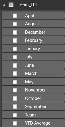
When I Get Data from the tables using PBID, the 'TeamRegion_Tbl' table identifies the 'Month' items as measures, whereas the 'Team_Tbl' table does not.
If I Get Data one table at a time, it gets even weirder: For example, if I get 'Team_Tbl' first, those month columns that have valid data ARE identified as measures. If I then bring in 'TeamRegion_Tbl' data, its 'Month' items are identified as measures, but the first table 'Team_Tbl' loses its measures.
Screen shot 1: 'Team_Tbl' table in Excel
Screen shot 2: 'TeamRegion_Tbl' table in Excel
Screen shot 3: 'Team_Tbl' table in PBID
Screen shot 4: 'TeamRegion_Tbl' table in PBID
Since I am doing this action for the first time, perhaps I am either overlooking something in my data preparation, or my observations are suspect. Please help.
![]()
![]()

![]()
Hi Mark,
Formatting in Excel has nothing to do with data types in Power BI. I can see in your Excel tables that there are inconsistencies in the columns that contain the green flag in the top left of the cells. These are some of these columns that do not show the sigma sign in Power BI. It may be related, but it might not.
Either way, when you get the Excel data with Power Query you must set the data types (Home tab > Data Type) before 'Close & Apply' or 'Close & Load'. You do this for each column in your table. When these data types are set in Power Query you will see the sigma signs correctly in Power BI.
All that said, your data is not in a tabular format and should be unpivoted with Power Query before loading it into the Power BI data model, otherwise you won't be able to analyse it the way you intend.
Hope that points you in the right direction, but let us know if you get stuck.
Mynda
Mynda,
Thanks so much for your helpful reply.
I've un-pivoted the 'Month' columns, and things are starting to look up a bit, but I still have a couple of problems with the BI visualizations.
1. I would like the clustered bar chart to display the months according to calendar order, that is: 'JFMAMJJASOND', rather than ascending or descending alphabetically. Does such an option exist? I can't see it anywhere.
2. When I select a single month in the 'Month' slicer, the clustered bar chart wastefully hogs a massive amount of real estate. I think perhaps there must be a better way to visualize the monthly teams' performance scores, but don't know what that could be.
Any further advice would be appreciated.
![]()
![]()
Hi Mark,
You can use Sort By to tell Power Pivot to sort a text column (the month names) by a numeric column (the month numbers) as shown in lesson 7.04 of the Power Pivot course.
In regard to your clustered column chart, I would have thought a bar chart with the team name on the vertical axis and the month in the legend would help you better see the performance of each department overtime. It would also adjust better when looking at only one month.
Mynda
