Hello,
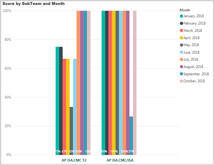
1. My columns are too narrow, such that the labels are not clearly seen. Also the columns are unnecessarily compacted together, when there is ample room for them to be spread out for better viewing aesthetics. Is there a way to expand them? | See attached screen shot.
2. Is it possible to get the legend to appear IN the bars? One comment I have received is that the user has to keep glancing left to right to associate each bar with a particular month. I know the bars are already in Month order, and are colour coded, but this is a request I have received and would like to accommodate it if possible.
Kind regards,
Mark James.

Hi Mark,
You can try changing the X axis settings for category width and inner padding to make the columns wider.
That said, I would make this a line chart with the months on the horizontal axis. You'll have two lines, one for each team.
Mynda
Hello Mynda,
Your suggested use of the Line Chart works a treat for one or two teams - after that it starts to look busy.
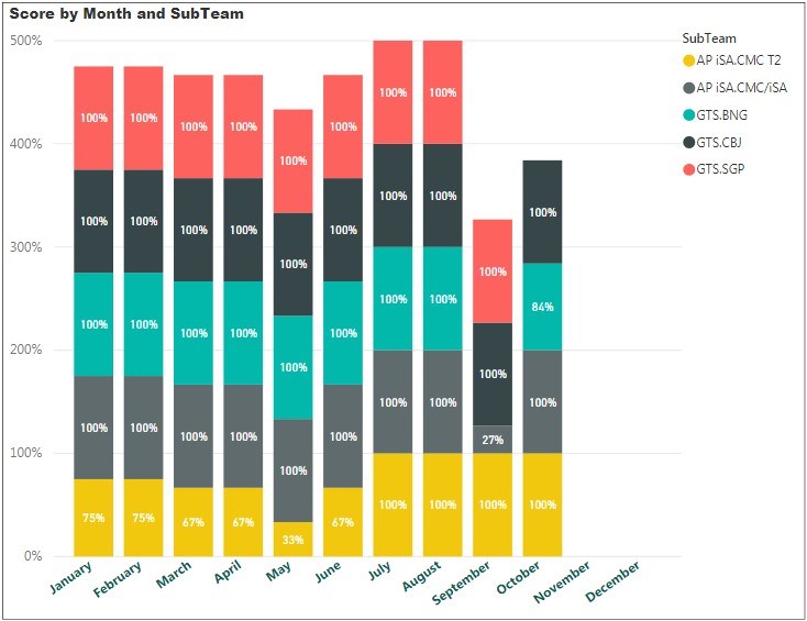
Here's an example of (5) teams represented on a stacked column, which looks pretty clear and understandable. I think I'll go with this, but you did put me on the right track with the axis change, and looking for a better visual alternative to the clustered columns 😀
Thank you very much!

Hi Mark,
I wasn't aware that you had more than 2 teams. In that case I'd recommend small multiples style of chart because the stacking makes it difficult to quickly establish the change from month to month in anything but the first team. It makes it more difficult for your users to interpret.
This post explains how to create small multiples using conditional formatting in a matrix table: https://www.decisivedata.net/blog/small-multiples-trellis-bar-charts-in-power-bi
I recommend this approach over the stacked column chart.
Mynda
