I would like to select only the top 5 or 10 bar chart elements for a given date interval (month, day, etc.) We have equipment that generates 30 to 40 unique error conditions, each reported as a percentage of total transactions for a day, and I want to provide a way to chart only the Top N error types per day, eliminating the null or low value err types.
I generated some data to represent the problem. In my data all error types have somewhat similar values, but there is still enough variability to be able to select the Top N for each time interval.
Any ideas greatly appreciated. I have watched videos on Top N filtering, but can't seem to make it work with my data.
I attached my txtErrs.csv input data, and a simple .pbix project file with a bar chart visualization. The errN% columns, where N is 0-9, are calculated columns. I am charting the errors by the percentage of daily transactions, not by the absolute error count for a given error type.
Larry Hybl
Although my sample data doesn't illustrate it, I think the real data I'm trying to graph as a Top N, is actually a good example of a Pareto condition, if this is the right way to say it. I believe 80% of our overall errors are caused by 20% of the possible error types, and would be best analyzed as such.
I am not a data analyst. Far from it. But the task has fallen to me, so I'll dive into this new, to me, technique of analyzing data.
Question: Does the Power BI course cover Pareto analysis? If not, are there other good tutorials you can recommend?
Thanks in advance,
Larry
Hi Larry,
Thanks for sharing your file and data.
I see that your data layout is not tabular. First, you need to unpivot the data. In the attached file I've done that for you. Note: You'll need to edit the file path to the CSV file in the query so that it's referencing to your PC, as it's pointing to mine in the attached file.
Unfortunately, there's no easy way to create a Pareto chart in Power BI and I don't cover it in the course, sorry. However, I found this post that has detailed instructions. I hope that points you in the right direction.
Mynda
Very helpful. You showed me an entirely different way to solve this Top N problem. I read that you need Dimension tables for Groups and Slicers, so I was going to take that approach instead of the technique you used for replicating the rows to have a row per each error type, per day.
Our raw data is modeled like my sample data, with one row per day, and 30-40 columns to provide the count for each error category. I was hoping to create a dimension table that would allow us to leave the fact table as is, i.e. wide and shallow. While I'm way out of my depth, this seemed to me like a many to many relationship, which I know is not optimal.
I'll make a dimension table for my sample data, to see if this might be viable too.
Again, thanks so much for the help on this. The Top N results are exactly what I was needing.
I would like to pursue the Top N topic via dimension tables, because our fact table structure has already been put in place, with a sum of each of the 35 error types per day, so 35 columns of separate error type tallies.
If you were to create an Errors Dimension, would you recommend one dimension table per error type or a separate dimension table for each of the 35 error types? The latter seems really tedious to set up, and probably also more difficult to set up in the Power BI reporting layout.
I tried a simplistic test of using two distinct error dimension tables (err0 and err1) and had some luck charting it. When I tried a single errors dimension table with all 10 errors (err0-err9) I crashed and burned in setting up the relationships to the fact table.
Any recommendations greatly appreciated.
I am reading the RADACAD May 2019 articles on Data Modeling. I just finished the Dimension article (why you should say No to one big table, as our transactional database stores our equipment information). I am now reading the Fact Table article. The following quote leads me to believe I should indeed split the single row per date records with 50-60 columns of error type and equipment state into multiple rows, each with a key mapping to the dimension type I want to use for slicing/dicing. This is what you did in your recommended solution. If I am on the wrong track trying to leave the fact table as-is (i.e. leaving just one record per day) and solving it with one or more dimension tables, please advise.
As I reflect on it, I think our very wide fact table containing all possible errors and machine states is analogous to having a sales table that has a column for every possible product in inventory and a value for each product every day. Naturally, many/most will be low or zero value, making it difficult to analyze sales.
Larry
The quote from the May 14, 2019 RADACAD article (not able to paste a URL):
Basics of Modeling in Power BI: Fact Tables
... [details removed; bold/italic my emphasis ]
The more fields you have as a grain in your fact table means the more dimension you are connected to, and it means more power for slicing and dicing. On the other hand, more fields, also mean row numbers will increase too, and you will need more memory to store the data.
If you build your fact table from the lowest grain (the most detailed list of dimensions), you always get the ability to expand easily in the future. Although, you should keep in mind that it means your fact table will have more data rows.
Hi Larry,
I would unpivot the error table, for me the other layout is a mistake that will lead to pain and frustration in the future. You can use Power Query to do this before loading to Power Pivot, so you don't necessarily need to go back and change how it was set up, just fix it for the purpose of Power Pivot.
i.e. instead of a column for each error type with the values in the rows below, you have a single column that houses the error type code and then another that houses the value. From there you can map the error type code to a dimension table that groups those codes however you want.
This is a correct tabular format. Additionally, while it may well result in more rows (and less columns), generally it's more efficient for PowerPivot to compress data in lots of rows than it is compress lots of columns.
I hope that answers your questions, but shout if you have more.
Mynda
Just this discussion on Top N Bar Charts has justified the cost of the courses I am enrolled in. Thanks so much!
I was indeed able to get the Bar Chart Top N behavior I wanted once I unpivoted the error columns. We have a meeting today where I present what I've accomplished in my first 2 weeks. I am so happy to be able to show the before and after results w.r.t. what I did on my own, followed by what I did with your help and coaching.
I am confident they will agree it's OK to expense the cost of the courses, which I signed up for w/o getting management's approval.
Hoping to send many others your way for the Power BI training.
Best,
Larry
Congratulations on your hard work and success, Larry! It's great to know we could play a small part.
"No good deed goes unpunished." 😉 They liked the Top N Error Type filtering so much they asked me to take it to two more levels. They would like to show errors by Type, by Store and by Hour. By Type is now working thanks to UnPivot, kinda/sorta, except for By Error Count sorting, per below.
I created some sample data that is closer to real world with store number, which is not yet "Unpivoted" in my sample project, and error type and name which have been unpivoted.
I haven't spent much time on the By Type and By Store multi level filtering yet, but I can tell it is not yet intuitive (to me) how to do that.
While working on that, I notice my initial By Error Type filtering isn't always sorting By Error Count, as I expected. And that is really the main point of this posting.
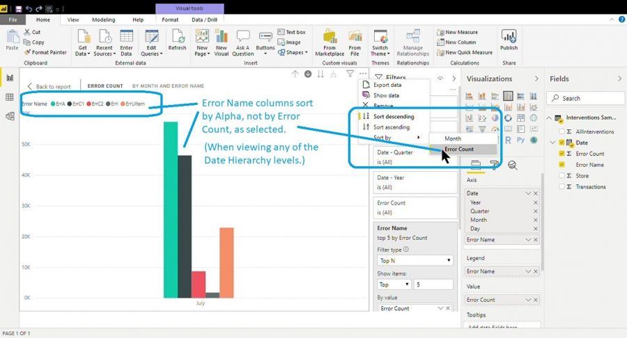
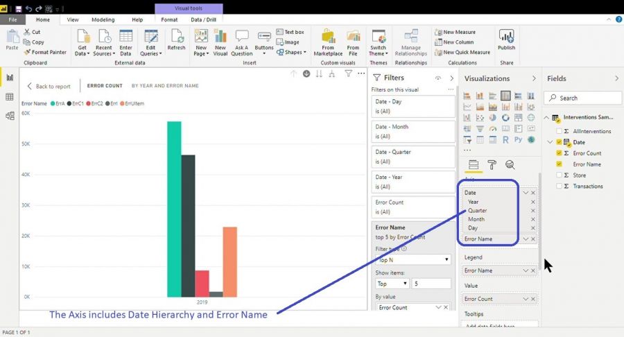
When the Axis hierarchy is in the Date levels, the Error Type columns are arranged alphabetically by Error Type name, not numerically by Error Count value, even though the Sort option (in the visual ellipsis menu) specifies sort by Error Count.
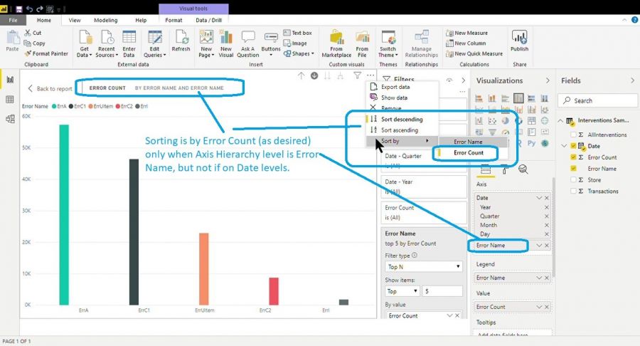
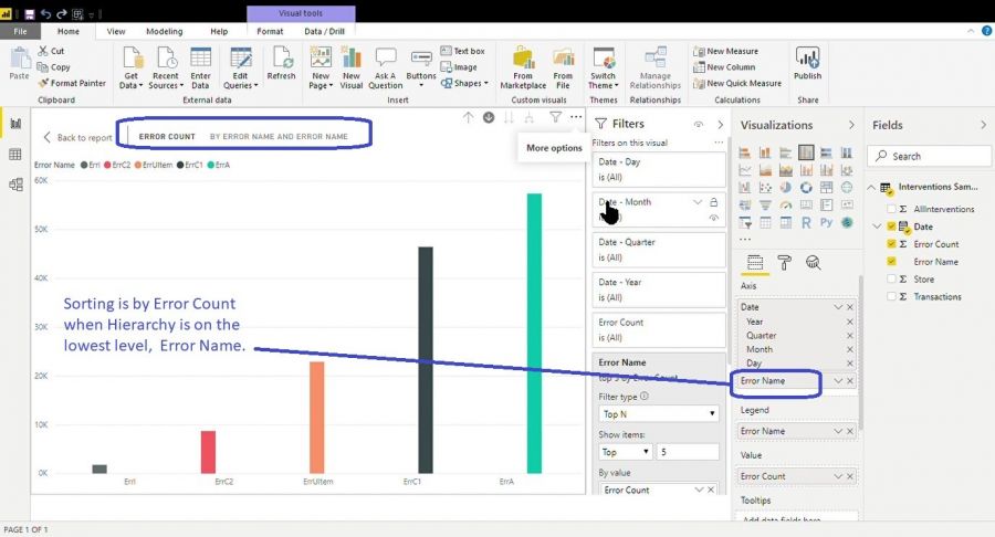
When I drill down to the Error Type lowest level of the Axis hierarchy then the Error Type columns do sort by Error Count, ascending or descending, depending on the sort direction specified.
Question: Any suggestions on how to make the Error Type columns always sort by Error Count?
I included my project file, the original (pivoted) csv data and a short video of the above. No joy on including the .mp4 video screen capture.
Thanks in advance for any help you can provide.
Larry
I didn't upload my files before posting, so will do now. Hopefully this doesn't duplicate the files.
Also adding some screen shots from the video that would not upload.


Hi Larry,
I tested adding a dimension table for the error names with a SortBy column that forced the sort order, but that didn't work. It looks like a limitation of Power BI when you have a hierachical horizontal axis.
I can't think of any other way to achieve what you want, sorry. You're not the only one. I also found this post with the same issue.
Mynda
