Hi Team,
I would like to appear all the Legend (which is Facilities in my case) on the visual. At the moment, we have to drag it to see them all.
Another issue is apart from hovering data, is there any way legend data can be appeared on the chart. Even on the Y axis will be good.
Many thanks, Team
Regards,
Aye
Hi Aye,
You can't force the legend to fit on the chart. I would argue that if you can't see all of the legend items then you're probably not using the best chart for your data or you're trying to show too much in the chart. Too many legend items make charts difficult to read, and this defeats the purpose of the chart in the first instance.
Maybe a bar chart would be better, with your legend items in the vertical axis.
Mynda
Hi Mynda,
Can I choose axis item?
I mean I am not sure how to choose 'X' axis and 'Y' axis.
I would like to appear the name of the facility in their shaded area together with occupancy %.
I have attached my data set and please let me know what would be the best chart for them.
Many thanks, Mynda.
Hi Aye,
In a bar chart the 'axis' field is the vertical axis. The horizontal axis will automatically populate based on the data.
Thanks for sharing your data. It's not clear what role the Region should play in your visual, but if you build a bar chart then I'd put the Region and Facility in the Axis and the Average Occupancy in the values area. If you put the Region first and the Facility below it will group the data by region then by facility.
Mynda
Hi Mynda,
Thank you.
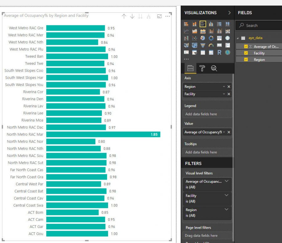
I just want to organise my region grouping facility within region and showing occupancy%.
I can see that in my visual as attached.
However I have to distribute some on the PDF and name of the facility is not showing within shaded area.
As I cannot expend my legend area, what would be better way to show facility on my chart.
Matrix in Power BI can do only 3 criteria only, in my case: Facility, date (last 15 days), and Occupancy.
I would like to have Region, Facility in the Region sorted by Region, date(last 15 days) and Occupancy.
Please let me know how can I do that 4 criteria matrix on my visual.
Thanks, Mynda.
Regards,
Aye
 Hi Aye,
The stacked column chart is the wrong visual for this data. A bar chart is better, see example attached. Note: you don't have any date information in the sample file you sent me, but you can add it as a visual level filter.
Mynda
Hi Mynda,
I cannot find the example attached.
If possible, can you please send me over.
I do have the date information.
Regards,
Aye
Many thanks, Mynda.
Regards,
Aye
