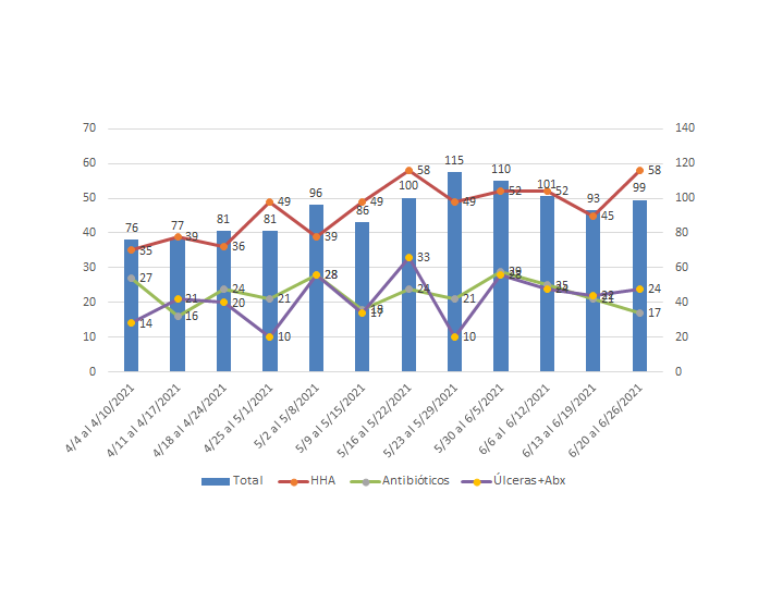
Hello Mynda,
I need your help creating this graph in Power BI. The user want to see a column chart with the new admissions count and on top of the bars a lines chart with the service type. I try to used the line and clustered column chart and it only provide to enter one value for the line. Also I attached an image of the desire chart.
Please advise, thank you so much for your help.
Mariena
Hi Mariena,
No image attached. You need to click the Start Upload button after selecting the file, then wait for the grey check mark beside the file before submitting your reply.
Note: without a sample file it's difficult to provide you with a solution, so I recommend you create a mockup file with some dummy data to illustrate what you've tried.
Mynda
Thanks Mynda:
I am sorry.

Hi Mariena,
I'm not sure why you can't drag another field into the line field. I was able to. You just left click and drag until you see the yellow underline showing where the field will go.
Mynda
