Hi
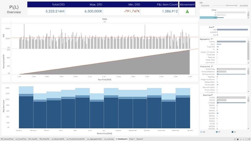
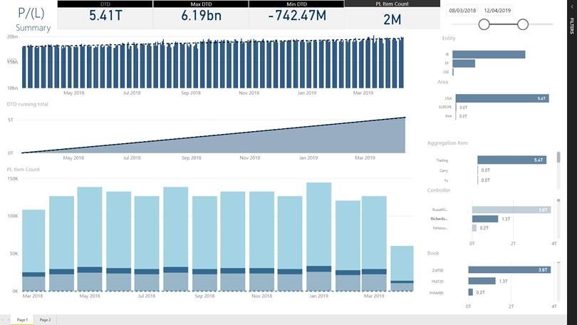
I am struggling formatting bar charts. Attached are 2 images. One of some bar charts created in Tableau and the second of the same Vizs created in Power BI - the tableau one has bar charts, with secondary bars inside, running on a dual (not shown) axis .. so representing a sum of value and a count of records. I have a few questions regarding these;
1. is it possible to have embedded bar charts with effectively dual axis (needed because the scale of the numbers for count and value are widely different) ?
2. Is it possible to make the bar thickness much smaller - as in the Tableau image so showing much more data in the same space?
3. Is it possible to align the Y axis, which seems to being moved according to the y-Axis label sizes?
Thank you!
Hi Marcus,
No images attached. That said, I don't think you can change the width of bars for a series.
Mynda
[Image Can Not Be Found]
[Image Can Not Be Found]
Hi Mynda
Apologies - pictures should be attached above
Many thanks


Sorry Mynda
Take -three at inserting attachments!
Hi Marcus,
Thanks for sharing the images. I'm not aware of any way to change the width and overlap for a single series in the formatting options. There might be a custom visual you can download that gives you this styling though.
Mynda
Hi Mynda
Thanks for your reply. So with the bar charts on the RHS there is no way to align the "Y-axis" on them? I dont understand on the image above why the top 2 bar charts, the Y-Axis labels appear to be close to the y-Axis line - but the ones below have a huge gap?
I have to admit after initially being blown away BY PBI I am starting to feel a lot less enamoured with it. Tableau is poor for explicit formatting - but this appears to be even worse.
Thanks
Marcus
Hi Marcus,
Sorry, I thought you were asking how you could overlay one series on top of the other series as shown in your Tableau charts.
The Y axis on the PBI bar charts doesn't look right. You can see the top two charts have the Y axis labels in the correct position. Mine are also correctly aligned. I wonder if you can re-insert them if you'll get a different result? If that doesn't work then check that PBI is up to date.
Mynda
