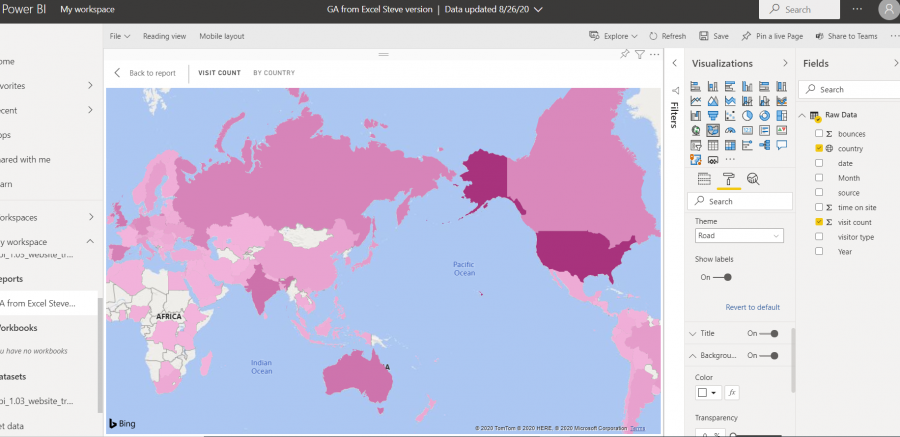
Mynda,
I recreated the dashboard in lesson 1.03. With the filled map visualization my map has the country labels in the background unlike yours. I see where I can turn them on or off, but how do bring these to the forefront like yours? I'm sure it is operator error.
Also it seems my map orientates itself differently. Is that because I'm in a different country than you?
Thanks,
Steve
Hi Steve,
That looks like a bug. When I create a new filled map visual now it also shows the labels behind the data!
I'll report it to Microsoft.
Mynda
Update from Microsoft, it is a bug and they'll look into it. In the meantime you can use a custom theme, but that requires you to create the visual in Power BI Desktop, so won't help in this example.
In the meantime you can override the hidden labels with a custom theme file (see session 4.18) as a workaround:
"visualStyles": {
"map": {
"*": {
"dataPoint":[{
"transparency": 50
}],
}
},
"filledMap": {
"*": {
"dataPoint":[{
"transparency": 50
}],
Thank you so much.
