Hi,
I'm really enjoying the videos and resources here. I have an excel question and I thought I would try the forum.
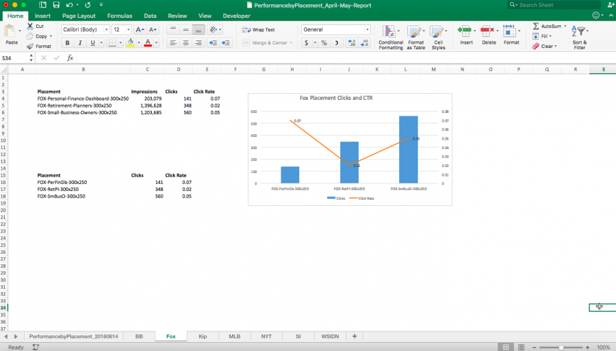
I was asked to create some charts for a digital marketing initiative. I was asked to show impressions, clicks and clickthrough rate for various ad placements.
The values vary widely and I'm having trouble. I settled on showing clicks and click rate on a combo chart with 2 axis because I'm on a deadline and I think the visual makes the insight pretty clear.
Still, I wonder if there is another, better way to plot this? Appreciate any guidance or suggestions...

Hi Damaris,
Firstly, I have moved this post to our Members Dashboard forum as opposed to the public one which anyone can see. Please be sure to use the Members forums for questions related to courses in which you're enrolled.
In the attached file I have 2 options:
1. Create 3 charts, one for each measure (Impressions, clicks & click rate), set the chart fill to 'no fill' and overlay them so they appear as one. Each chart has it's own axis scale but you hide it and use data labels instead. I've grouped the charts to make them easier to work with. I also took a screenshot of the legend and pasted them in so I could easily get them in the position I wanted.
Avoid using line charts when comparing data that is unrelated. Line charts are good for plotting data over time. Your data is by department (or similar), so they are not related. I've used a line chart and hidden the line to only show markers, which is ok as there isn't actually a line showing.
2. The other option is to simply show each measure in its own chart.
I hope that gives you some ideas.
Mynda
