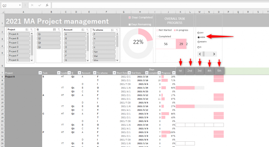
Hi All
I made my Dashboard under Youtube instruction. It works ok but I want to add one more tweak that can change the view of the Gantt part in multiple timelines such as weeks, months as well as days. I succeeded in changing the view according to weeks and months, including column width, by selecting button form, but the graph part with embedded formulas doesn't show correctly. Could you give me advice so that I could show the graph part with proper the dynamic timeline?
Thank you for your help
HT
Hi Hiroto,
Welcome to our forum!
You can use an INDEX formula to toggle between different time periods. See file attached.
Mynda
Dear Mynda
Thank you for the advice. I guess that my explanation was not great. I attached pictures that would be my ideal styles once I hit each button. Please refer to those. If you give me a solution to upgrade the sheet, that would be great.
Best
Hiroto
![]()
![]()
Hi Mynda,![]()
I uploaded the wrong one for the Month. Please see the attached one.
The red squares and arrows would be the points I wanted to change.
Best
Hiroto
You can use the TEXT function to change the formatting of the dates returned by SEQUENCE to suit the periods selected in the Radio Buttons. You'll need an IF to detect which format to apply.
Converting the dates to their week ending and month equivalents should be easy, but here is a tutorial on converting dates to quarters.
I hope that points you in the right direction. Come back if you get stuck and share your attempt.
Mynda
Dear Mynda
Thank you for the advice. Your recommendation would work for the timeline but do you think the modification would also work the graph part? Since many formulas composed the graph part, I guess the formulas also need to be change.
Thank you for your advice
Hiroto
Good point, Hiroto. You'd need a hidden row containing dates that aren't formatted with the TEXT function that you'd use to refer to in the conditional formatting formulas, which may also need modifying.
Thank you Mynda! I appreciate your support.
