Hi all. New here, let's test it out!
I have a table like so and have added a pivot chart. Hierarchy goes company>site>team>user. So I need to add average lines based on the levels above user, when filtered (I just drew these ones on J . is it possible to do achieve this with table? Users here are represented as number, that's .by the by
I will add a slicer or more but I want to be able to clicking say a user or team and have their performance measures against the levels higher than them in the hierarchy and with date dimensions applied. I could do manual chart for a weekly one say I could just add a fixed value into a column and add a series or more. But guidance on making it dynamic please!
Thank you
Hmm just found this...
https://www.myonlinetraininghub.com/creating-excel-charts-from-multiple-pivottables
Hold fire 🙂
No problem, Matt. Let us know if you have any further questions.
Thank you Mynda. That post did very nicely. Bit fiddly to do but all good.
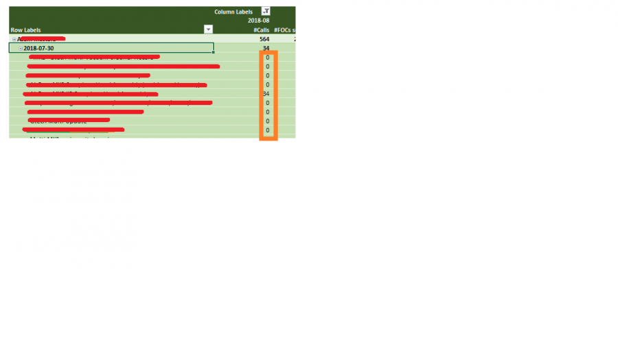
I have another questions now regarding formatting a pivot table. I want to only display The header values of the 2 groups. In that the detail values are misleading. So in the attached, red is hidden by me to protect the innocent, But the orange box I need to hide those values, just the category subtotals should be displayed. So I guess some formatting to make them invisible might work (font the same as background?)
But I need it to be dynamic.
I got it working on the top of the group (it the 564, I displayed that in conditional formatting to be different from the rest by applying a top 1 rank rule by row). "top2" did nothing different.
So in this example, the header totals 564 and 34 need to be seen, but not details beneath the date, in that particular column. Make sense? 🙂 Thank you!!

Hi Matt
Have you tried clicking the negative (-) button to the left of the headers?
It will collapse the entire field group leaving only the sub total.
Sunny.
Ah yes. Maybe I didnt explain clearly. Well the field is collapsed by default any way. I just want to not display the numbers if you are expand it. The reason being that the numbers mean something at the date level (the group level) but they are misleading (in fact wrong) if attributed it to individual rows (products)
Hi Matt,
Perhaps you could use conditional formatting to hide them at that level of detail by formatting the font in the same green colour as the cell fill. You'd need to be able to find a common denominator either in every expanded row, or every subtotal row. e.g. if the row label doesn't contain 2018 then hide the data in the # Calls field.
Mynda
Looks like Mynda have beaten me to the answer 
Yes, use Conditional Formatting. If your PT is in a Tabular format, you can easily use a formula to check if cell in column C is not a blank.
Then format the column D font to white.
Sunny
Ah ha. Yes that I think would work. I did have conditional formatting working (sort of ) but just on the top header row. OK your approach is slightly different but makes sense. I will try today.. thanks
