I have a simple line graph and have highlighted the period which contains the highest value. I used the formula, "=IF(MAX($B$5:$B$24)=B5,B5,NA())" to identify the maximum point, and the formula, "=ISNUMBER(C5)" to identify the period to shade.
How can I rewrite the 1st formula to identify the 3 highest numbers in column B, so that the shade helper column will then include all three periods?
Thank you.
Hi Tom,
You can use this formula in cell C5 then copy down (if you're not on 365 you need to enter the formula with CTRL+SHIFT+ENTER):
=IF(MATCH(B5,LARGE($B$5:$B$24,{1;2;3}),0),B5,NA())

Mynda
Thank you Mynda, that worked perfectly!
A quick follow-up question: Regarding the shaded periods, is there a way to have the shading go below the x-axis so that it includes the time period label?
No! Sorry. You cannot format the axis labels area.
Mynda
Hi Mynda and Tom,
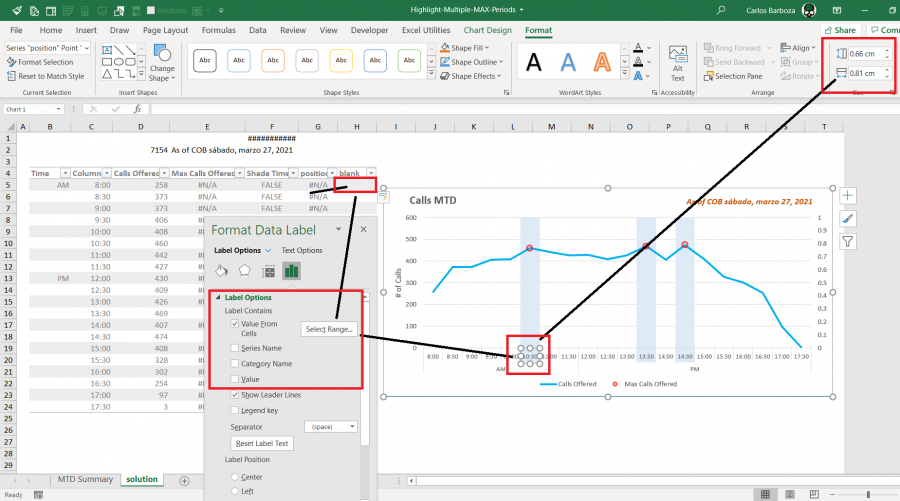
This would be your workaround ( I am attaching the file also)

Basically, you have to add two columns, one for positioning the label and another one with blanks (double quotes) to just show that. So in the label it doesn´t show anything. Once the labels are put, at first you will see a 0 (cero) go to the label options and switch it off (value) but first, activate the value from cells option and then select the dummy column with blanks. Then, you resize the label area (or label box) with height: 0.66 and 0.81 width and lastly, apply the same color of the bars.
Hope it works for you.
Hi Tom,
My workaround above is a bit "static", case in the future you need it to be more dynamic, scatter plots is the way to go.
with this type of chart, there are many possibilities for "hacking" it´s options. Below it´s something I recently developed where the requirement was a bit similar to yours. I will attach the file case you want to review it.

Regards,
At Mynda, I got this message: "015_highlighting_axis_item.xlsx: Error 106 - Upload file size exceeds maximum allowed size"
Would it be ok to share an external link for downloading the file ?
Sure, happy for you to share an external link. Nice solution!
Hi Mynda and everyone,
Sorry for the delay, here it´s the link to download the workbook: https://1drv.ms/x/s!Am3AC3QcIMahg9Q7hp-Qc_wPK-3eWA?e=SfUFZs
related to the Gif image above. Note: this workbook was done using Excel´s new functions: # dynamic arrays #. It can be done using Excel tables and cell ranges as well.
Take care everyone.
Another follow-up: When I have the columns highlighted, and combine it with a line graph, it works great. But if I want to have one of the lines to be shown as a column chart, any columns in the shaded area are behind the shading so they are not visible and I cannot get them to display on top of the shading. Mynda, do you have a solution for that?
Thanks,
Tom
