Hi all,
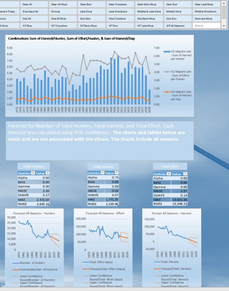
I was building a dashboard and I thought adding a line chart by using the forecast function would be interesting to include. I have created dynamic charts for this dashboard by using pivot tables and slicers. I can create the forecast chart, but I'd like to have this chart be interactive, too. Is it possible to create a line chart for forecasting that would be interactive by using pivots & slicers? Unfortunately, I can't add the file because of size restrictions. I will add a screen shot for reference.
![]()

Hi Brent,
It's possible, but maybe not with a Pivot Chart. It would depend on what you want to filter on. e.g. is it time, categories etc.
I recommend you create a mockup file that you can share that represents your data and what you want the end result to do. We can help you further from there.
Mynda
Hi Mynda,
I'm attaching the small data set that I created. I would like to use the forecast function to predict the changes over time based on the Season field. My original thought was to use a pivot table to create a dynamic line chart where the user could select the season and then select for how many years into the future for the forecast. The forecast was set at 90% confidence. Unfortunately, I couldn't see how to make the forecast function work with a pivot table.
Thank you for taking the time to provide any suggestion/solutions. I can see myself using such a dynamic table for my much larger data set, eg. 50K rows of data.
Sincerely,
Brent
PS. I'm using Office 2019, but some of my colleagues are using Office 2013. I don't know if this matters, but I thought I'd mention it.
Hi Brent,
Thanks for sharing your file. If you have Microsoft 365 you could use the FILTER function to return a filtered list based on selections users choose in Slicers. You could then reference that list with the FORECAST.ETS and FORECAST.ETS.CONFINT functions to create the forecast. From there you can reference the data with a regular chart.
You'd need to create dynamic named ranges for the chart reference as the size of the chart source data would be changing based on the Slicer selections.
Basically, lots of formulas are required.
Hope that points you in the right direction.
Mynda
Hi Mynda,
Unfortunately, I don't have access to Office 365 and the Filter function. I purchased Office 2019 awhile back. Any other suggestions/solutions would be appreciated.
As a side note, I do have access to a PowerBi and an early version of Tableau. Unfortunately, I don't have much time with PowerBi. I'm unsure if I attempt to create a dashboard in PowerBi if I'd be able to share it with my colleagues.
Thanks,
Brent
Hi Brent,
Sorry, I missed that you said you had Excel 2019.
Power BI requires you and those who want to view your reports to have a US$10/mth Pro licence, so that's probably a showstopper.
I don't think there's any easy way to create a dynamic forecast that automatically adjusts based on filters using formulas available in Excel 2019. It's doable, but will be error prone and a lot of work.
Maybe you could use Power Pivot in Excel. I found @sam.mckay/forecast-future-sales-using-dax-in-power-bi-65795a45ed57">this post on forecasting future sales that might give you some ideas.
Mynda
