In an ideal world our data will be in one table so we can easily analyse it in a PivotTable and PivotChart. However sometimes the data we want to display in a chart is split across multiple tables, and this is a PivotChart showstopper.
Remember Pivot Charts are monogamous in that they only display data from a single PivotTable.
Let’s forget for a moment that we have Power Pivot which allows us to mash up multiple tables into one PivotTable/Pivot Chart. And for whatever reason we don’t want to consolidate the tables, even though we very easily could with Power Query.
Download the Workbook
Enter your email address below to download the sample workbook.
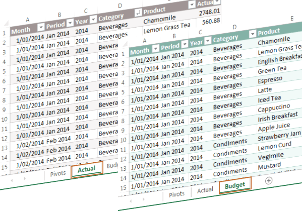
The Data
Here we have actual data in one table and our budget data in another.
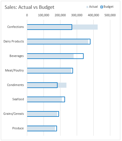
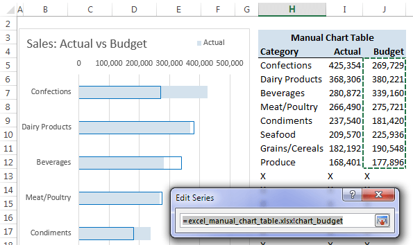
And we want one chart that shows them both together like this:
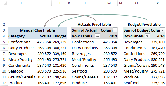
Manual Chart Table
We can’t use a PivotChart but we can still use PivotTables to quickly and easily summarise the data.
Once we have our PivotTables we create what I call a ‘Manual Chart Table’ that consolidates the data from the two PivotTables into one table (columns H:J), which will feed the chart:
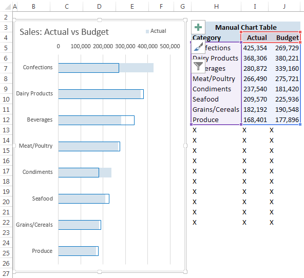
You can then go ahead an insert a regular chart (as opposed to a PivotChart) as I have done below, which you can see is referencing the manual chart table in columns H:J:
Building your Manual Chart Table
There are no hard and fast rules for which formulas to use to build your Manual Chart Table, but you should aim to incorporate the following:
- Allow for growth/contraction – formulas should extend past the end of your PivotTables in case they grow
- Error Handling – if your formulas are likely to return an error then wrap them in the IFERROR function to avoid a load of ugly #N/A’s or #DIV/0!’s etc. adorning your charts
- Reconciliation – make sure the figures in your Manual Chart Table reconcile to the values in the PivotTables. You can see my reconciliation in cells I2 and J2 below:

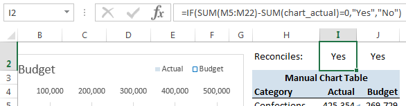
Tip: A little Conditional Formatting on cells I2 and J2 will turn the font red if a "No" is returned.
Manual Chart Table Formulas
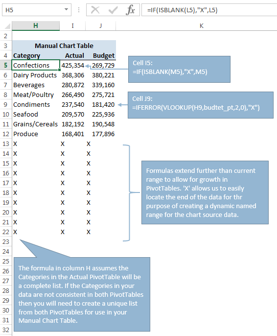
Column H Category - cell H5 =IF(ISBLANK(L5),"X",L5)
This simply picks up the category name from the Actuals PivotTable. The IF function checks if cell L5 containing the category name ISBLANK, if it is it will return an X (which I’ll use to locate the end of the data for my chart), and if it’s not then I’ll get the category name from column L.
I’ve allowed for growth in the PivotTables by extending the formula down to row 22.
Note: This means I’m assuming the Categories in the Actual PivotTable will be a complete list. However, if the Categories in your data are not consistent in both PivotTables then you will need to create a unique list from both PivotTables for use in your Manual Chart Table.
Column I Actuals – cell J5: =IF(ISBLANK(M5),"X",M5)
This does the same as column H except returns the Actual amount, or an X if M5 ISBLANK.
Column J Budget – cell J9: =IFERROR(VLOOKUP(H9,budget_pt,2,0),"X")
It’s safer to use a VLOOKUP formula to find the corresponding Budget amounts because the categories in the Budget PivotTable may be in a different order to the Actual PivotTable. An X will be returned if the VLOOKUP can’t find an exact match.
Again, this assumes all categories containing a budget are present in the Actual PivotTable list. Don't forget to build in error checking to ensure the total of the Actual and Budget PivotTables reconcile to the Manual Chart Table.
Tips:
- You could use the GETPIVOTDATA function in place of the formulas in columns I and J.
- You could skip the PivotTables altogether and use SUMIFS to build your Manual Chart Table, but where’s the Pivot Fun in that?!
Chart Dynamic Ranges
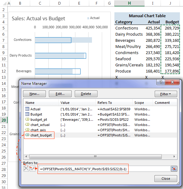
The great thing about PivotCharts is that they automatically update to reflect changes in the PivotTable without you having to lift a finger toward the keyboard or mouse.
We can achieve similar automation using Dynamic Named Ranges (with OFFSET or INDEX) as the source for our chart series. This is where I use the 'X' to figure out the end of my chart data.
For example, in the screenshot below you can see that the chart series for Budget is referencing a range called ‘chart_budget’ which returns the range J5:J12:
And in the Name Manager (below) you can see the name chart_budget is created with this formula:
=OFFSET(Pivots!$J$5,,,MATCH("X",Pivots!$J$5:$J$22,0)-1)
Related Tutorials:
- See items 3 and 4 this tutorial for how to create Dynamic Named ranges using OFFSET or INDEX.
- More on the OFFSET Function
- More on the MATCH Function
So, next time you want to chart data from two different sources, whether they be Excel Tables or even different databases, remember the Manual Chart Table technique.

Thank you so much for this, i been thinking for over a year for a solution to present a set of data, and this is it, just what i was looking for.
Glad I could help, Jimena 🙂
A useful technique with single pivot tables too, to get around the limitations of pivot charts
jim (still using Excel 2007)
Cheers, Jim 🙂 Glad it’ll be of use.
Mynda
P.S. It could be worse…you might still be using Excel 2003 😉
or worse still, we might migrate to Google Sheets (here “migrate” has the alternative meaning of “give up most of the functionality of a spreadsheet”)
Oh, let’s not wish that on anybody!
worse still, my ex-company is still using Excel 2000… @_@
Lucky you’re not there anymore!