October 1, 2024
How to Choose the Right Chart for Your Data
Charts are one of the best ways to visualize data and communicate insights quickly, but using the wrong chart can
Read More
October 1, 2024
Charts are one of the best ways to visualize data and communicate insights quickly, but using the wrong chart can
Read More
August 25, 2023
One of the best uses for Python in Excel is creating the amazing charts available through Python libraries like Seaborn
Read More
August 1, 2023
Progress charts are a powerful way to track milestones and showcase achievements. However, there’s no built-in way to create Excel
Read More
July 11, 2023
Charts provide a visual representation of data, making it easier to understand and interpret large amounts of information quickly. At
Read More
June 13, 2023
Dashboards have limited space which is why an Excel scroll and sort table is super handy. Scroll and sort tables
Read More
March 2, 2023
When building reports, it's important that people not only understand what you're saying but also remember it. Picture fill Excel
Read More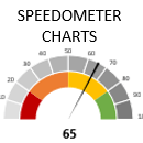
January 19, 2023
Excel Speedometer charts or gauge charts as they’re also known, have a worse reputation in data visualization circles than the
Read More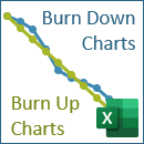
November 3, 2022
Excel Burn Down and Burn Up Charts are easy to make with line or scatter charts. If you’re familiar with
Read More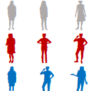
October 27, 2022
Excel WeePeople font charts enable you to build interesting variations on waffle, bar and column charts, to name a few.
Read More
October 20, 2022
One of the things that makes Excel stand apart from other reporting tools is its immense flexibility. With some tinkering
Read More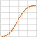
August 25, 2022
S-curve charts are a common tool used in project management to track the cumulative costs, hours, sales etc. over time.
Read More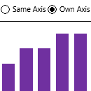
March 24, 2022
When working with small multiple charts or panel charts as they’re also known, it’s handy to be able to switch
Read More
January 27, 2022
You can create more interest and give your charts infographic styling when you create Excel charts with Shapes. There’s no
Read More
February 11, 2021
Excel pyramid charts are easy to build using bar charts or Conditional Formatting, but there are a few rules you
Read More
January 21, 2021
Shading or highlighting periods in Excel charts can help users more quickly interpret them and identify patterns. In the chart
Read More
December 10, 2020
Last week we looked at building Excel waffle charts using Conditional Formatting. This week we’re looking at building Stacked Bar
Read More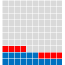
December 3, 2020
Excel Waffle Charts are a popular way to visually display parts to a whole. You can think of them as
Read More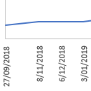
July 9, 2020
When you have data that spans a long period of time that you want to plot in a chart, the
Read More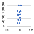
February 26, 2020
If you use a scatter plot for a dataset that has discrete values in one dimension, for example your x-axis
Read More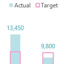
February 20, 2020
When you plot multiple series in a chart the labels can end up overlapping other data. A solution to this
Read More
February 13, 2020
We can use a data validation list or a Slicer to lookup pictures in Excel. This ability to lookup pictures
Read More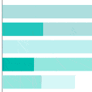
February 6, 2020
One of the cool features in Power BI is the ability to cross highlight from one chart to another by
Read More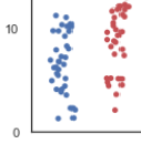
January 11, 2020
If you need to plot data that has one variable where values can be the same or very similar, for
Read More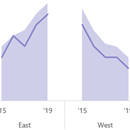
November 19, 2019
Reduce clutter in busy line charts by plotting your data in small multiple charts, or panel charts as they’re sometimes
Read More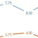
November 12, 2019
Labeling charts is useful if the reader needs to know the exact value for each point. We can position labels
Read More
November 6, 2019
Often, you’ll find Actual vs Target charts based on categorical data in the form of a column chart, however they’re
Read More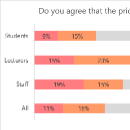
August 22, 2019
Charting survey data can be tricky, and when you want a segmented survey data chart it adds another layer of
Read More
August 14, 2019
Year on year charts or data over time is one of the most common data visualisations you’ll see. However, the
Read More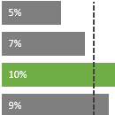
August 8, 2019
In this post I’m going to show you a way to create an Excel bar chart with a vertical line.
Read More
May 6, 2019
If you work with PivotTables, then you’ve probably found that you can’t include grand totals in Pivot Charts, or subtotals
Read More