Excel Formatting Best Practices
Proper use of Excel formatting can significantly impact the speed and clarity in which users can work with and interpret your spreadsheets.
It enables you to highlight essential information, direct users, and encode data. Effective formatting subtly enhances usability, while poor formatting can be a distraction.
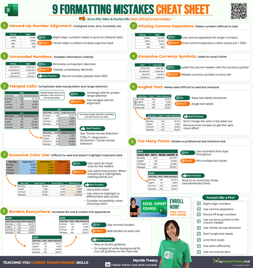
These are my top 10 GRIPES I see time and again.
Table of Contents
Watch the Video : 10 Mistakes to Avoid With Excel Formatting

Download the Formatting Mistakes Cheat Sheet
Enter your email address below to download the cheat sheet PDF.

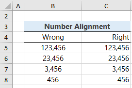
Number alignment
By default, in Excel numbers are aligned right and text aligned left. Don’t mess with numbers by centring them. Keep the ones, tens, hundreds etc. lined up so they’re easy to read:
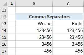
Comma separators
If you have numbers in the thousands or higher, put a comma separator in them. It makes them instantly easier to read:
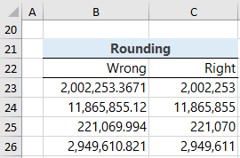
Rounding
If the numbers are greater than 1000, the decimals are immaterial. Round them so the important information is easy to see:
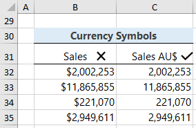
Currency Symbols
Repetition of currency labels just adds unnecessary noise. Instead, label the header of the column. And if there’s a chance it could be confused with other currencies that share the same symbol, add the currency name:
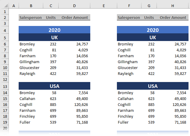
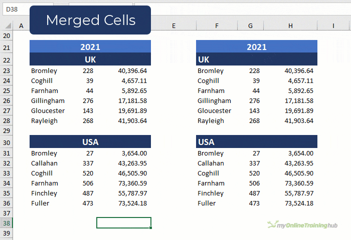
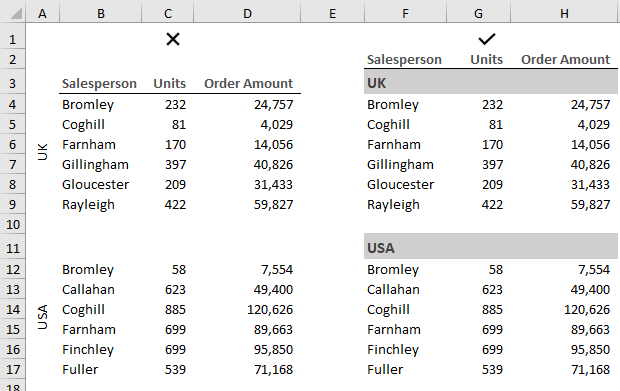
Merged Cells
Instead of merging cells, use Centre Across Selection. This way you still have the aesthetic of a centred label, without the inconvenience merged cells causes when selecting ranges interspersed with merged headers.
In the image below the tables in columns B:D and F:H look the same, but the tables in B:D have merged headers, whereas the tables in F:H use ‘Centre Across Selection’ to align them:
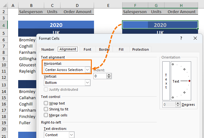
You’ll find the ‘Centre Across Selection’ option in the Format Cells dialog box on the Alignment tab:
In the animation below you can see the hassle Merged Cells causes when trying to sum the column of data compared to the easy when using Centre Across Selection:
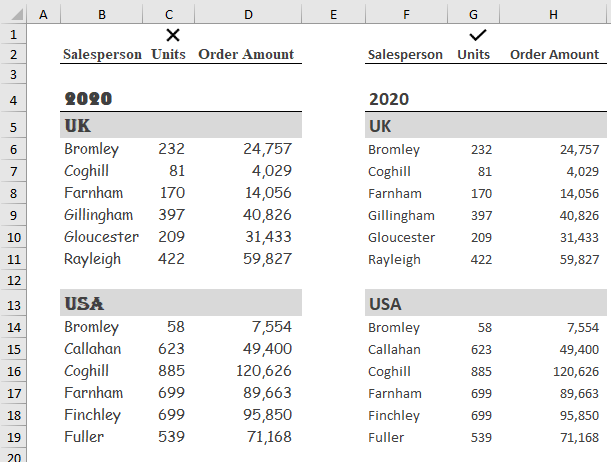
Angled Text
Avoid making people turn their head to read labels where possible. The tables in columns B:D are more time consuming to interpret because the region labels are off to one side and require more effort to read than those in columns F:H, which allow the reader to read in a logical, top to bottom order:
Zoomed Out with Massive Font
I’ve never worked out why people zoom way out on a worksheet, only to then increase the font size so they can read it, but I see it a lot.
The only thing it achieves is smaller font in the column and row labels, but they hardly take up that much space anyway.
If you must zoom out, simply stop when you can still read the font.
Too Many Fonts
Too many fonts, serif fonts, comic sans and the like are all inappropriate for most business scenarios.
Keep it simple and stick to no more than three different fonts in a spreadsheet.
Choose fonts that are easy to read and complement one another. Or instead of different fonts, use different font sizes or bold to differentiate headings etc.
Too Much Colour
The image below is an anonymised example of a real workbook I was sent by someone asking for Excel help. The coloured headings are way too much. Plus, the pink and red fill colours make the font very difficult to read. It makes me want to wear sunglasses to view it:
Colour is a great tool to categorize data and communicate information, but you can do it with subtle colours too:
Or consider whether you need every column coloured because when everything is coloured, nothing stands out:
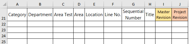
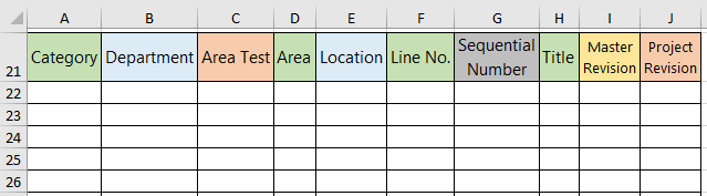
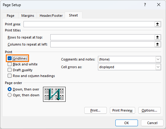
Cell borders EVERYWHERE
By default, Excel has gridlines turned on, so there’s no need to add cell borders to a table. These extra borders unnecessarily bloat your file and create a busy workspace.
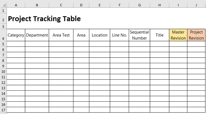
If you want to hide the gridlines for the header area, apply white cell fill, and leave the gridlines in place for the table area:
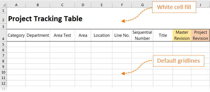
This will result in a much smaller file and you won’t have the hassle of gridlines disappearing if you cut and paste a cell.
And if you want to see gridlines when you print, you can turn them on in the page layout settings:
That wraps up my pet peeves. Did I miss any formatting habits you find annoying? Please share them in the comments.

I agree with the gridline comment. A lot of the users at my work (especially the boss) use the gridlines everywhere which makes it very difficult to view. My take is to put a border on the right of each column that I am using and then put a dotted line border (the one just below the none option). I then put solid border on the bottom of the row where my headings are. When printing, this doesn’t overpower the user and helps to differentiate the columns and cells. Yes, I do have to fix some things when copying or pasting but it doesn’t usually happen very often.
Sounds like you could create a custom table style and use that to speed up your formatting, Tom.