Year on year charts or data over time is one of the most common data visualisations you’ll see. However, the message conveyed depends on the chart you choose.
Watch the Video

Download Workbook
Enter your email address below to download the sample workbook.
Read along
Line charts are great at displaying data over time and we can start the vertical axis above zero to accentuate changes in the data.
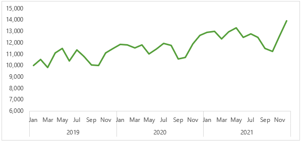
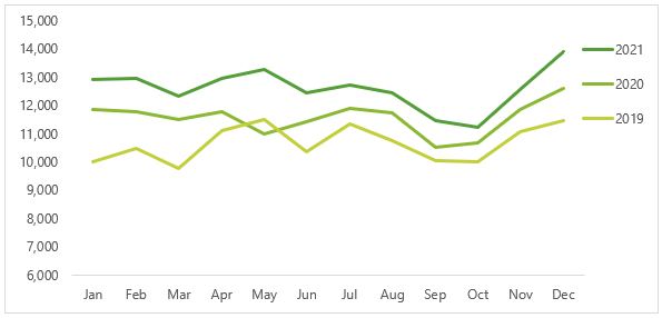
From the chart above we can see at a glance that the trend is upward. Whereas the chart below shows the same data with a separate series for each year, which more clearly illustrates seasonality in the data.
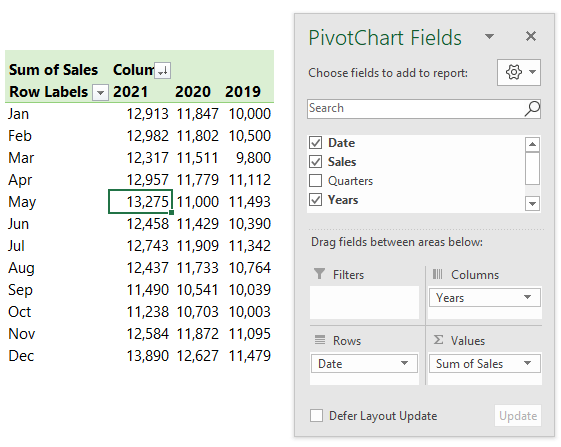
The key to generating a chart like the one above is to format your data with the years in the columns and the months in the rows, like so:
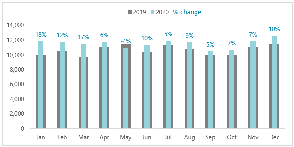
Column charts are another common way to display year on year data, as shown below:
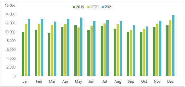
Important: The vertical axis in column charts must always start at zero. This is because we subconsciously compare the height of the columns to one another, therefore starting the axis above zero can exaggerate variances between the columns and mislead our audience.
Notice that even with a change in the colour scheme, the chart above it’s not as easy to see the trend in the data or compare one year to the other. For that reason, this is my least favourite year on year data chart.
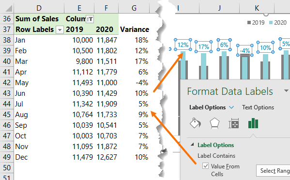
Year on Year Chart with Variance
Another option is to show the variance year on year, but this only works well for two years’ worth of data. The chart below clearly shows the comparison year on year with the current year at the front in a bright attention grabbing colour. Data labels add another layer of information that is quick and easy to interpret.
The labels are generated by formulas in column G, shown below, and the ‘Value from Cells’ option available in Excel 2013 onward:
If you want to focus on the variance, then another option is to plot just the change year on year:
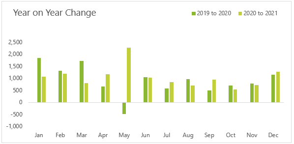
Be mindful that this type of chart drives home the variance, but it doesn't easily give the user a feel for the direction of the data.
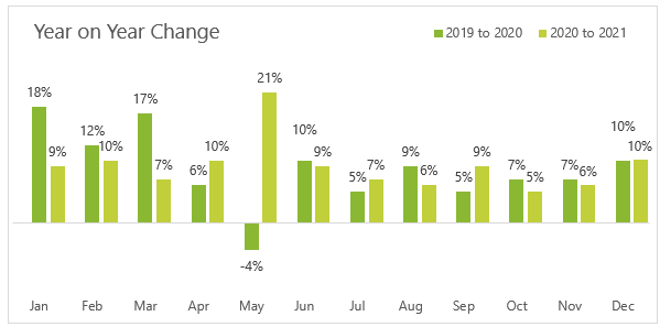
Or as a percentage:
Hi Mynda,
Thanks for the sharing.
With regard to “Year on Year Chart with Variance”, I have a problem. The grey and light blue columns cannot show together. One always overlap another, thus I can only see one column if the other is smaller. I try to solve the overlap issue by changing one column’s transparency, but this makes its color indistinct. I find you did not change the transparency, which is great.
Would u pls help with this issue?
Milo
Milo, the blue column should be thinner (bigger gap width) than the grey columns and sit on top as shown in my example. If you’re still stuck, post your question on our Excel forum where you can also upload a sample file and we can help you further.
It is working now. thanks for your help.
Great
Hi Mynda
Thanks so much again for the tips.
I have a problem with trying to remove field buttons on the charts – when I right click nothing happens. I’m using Office 365 business. Any ideas?
cheers
You’re welcome, Peta. You can also hide field buttons on the chart via the PivotTable Analyze ribbon > Field Buttons > Hide All.
Mynda
Thanks very much, that works.
I like the bullet type chart the best but I’d try to plot the %s a separate series on their own axis (still labels only)
I think this would require a third y-axis though…