Isaac teaches over 2,000 MBA students a year at Columbia, NYU and Temple U and over 3,000 undergrads on-line.
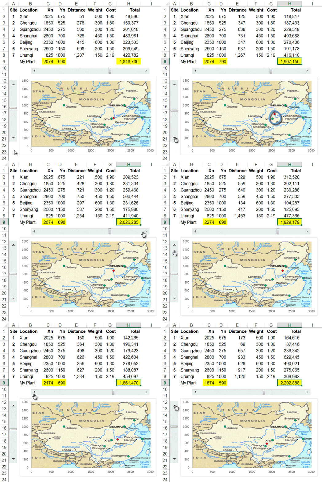
See how he uses the Solver to find out the ideal location for a manufacturing plant. He then takes the output and plots it on a scatter chart, adds some scroll bars and a sprinkling of magic dust and makes it do this (watch the red marker on the map):

Here is the video:
Now I know it’s not every day you need to calculate the ideal location of a manufacturing plant, but take a few minutes to think about how you could use one or more of the tips in this video and apply it to your work.
Enter your email address below to download the sample workbook.
Download the Excel workbook. Note: This is a .xlsx file, please ensure your browser doesn’t change the file extension on download.
If you'd like to learn how to incorporate interactive features like this in your Excel reports and charts check out my Excel Dashboard course.
Where’s the Solver?
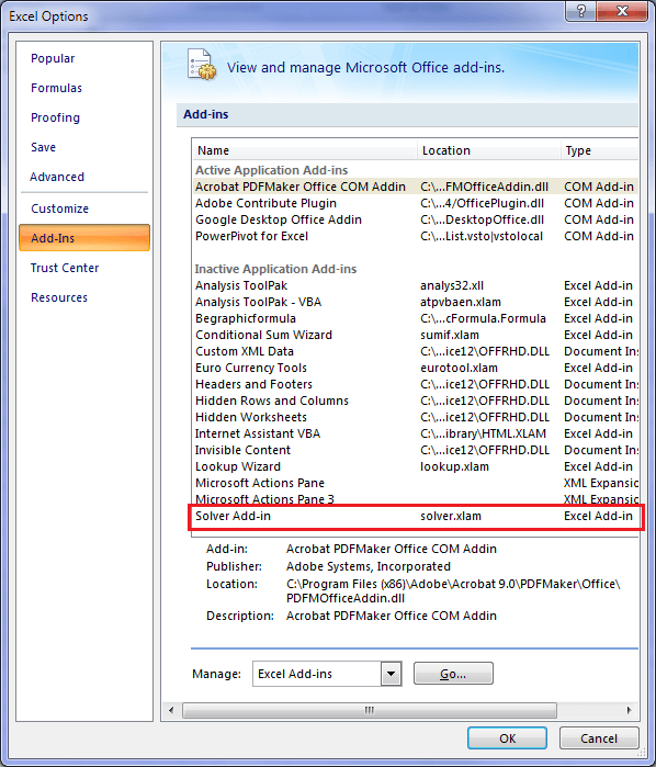
The Solver is an add-in. If you don’t already have it on the Data tab of your ribbon you can add it by going to Excel Options (Office button or File tab) > Add-ins:

Then you should have this:

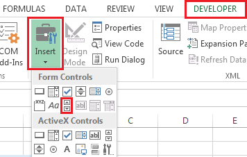
Where is the Scroll Bar?
On the Developer tab of the ribbbon.

If you don't have the Developer tab available you can add it:
File Tab (2010/13), or Windows button (2007) > Options > Customize Ribbon; check the Developer box under Main Tabs in the right selection pane.Thanks
Thank you Isaac for allowing me to share this tutorial.
If you liked this please share it with your friends and colleagues on LinkedIn, Google +1, Facebook or Twitter, or leave a comment below.
Shalom isaac
I enjoyed watching your podcast.
It gave me new goals for the future to use in my dashboards.
One thing that i still having problem is how to change the map size so that it will fit the coordinates of the countries /city
Like take the map of israel what size should it be in order to put haifa city coordinate to see on the map.
Thank you
Amiram
Amiram
To adjust the axis – you can right click on the axis and set it up with the right borders and it will not change. Once you have the chart with the map – you can adjust the coordinates on the Excel sheet so that the cities are in the correct position.
It is interesting that you asked about Israel. I created an example of Israel in Hebrew: https://www.youtube.com/watch?v=oC8KCfyhtw8
I really enjoyed this!
I have a couple suggestions which might address issues some people may have with this:
1) You can easily stretch the chart to match the dimensions of the original map, so it doesn’t look skewed.
2) I was unable to figure out how to reorient the vertical slider control so that moving up resulted in a higher number; it always seems to work backwards. So I tied the slider to another cell, J9, and changed cell D9 to be =1600-J9. Now the motion is much more intuitive.
3) You can adjust the size of the slider controls to match the graph dimensions, which also makes it easier to use. If you adjust the slider so that the max and min positions match the edges of the map, in combination with item 2 above, then moving the slide positions the red dot in the same horizontal/vertical position as the slider bars in the controls.
Great tips, thanks Glenn.
Great Help from you many thanks to you. Also our co in kSA is going to start E-commerce courses on MS office..can you assit me on anything like this if possible…best regd
Cheers, Darryl. Glad you liked Isaac’s video.
Please contact me at website @ myonlinetraininghub.com about the E-commerce courses as I’m not sure what you mean.
Kind regards,
Mynda.
Hi, do you know how to use the Index function in Google spreadsheets? I used it on an Excel spreadsheet that I needed to share with others, bu when I upload to Google Drive, the index function doesn’t work. This is the function I have: =INDEX($G$10:$CQ$10,1), =INDEX($G$10:$CQ$10,9), and so on. Increasing the digit one by increments of 8. Don’t know if that makes sense :/
Hi Yaa,
Your formula is missing the column number argument. It should be like this:
See the second comma? This is a placeholder for the row argument. You don’t need a row argument in this case because your reference is only one row high so Excel knows you must be looking in that row, but you still need to put a comma in so that it knows the next argument is for the column.
Kind regards,
Mynda.
Hi Isaac
Great application tutorial.
Regards
I am just amazed at what people are doing with Excel! Thanks for sharing this video!
Yes, it’s quite inspirational 🙂
Glad you liked it.
Wow, incredible tutorial! I’ve never used solver before and this was a nice intro to using it. I didn’t understand why the weights were different; one would think they would be the same.
Hi Brenda,
On behalf of Isaac, thank you.
The weights were all different as this is the amount each location requires from the plant. The materials produced by the plant aren’t evenly distributed.
Kind regards,
Mynda.
Hi Isaac,
It is a great piece of genius thinking and a master-piece techinque and Solution.
such people like you provide inspiration and motivation for others to also delve more into reseach and thinking to try and get close to your thinking.
Iam delighted to see what you have done as i still try to grasp the whole idea.
Cheers,
Nkhoma
On behalf of Isaac, thanks.
It’s really awesome tutorial
On behalf of Isaac, thanks 🙂